
Grahame Booth explains why pen and wash is so much more than just a rescue remedy.
“True pen & wash is fundamentally different to watercolour”
“Use a bit of pen on it -that’ll fix it!” Oh dear, to think of pen & wash simply as a rescue remedy for a failed watercolour is to misunderstand one of the most beautiful and satisfying mediums in painting. A pen & wash is not just a coloured drawing and nor is it a watercolour with a few pen lines added. Instead the pen drawing and the watercolour washes should complement each other to produce a work that is more than the sum of its parts.
True pen & wash is fundamentally different to watercolour. In traditional watercolour the edge of a shape is distinguished by a hard edge and a change of tone. In pen & wash it is distinguished by a line.
In many ways the work is almost finished before the watercolour is applied whereas in a traditional watercolour the work is only starting.
Are you a nervous watercolourist? Try pen & wash – the watercolour can be applied much more confidently simply because the pen has already created the structure.
Only a few materials are needed, making it an ideal sketching medium. I use a Pitt Artist’s pen – a medium nib is best as it can produce a good variety of lines. The ink is waterproof and so doesn’t smear when over-painting. An ordinary felt tip pen is unlikely to be waterproof and although this can produce interesting effect, it is not suitable for this method. Always use fresh artists’ quality paint and I find that two brushes are ample – a size 10 or 12 round and a size 4 or 6 rigger to reinforce or vary important pen lines.
I find hot pressed paper best (or even a good sketch book) as the smooth paper takes the pen beautifully and the paint seems to float over it. In pen & wash, cauliflowers or run-backs can often be a bonus instead of a disaster!
Because pen & wash needs strong line for structure, I feel it lends itself particularly well to buildings and street scenes. I like to draw directly with the pen because this gives a looser feel to the drawing, but if you wanted to begin with pencil, I recommend not being too careful when applying the ink. Be free with the pen. Ink over the pencil quickly to avoid a static uninteresting drawing.
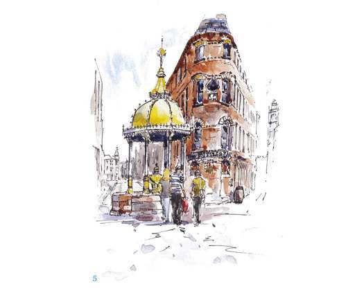
Working directly with the pen, I was careful to relate each shape to the other shapes in terms of relative position and size and with this first stage I lightly drew only the important main lines.
There is no point drawing every little detail of a shape only to find it is too big or too small or in the wrong place. If you make a mistake with a line, just make the correct line stronger.

Once I was happy with the general size and positioning of the main shapes I began to add detail and emphasise the important lines.

The first wash was applied with the size 10 brush. It is important to paint with a full brush to achieve a nice fluid ‘watery’ effect.
I deliberately varied the strength and colour of the wash as I applied it and avoided stopping the wash exactly at a line. You will see where I have painted over lines in places and in other parts the wash doesn’t quite meet the line. The building is in Burnt Sienna with a little French Ultramarine. Adding more Ultramarine to that mix gives me my browns and adding still more Ultramarine gives me grays.
The sky and roof colour is Tropical Phthalo Blue tempered with a little Alizarin Crimson and the fountain is Cadmium Yellow. Experiment with paint mixes. Colour variety gives interest. I allowed the paint to dry completely.
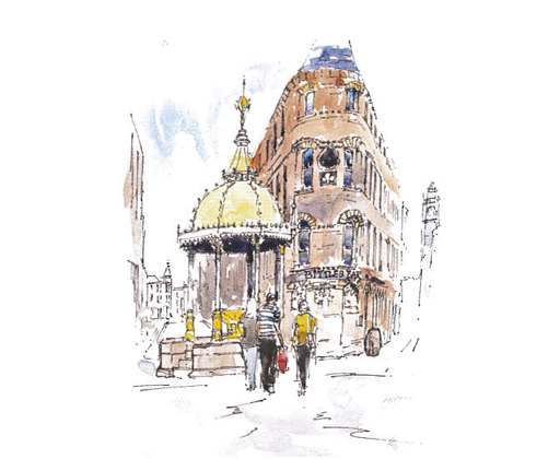
Next I strengthened up the first washes, using much the same mixes but a little stronger. I was careful not to over-paint all of the first wash with the second. I am seeking tonal variety and again I applied the wash loosely.

For the final stage I subtly strengthened some of the more important lines with the pen, particularly on the fountain and I applied a medium blue/gray shadow wash over parts of the figures, the fountain, the fountain plinth and the window reveals of the building. I finished with a few dabs of colour here and there to add to the looseness. The intention here is to create additional tonal contrast to give impact to the finished piece.
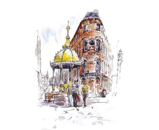
Tip – Don’t shade with the pen, add darks with the watercolour at a later stage.
Tip 2 – Draw with accuracy but with a certain looseness – controlled carelessness.
Tip 3 – If you are unsure as to the strength of some of the lines leave them less strong than you feel you might need. Better to strengthen a line later than to overdo it too soon.