A Limited Palette by Ali Hargreaves
2nd May 2017
Estimated reading time: 1 min
Most often, in my classes, I use a limited palette (usually versions of the three primary colours) as I believe that this simplifies the painting for my students, and generally helps a painting become more pleasing on the eye. I often choose three primary colours….although not perhaps the classic ones we immediately think of!
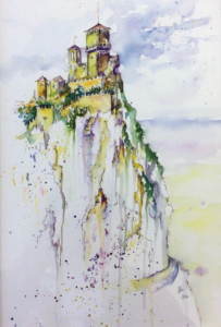
- I gave everyone a photo of a castle in France to work from. We drew the castle and the rocks with a permanent fine tip pen
- Splattered the sky area with a mix of Prussian Blue, Intense Violet and water.
- “Joined the dots,” so to speak, to paint the sky and clouds
- Mixed the Intense Violet and Quinacridone Magenta with the Aureolin to make the shadows on the side of the castle, the rooves, and the rocks
- Mixed Aureolin and Prussian Blue to make the varying greens for the foliage
- Focused on painting the castle at the top of the rock with the most colour
- Left plenty of white towards the bottom of the painting so creating a less busy area
- Added some splatters of each colour to add some texture
Please note…just using Aureolin and Intense Violet can produce an excellent painting with a wide range of tones and a pleasing finish.