
To capture the light and energy in this picture I needed the power and immediacy of pastel. For me no other medium compares with these pieces of pure pigment and their direct application.
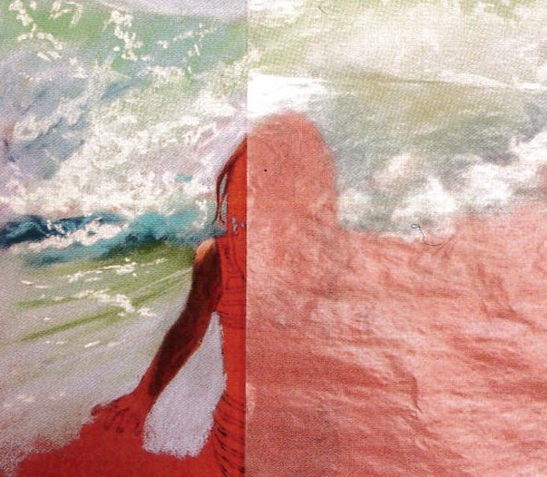
 I selected a hot salmon coloured piece of paper as I wanted its warmth to shine through the cool colours of the sea and to add heat to the flesh tones. I then drew up the figure and suggested the lines of the waves. I decided to go with a lost and found edge for the top of the child’s head against the white water. My first task was to select the sea colours I wanted. I chose French Ultramarine, Cerulean Blue Tint (7, 3 and 8), Prussian Blue (5 and 8), Cobalt Blue Tint and White. Selecting these colours is important for getting the right tonal and colour contrasts in the figure and to give the painting light. Having decided on this palette I continued down to the figure. In forming the surf I found a central colour and tone (Cerulean Blue Tint 7) and the worked in the other Cerulean Blue tints to give shape and movement. I was not trying to copy the photograph but to give a feel of the tone and movement of the sea.
 While working on the figure I used Clairefontaine Crystal Paper to protect my drawing and prevent grease or moisture from my hand tainting the pastel paper. When finding the first colours and tones for the young girl I used Derwent Pastel Pencils in a range of Burnt Orche, Raw Umber, Terracotta, Sepia, Cadmium Red, Dark Sanguine and Burnt Carmine. To these I then added Ultramarine and Cerulean Blue to cool the colours.
 Using soft pastels over the pastel pencils allows me to get more colour overlaid. I didn’t blend the skin colours as I wanted the vibrant colours to lie side by side with each pigment being allowed to shine through. If I took all my pastels and put them in a blender, I would get a grey/brown mush – blending has the same effect. Laying one colour over another gives the opportunity to put in complimentary colours to create vibrancy. In the swimsuit Yellow and Red were used in a triad of colour that glows. The orange-red in the arm helps the blue to shine. The skin colours are mainly the colours of the paper with the Sienna, Geranium Lake and blues added. I love black! The strong neutral really shows off the true nature of the colours around it – note how the Magenta piping on the swimsuit is seen not to be black and the potential great areas of blue tinged skin are seen as warm. Check the work of Monet and Degas to see how black is used to enhance colour.
 At each stage of the work I painted in the background tone and main colours before painting the figure. This way I can play with the colour palette and the tonal contrast. The deeper the shadow area the brighter sunlight and the greater the opportunity to enjoy the interaction between colours. With the hair I started with the pencils in Vanilla, Marigold and Yellow Ochre and worked in the darker tones with Sepia, Indigo and finally Carbon Black. To get the highest tones I used White soft pastel.
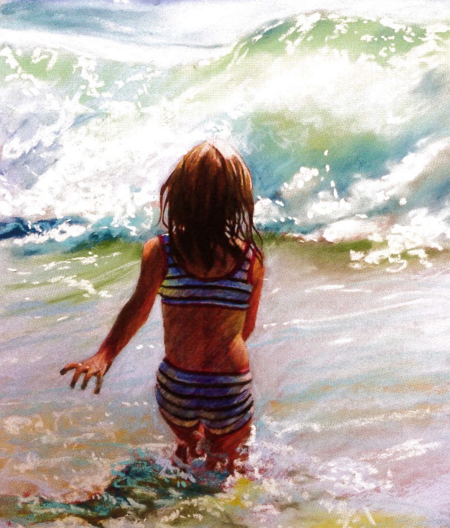 In the final stages of the work I worked over the skin with soft pastel. While pencils allow for accuracy, they lack the depth of pigment of soft pastel. I find that using a combination of soft pastels and pastel pencils works better than blenders. The pencil adds a little pigment and it moves the soft pastel to get details. In the foreground I under-painted the area with Raw Sienna to give it warmth and to suggest the sand through the shallow water. Over this I used then lighter tones of Cerulean Blue and a little Permanent Green Light to give a turbulent feel. In the shadow area I used the darker Cerulean Blue and a little Prussian Blue.