Capturing Eyes with Catherine Inglis
7th February 2024
Estimated reading time: 5 mins
From Paint & Create July 2014, the magazine of the SAA
Materials List
Shop Unison
The eye is the most expressive feature of the human face and great care with observation, positioning and execution should be taken when attempting to draw the correct shape of the eye.
The importance of lighting.
With life models make sure that lighting in the studio is set up to give a natural shadow over the face. These lights and darks are the basic instructions you will need to work from. Setting your light source from the side at approximately 10 or 12 o’clock will give a kind lighting to the face. If working from photos, avoid the use of a direct camera flash which will leave the eye devoid of natural shadows.
Understanding the anatomy of the eye.
The eyeball is a sphere sitting within the eye socket with upper and lower eyelids curving over and partly covering it. The light travels through the cornea (the clear bit), usually on the upper part of the eye. This light reflects on the lower part of the iris making it glow and giving it life. The white part of the eyeball is never really white – there are shadows cast by the upper eyelid as well as little shadows in the corners of the eye, this is what will make the eyeball become rounded, similar to painting an apple or ball to achieve a spherical image. So be very aware of the lights and darks, not forgetting the tonal variations in between.
Tackling colours.
Brown eyes require very warm browns to avoid looking dull. Where refracted light from the iris exits the eye use a bright warm brown like Unison Brown Earth 12, or even brighter, Unison Special Collection 2 or 3. This can be smudged a little to diffuse the ‘glow’. If you have difficulty with the blue eye colours, a grey pastel glazed gently over the blue will help to neutralise the blueness and make them less stark.
Step 1:
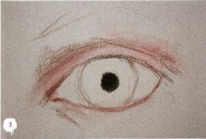 Choosing the smoothest side of the paper and the harder Conte crayons, I used mid tone 079 Tile to draw in the outline of the eye and shaded the shadow area above the upper lid to create recession. A hard line will kill it – it is a fold and needs to be softened. For warmer mid tones I used 049 Orange Lake, and flesh for the lighter tones catching on the edge of the upper lid. I blocked in the pupil with black and applied Sennelier 463 Intense Blue over this to give greater depth to the black.
Step 2:
 For the shadow cast by the lid onto the top of the iris, I used a softer pastel; Unison A49 Dark Blue, graduating to a lighter tone on the lower half of the iris, A51 Mid Tone Blue. For shadows cast under the upper lid to the white of the eye I used Unison A19 and to the lighter areas of the whites Light 5, blending gently together, remembering that these subtle tones will give a roundness to the eyeball.
Step 3:
 Using the sides of the same Conte crayons as stage one, I put the brow bone, again this catches the light. I worked up the darker tones in the socket shadow, blending in a little as required. I did the same to suggest the soft shadow under the lower lid and light tones on the cheekbone, then added a touch of Red Portrait 8 to both corners of the eye and a little along the right side of the lower lid.
Step 4:
 I then strengthened the tonal values to suggest surrounding structure, with the lightest tones being above the brow, upper and lower lids and the cheekbones. For the lighter but warmer tones I used Unison Portrait 5 and for the lights, Light 6. I used Unison Red Earth 4 and 15 for darker tones and a little Conte 080 to the shadow of the socket to further darken and blend the tone here.
Step 5:
 Unison Grey 27 was used for the catch light in the eye and to each side of the white of the eye next to the pupil. One or two blue violet pastels were used sparingly to adjust the eye colour and graduate the light down the iris finishing with a ‘glow’ of paler blue where refracted light emerges from the iris, followed by a touch of Conte 064 Chinese Red Vermillion to each eye.
Step 6:
 I used the tiniest amount of Conte 76 Leaf Green to some of my darker shadows to neutralise the reds and give a wonderful shadow. I then added darker tones to the eyebrows with Conte 080, softening hairs with my fingers at the point at which they emerge from the hair follicles in the skin. Finally I applied the eyelashes using Conte Black, this stage requires courage!
Catherine’s Top Tips
- Always be aware of the light and where it is coming from.
- Place spare paper under your surface to act as a cushion to avoid creating a ‘brass rubber’.
- Work upright to prevent pastel dust falling on your paper and have cloths handy to keep your pastels and fingers clean.
- Break new pastels in two and remove any paper wraps so you can use the side, the tip and the ‘heel’ of your pastel. Using the tips of pastels, especially with softer pastels, will result in muddy work and will clog the paper’s tooth.
- Craggy eyes can be challenging. Remember the face has no hard lines only deeper folds, so keep those crows feet and under-eye bags soft! A little light against dark and a light touch of the finger to smudge works miracles.
- Make sure both eyes are looking in the same direction in your portrait!
 Catherine Inglis is a pastel artist and tutor, keep in touch: Email, SAA Profile, Website, Facebook, Instagram.

 Choosing the smoothest side of the paper and the harder Conte crayons, I used mid tone 079 Tile to draw in the outline of the eye and shaded the shadow area above the upper lid to create recession. A hard line will kill it – it is a fold and needs to be softened. For warmer mid tones I used 049 Orange Lake, and flesh for the lighter tones catching on the edge of the upper lid. I blocked in the pupil with black and applied Sennelier 463 Intense Blue over this to give greater depth to the black.
 For the shadow cast by the lid onto the top of the iris, I used a softer pastel; Unison A49 Dark Blue, graduating to a lighter tone on the lower half of the iris, A51 Mid Tone Blue. For shadows cast under the upper lid to the white of the eye I used Unison A19 and to the lighter areas of the whites Light 5, blending gently together, remembering that these subtle tones will give a roundness to the eyeball.
 Using the sides of the same Conte crayons as stage one, I put the brow bone, again this catches the light. I worked up the darker tones in the socket shadow, blending in a little as required. I did the same to suggest the soft shadow under the lower lid and light tones on the cheekbone, then added a touch of Red Portrait 8 to both corners of the eye and a little along the right side of the lower lid.
 I then strengthened the tonal values to suggest surrounding structure, with the lightest tones being above the brow, upper and lower lids and the cheekbones. For the lighter but warmer tones I used Unison Portrait 5 and for the lights, Light 6. I used Unison Red Earth 4 and 15 for darker tones and a little Conte 080 to the shadow of the socket to further darken and blend the tone here.
 Unison Grey 27 was used for the catch light in the eye and to each side of the white of the eye next to the pupil. One or two blue violet pastels were used sparingly to adjust the eye colour and graduate the light down the iris finishing with a ‘glow’ of paler blue where refracted light emerges from the iris, followed by a touch of Conte 064 Chinese Red Vermillion to each eye.
 I used the tiniest amount of Conte 76 Leaf Green to some of my darker shadows to neutralise the reds and give a wonderful shadow. I then added darker tones to the eyebrows with Conte 080, softening hairs with my fingers at the point at which they emerge from the hair follicles in the skin. Finally I applied the eyelashes using Conte Black, this stage requires courage!