
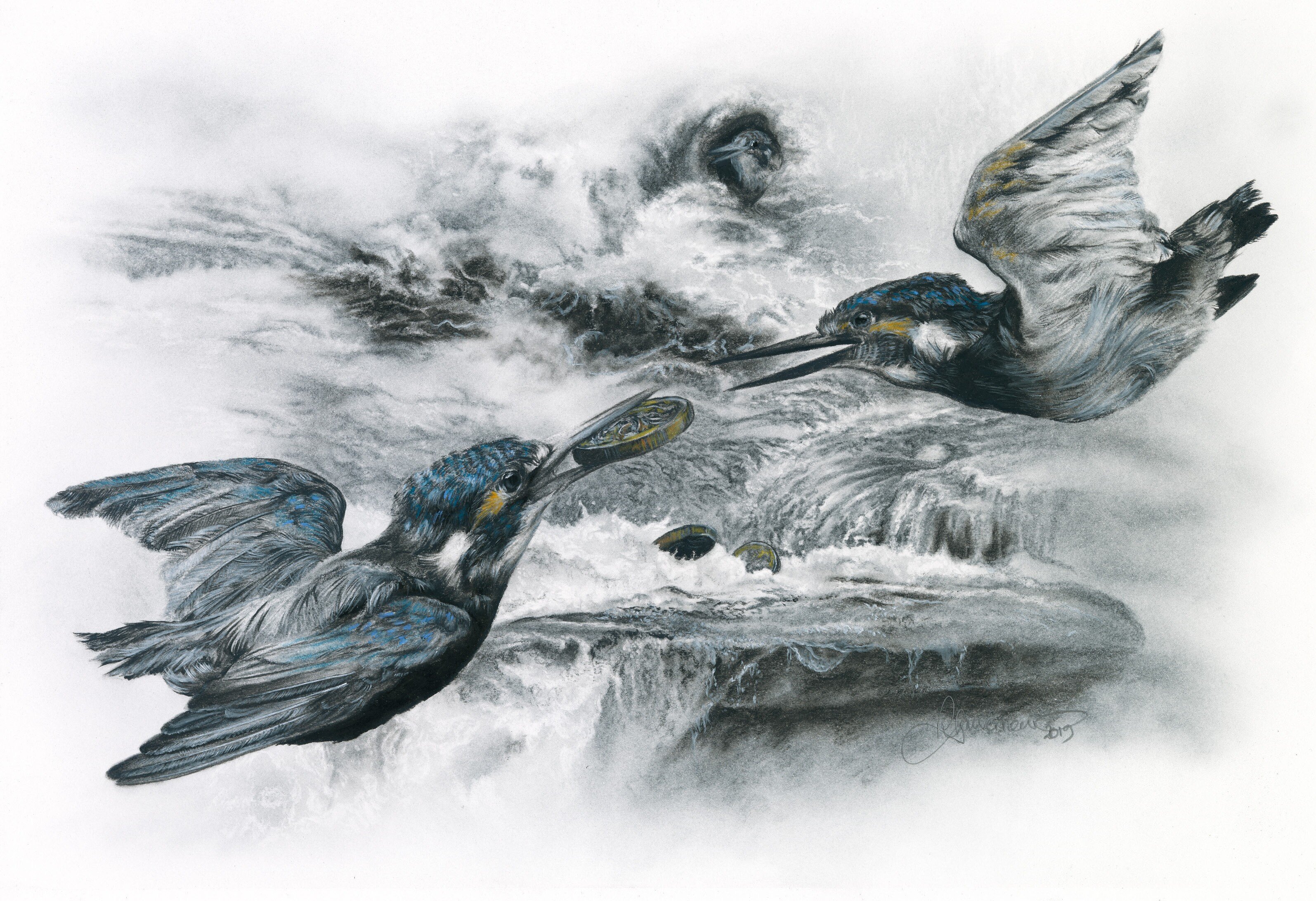
 I find art more engaging when it includes a concept beyond purely the aesthetic, and have interpreted this Aesop Fable to reflect modern society. I have used charcoal to draw two kingfishers distracted and squabbling over money; it is falling into the flood waters behind them, which are threatening to wash away their nest while they fight. For me, this represents a political fight, with politicians distracted from the ‘floods’ of climate change which threaten our world.
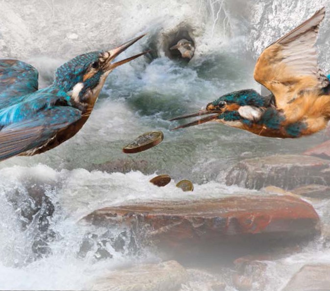 Wherever possible I use my own photos; this makes things simpler with copyright, and gives me full creative control over my finished work. You may need to think out of the box. For example, when I decided I wanted to draw fighting kingfishers I knew I was unlikely to get a picture of this, so decided to photograph taxidermy as my reference! I emailed several museums and put out an appeal on Facebook and a chap called Chris offered to loan me his Victorian specimens. I plan my composition in Photoshop before I start, so I move the images around and adjust the tones.
This type of charcoal drawing is delicate and may smudge if I lean on the drawing while I work. So I start at the top left and work across the image, completing each section as I go. Here I will discuss each phase of the drawing separately, not in chronological order.
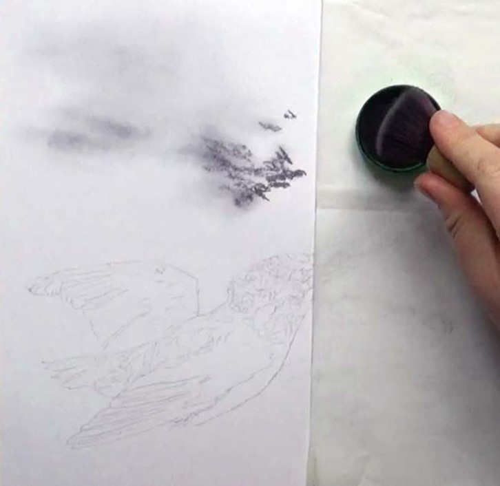 First plot the composition using a graphite pencil. These marks need to be erased as you progress, so should be as faint as possible. For the background, pick out the darkest areas in willow charcoal then, using a soft brush, apply charcoal powder, blending the willow charcoal out smoothly.
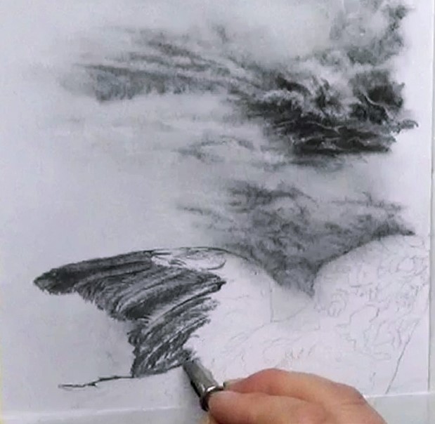 Add dark areas first using charcoal pencil then mid tones in willow charcoal. Always work in the direction of the feathers. Once you have applied the tones, blend with a small brush and use a putty rubber to create the texture of the feathers. The central spine of the feather may be either a dark or light line. Extra highlight detail is added towards the end using the white pencil.

Outline the belly of the bird in charcoal pencil, drawing in the feather texture, then fill the dark area with your darkest charcoal pencil or compressed charcoal. Apply a thick layer of charcoal powder to the back of the bird then create the feathers using the putty rubber. Add in the darker areas of the head, including the eye, using charcoal pencil and blend them into the lighter areas with a small brush to create your mid tones. Use a base of willow charcoal for the top of the head then add the darker lines with charcoal pencil.
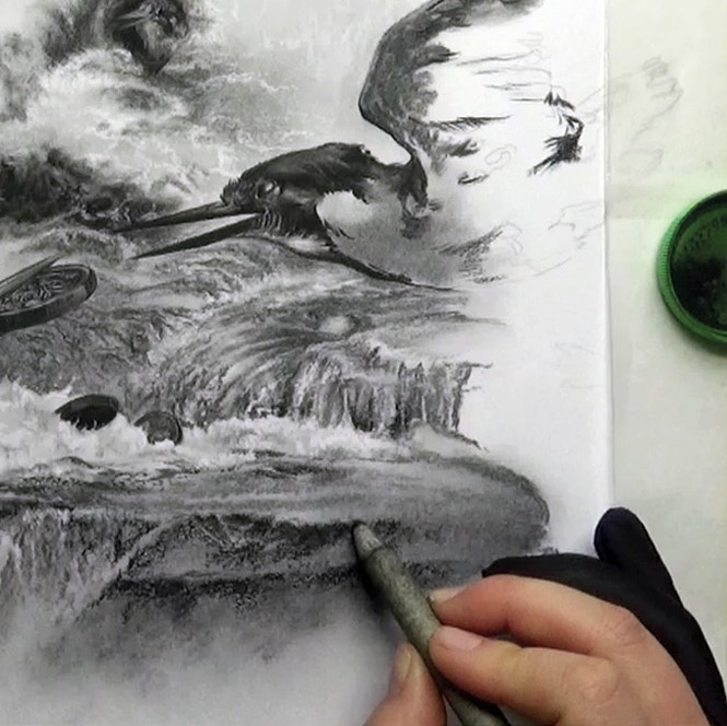 The rock is base coated with a layer of powder then darker areas are filled in with willow charcoal. This is blended with a brush while adding extra powder to the darker areas, building up the tones. Next, the darker areas under the rock are drawn using a charcoal pencil, avoiding the lighter ripples of the water falling over the rock. These darker areas will need blending with a tortillon rather than a brush as the charcoal pencil is more ‘sticky’ than the willow or powder. Finish by adding the highlight detail of the falling water using a white charcoal pencil.
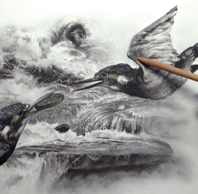 Draw the second bird and rest of the background using the same processes. If you want to add a little colour to your work, concentrate on the focal points – here that’s the two birds and the three coins. I left the baby bird monochrome to make him harder to spot in the background. To add colour I use pastel pencils, applied sparingly and blended out gently with a brush.
 Becky Gouverneur is a professional artist specialising in realistic, detailed portraits of animals. She works primarily in graphite and charcoal but occasionally in colour with pastel or coloured pencil. You can find out more about Becky and her work by visiting www.bexartsuk.wordpress.com. Also the SAA community site has plenty more tutorials, tips and videos by Becky.