Using Oils: How To Paint An Owl with Paul Apps
11th January 2018
Estimated reading time: 7 mins

Oils for Beginners – Starting Out in Oil
Basic Colour Palette
Palettes of colour (pigments) in all mediums are the same. The vehicle or carrier (suspension) it is mixed with will determine if you are using oils, acrylics, pastels or watercolour. So the rules for using colour for the most part transcend the different mediums. It means that the knowledge you gain in one will be useful in another.
The colours that you choose can be directly related to the subject. By picking a range of pigments to suit a high or low key rendering, you can limit the range needed. For example Alizarin Crimson, Ultramarine Blue, Cadmium Yellow Deep, Viridian and White would keep all your colour choices in the darker low key range. Alternatively Cadmium Light Red, Cadmium Light Yellow, Cerulean or Cobalt Blue, Light Green and White would keep your work in a lighter high key area.Your subject will seldom fall into one or other area alone, so I choose a palette that will give you a selection in all areas, whilst still remaining limited, with the addition of Naples Yellow not included last time.As a beginner this restricted palette not only saves you money but more importantly makes you think harder about colour mixing. You can mix all you will ever need from this selection.Tip: Learn to mix the colours you need from this palette and only add new colours later when you know how to use them. Experiment with colour; put pigments together and observe how they affect each other – enjoy the journey and make notes about is as you go.
Drying Time and Mediums
As a general rule the lighter the colour the longer it will take to dry, affected by the amount of impasto (thick) brush strokes you employ. Also, the usage of mediums to retard or hasten drying times will affect the final outcome. Sometimes it is a definite advantage to keep the paint wet, by adding oil such as linseed, allowing you to continue to adjust and refine the passage from one session to another. Conversely you can add a drying medium like Liquin to speed up the drying time, where within hours the surface may be ready to accept another layer; ideal if you wish to add thin layers or tints to a work in progress to build up a deep, rich surface. With practice you will become adept at deciding how to proceed.

Colour Mixing
This can be a minefield but it doesn’t have to be. Create your own colour wheel and follow its development with great care. By taking time to make careful notes about amounts of pigment at each stage, you will build an easy-at-a-glance resource for yourself. Repeat the wheel often in the first year – even when you know a lot it is a worthwhile exercise. It can seem a drudge, but you will never regret the in-depth understanding of colour mixing you will gain, which, when working, will become second nature.
Basic Colour Wheel
Create your own wheel like the one above on a sheet of Oil paper – have several goes. Place your primaries, using several brushes to keep your colours pure. Slowly mix each puddle of pigment toward the next. Watch as the pigments change and create new ones. As there are no tones (black or white) the values of each pigment remain constant and pure. Bear in mind that there are many shades of colour that might form any one group – the pigment make up of that shade will have differing characteristics leaning towards one of its neighbours on the primary colour wheel, affecting the temperature and outcome when mixed with the other pigments.
As an example I used Cadmium Red Light as my primary red; when mixed with French Ultramarine Blue it created and unsightly and dirty looking purple/violet secondary colour. Now try using Alizarin Crimson as your main red – the resulting secondary purple is much more pleasing to the eye. With experience, the primary colour chosen can be altered to directly affect the final outcome.
Now Mix Your Browns
Earth pigments can all be mixed from the primaries, all you need to do is take note of the amounts of each primary colour used in the mix. Slight variation will determine which of the well known earth colours you are using. Finally put all your primaries together in a mix to produce your darkest colour of all, black (or muddiest of muds). This black can be shifted to warm or cool again by adding more of one associated primary or another.

Flying Barn Owl – Oare Marshes, Kent
In this Article SAA Professional Artist, Paul Apps Considers a Basic Colour Palette.
Step 1: Sketching your owl
The first stage is the sketch. I placed the owl high and to the right creating dynamic interest in the image. I have chosen a white ground this time on a small canvas. Next, using a no.2 round brush and Naples Yellow with White, a hint of Cadmium Red and Yellow, I established some initial marks suggesting the large expanse of reeds. Adding a little Umber to the mix I fixed the top edge of the water. Then with a no.4 flat brush I used a mix of Ultramarine Blue with a hint of Alizarin and White to suggest in broad sweeps the background in shadows and imply movement with directional strokes. Finally in this stage I used elements of both puddles of colour to render the beginnings of the water. The white tone is added to reduce the value and cool the image.
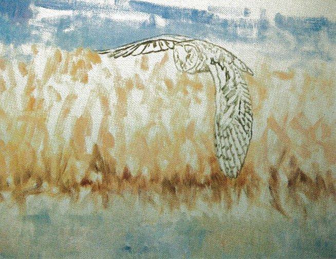
Step 2: Applying marks
Using either a no.2 round or the edge of a no.4 flat will have a similar outcome for the marks they make. I randomly applied marks all over the canvas from each of the mixed puddles of colour. By changing the amount of each used in the relevant areas of the painting, I suggested lights and shades but above all I am creating a harmony throughout the work despite a limited palette. Before moving on I used a small fan brush just to soften the effects from top to bottom.
Step 3: Adding darker colours
Using the no.2 round I have used pure mixes from each puddle it: without white, to deepen areas, suggesting dark spaces within the image, darker blues and violets, red and ambers; they serve to enrich the work, and once again by restricting the palette maintain that all important harmony. Each stroke is used less randomly placed and more refined implying form and structure. Small areas of darker reeds at the water’s edge add to the effect and add weight to the foreground.

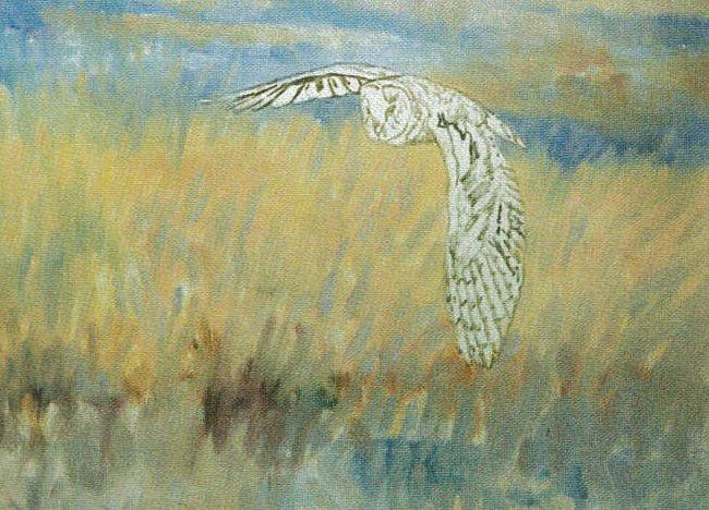
Step 4: Creating water
I added more information to the background elements and concentrated on the water. I retained the same colours used elsewhere by seeing marks at the water’s edge and dragging elements downward I suggested reflections. Remember the sky above also reflects and will appear in the lowest portion of the canvas. Finally, I added a lot of White to the Naples Yellow, and using a no.2 Rigger I dragged horizontal lines of this pigment across the canvas to give the effect of water. Turning my attention to the owl, using a small fine point brush, no.1 or 2 and the same colour as elsewhere, and a dark mixed from pure Ultramarine and Umber I started to add detail.
The owl is a combination of Ambers and Violets with darker wing and flight markings.

Step 5: Finishing your owl painting
I refined the owl’s markings further, paying due attention to where the light was coming from.
Finally I checked my reference photo and added some highlights to the upper wings, head, face and tail. Weight was added to the left side of the foreground reeds to balance the overall composition.
This painting suggests evening light which will subdue the pigments and limit the palette needed. It does mean however that it has to lack colour. Using colour elements in all areas, harmonies are formed and colour is both controlled and preserved.
