Even though I don’t own one, I have a real love of vintage VW Campers. When I see one pass by on the road, it fills me with happiness and makes me smile. As a subject to paint, they are full of character, colour and technical detail. I painted this from a reference photo of a friend’s camper van – he’s named it Bumble, because it bumbles along. The photo shows the van at an interesting angle with nice reflections in the windows and lights. With the door open and items on the roof, it becomes even more interesting. The photo is useful to set out the detail, but I don’t intend to literally copy everything.
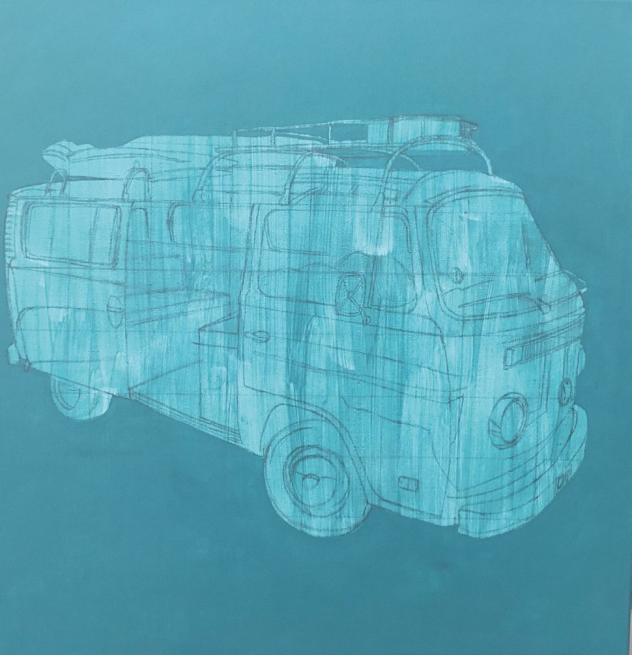 The first stage is to prime the canvas with the complementary background colour, in this case Golden Fluid Acrylic Teal III. Next draw a grid lightly onto the canvas to scale up the photo, making sure you show reflections in the hub caps, windows and lights. Decide which things to leave out!
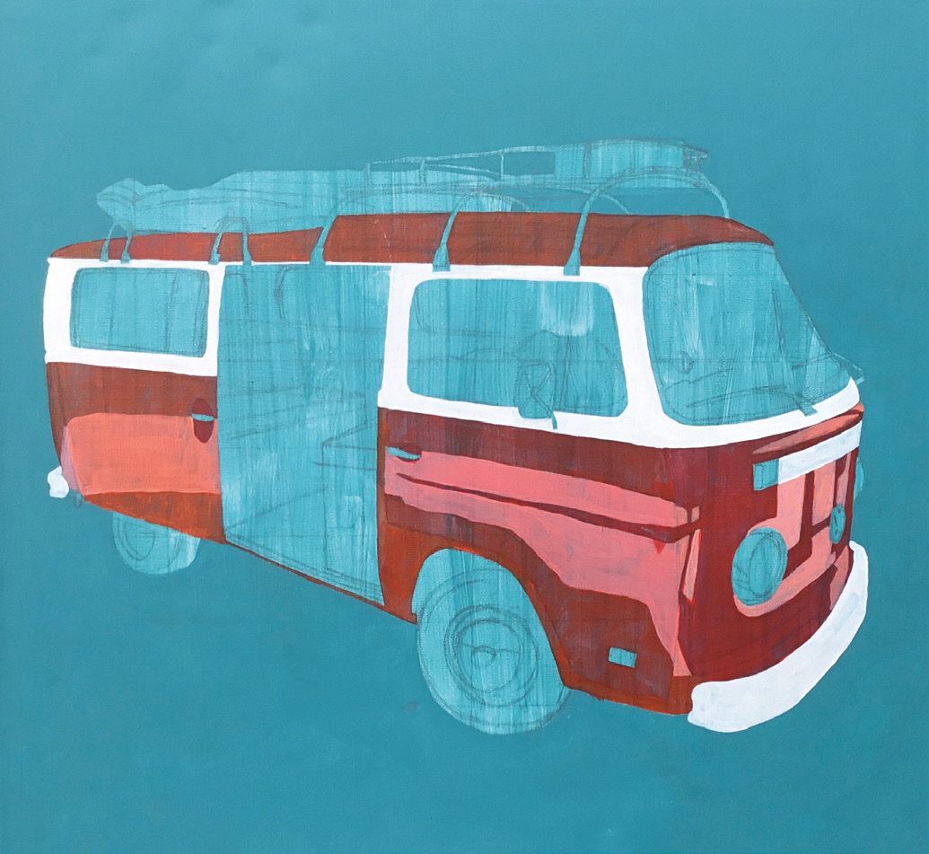 When applying the first layer of paint, the idea is to cover the drawing, plotting out the shapes. For darker orange mix Cadmium Orange with Crimson, whilst Cadmium Orange and Cadmium Yellow make lighter orange. I rarely use colours directly from the tubes and like to add reds, browns or blues depending on the tones. Don’t try to get a final finish at this stage as this will come later, even with acrylics because they need a couple of layers. Once dry, apply another coat to the background.
 For precision painting, I tend to use an easel so I can work comfortably and the paint flows downwards. The windows are a wet mix of Payne’s Grey and Burnt Umber, the lights are a wet mix of Ultramarine and Burnt Umber with Titanium White while the hub caps were painted with Payne’s Grey and Titanium White mixed with a touch of Burnt Umber. I worked in a fairly wet way to try to let the colours run into each other, much like watercolour. This will help to blend the line and make it a bit softer. Always look carefully at the reference photo to see the dark areas. The highlights can be added later. Go back over the main body of the van and see the colour really shine. Looking at the reflections, pick out the contours of Bumble. Work on the shadows in darker orange. Don’t be tempted to reach for black as it will make the picture look dirty. Keep the colours fresh. When mixing, it’s good idea to stick to a limited palette of five or so paints, mixed with various quantities. I used Payne’s Grey mixed with Burnt Umber and Crimson to achieve dark areas.
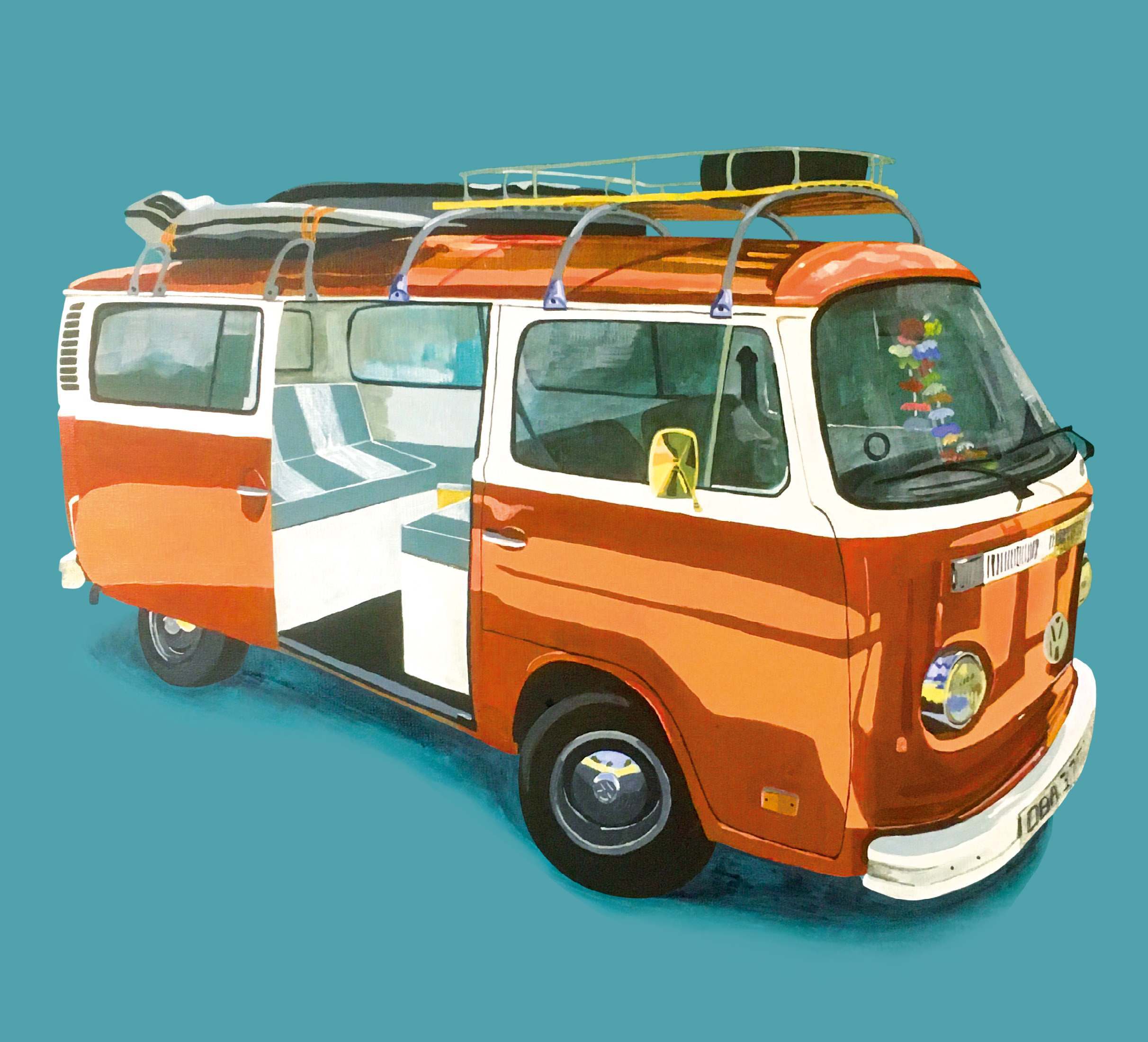 This is my favourite part, when the picture pops! With a tiny, pointed brush mix a strong fluid colour for the door lines and wheel trims and focus on grills, head lights and indicators. Add tiny touches of white as too much can look fake. Finally, don’t forget to sign!