
First of all, though it’s a little late, Happy New Year.
I must apologise for the lateness of my January blog but on Friday the 13th (of all days!) I tripped over an art bag at home and cracked a bone in my foot. How did this affect my right arm? It didn’t, but two days later I came down with the worst chest infection and cold I’ve ever had – possibly picked up in either the doctor’s surgery or A&E. Happily I’m now on the mend with both ‘ailments’.
For January’s blog I had intended, before Christmas, to paint a dragon’s head; mistakenly under the impression that this was the Chinese ‘Year of the Dragon’. It isn’t. It’s the Chinese Year of the Rooster, but as I’d decided on a Dragon, a dragon named ‘Haggis’ it is.
Finding dragons to photograph is quite a difficult task these days as they are such elusive and shy creatures, so I settled on one of my own imagination.
I’ve used Pastelmat again as it is, by a long way, my favourite pastel surface, colour – light grey, and a quarter imperial in size. After making various sketches I transferred the final image to my sheet of Pastelmat using Tracedown – and NO! it is NOT cheating. I have evidence (on DVD) of a very famous artist ‘admitting’ that they trace their image before starting to paint.
When looking at the range of colours of the SAA’s own pastels I decided to opt for a blue Scottish Dragon – a nod to my mother’s side of the family. I had used predominantly greens and reds for the December ‘holly sprig’, so I thought using blues would make a change and also the range of blues in the SAA’s options are excellent – plenty of choice.
Having transferred the image I blocked in all the dragon head and neck using Cerulean Blue (8) AP1168. I don’t usually block in whole areas of a painting with one colour but on this occasion I did.
Before working on the head and neck in detail I did some examples of a few types of dragon coverings i.e. scales. Not everyone who paints will either like to look at, or want, to paint a dragon or any other fantasy creature, but there are many similarities with wildlife found in abundance today. For example snakes, turtles and tortoises, lizards, fish to name but a few and I’ve discovered that some, if not all of these, make very popular topics to paint.
 In this example I drew a diagonal grid first of all. Then I lightly outlined each diagonal trying to keep them equal in size. Each scale is slightly raised or domed in the centre and, depending on the direction of the light, will pick up the light along the highest point. I used Cerulean Blue (8) AP1168 to block in the scales adding Cobalt Blue (9) AP1179 for the highlight and Phthalo Blue (7) AP0647 for mid tones, and Prussian Blue (5) AP0345 to darken the sloping sides of the individual scales. I used Pitt Pastel Pencil Dark Indigo 157 to add a little extra dark in the corners of the scales and around the edges where each scale meets the next.
 Firstly I drew a grid with roughly equal squares. Then I pencilled in the scales. Flat scales will still need a variation of colour, particularly just under the overlapping scale where there will be a slim shadow, and on the curved scale edges which will pick up the light.
I used Cerulean Blue (8) AP1168 to block in the scales. I used Phthalo Blue (7) AP0647 to add darker shadows with Cobalt Blue (9) AP1179 for the highlights. I used a Pitt Pastel Pencil – Dark Indigo 157 – to add a slim line of darker shadow under each curve where it’s overlapped.
 First of all I drew an ‘S’ shaped tube and then divided it into segments which taper towards a narrow end.
These are the sort of shapes you might find around the neck or body of an animal such as a Pangolin. The segments curve around a shape and need to ‘increase’ or ‘decrease’ according to the structure. I’ve used segments in the neck of my dragon.
Again I used Cerulean Blue (8) AP1168 to block in the shape adding Phthalo Blue (7) AP0647 for mid tones. Because of the direction of the light I’ve added White AP001 on the underside which continues up the side of the structure. To add darker shadows on the top of the shape and to separate the segments I’ve used Cerulean Blue (3) AP1163. I’ve used Pitt Pastel Pencil Helio Blue Reddish 151 to outline the segments on the underside.
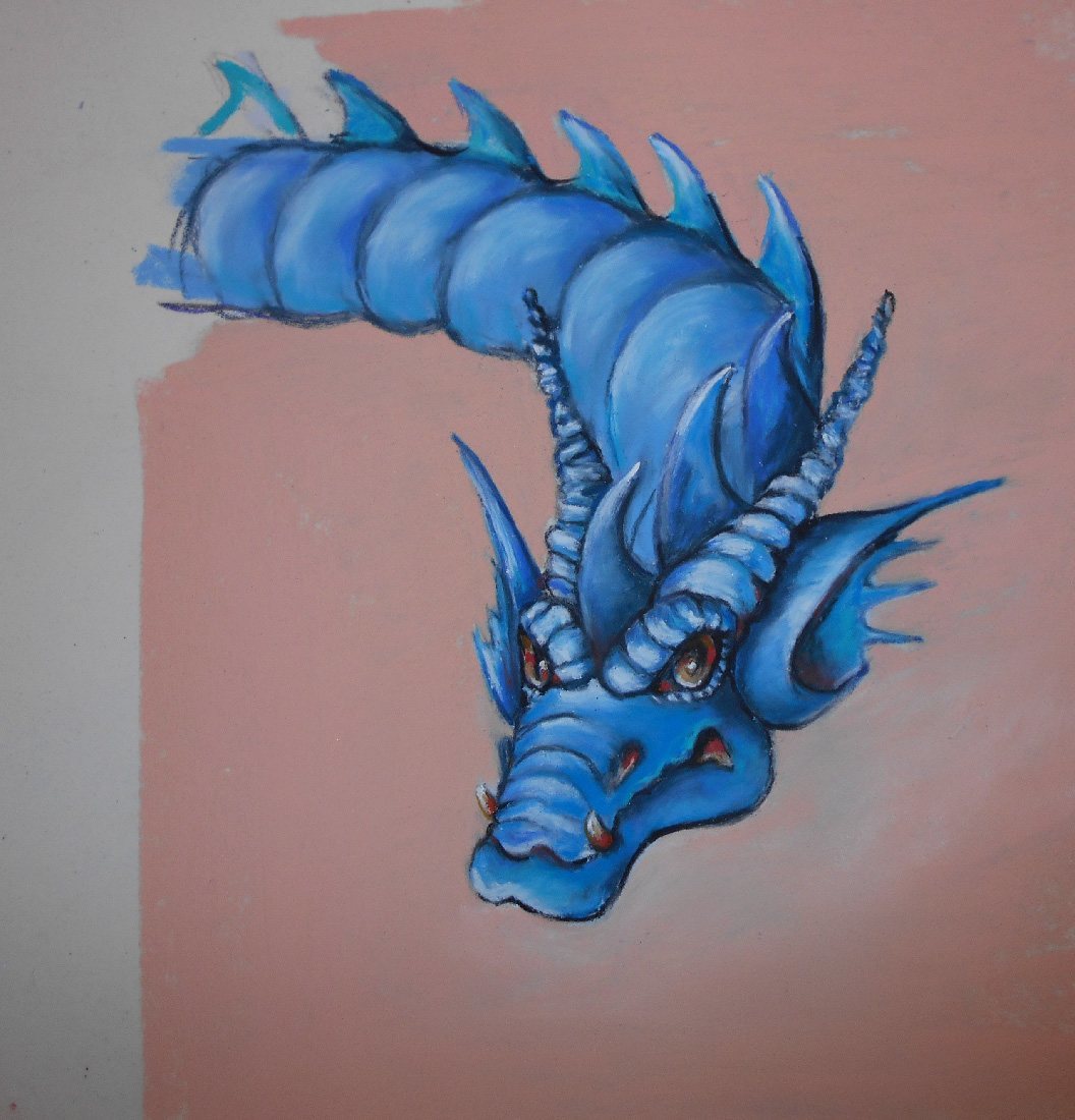 For dragon ‘Haggis’, the Scottish Dragon, I used the same approach as before – blocking the whole shape in using Cerulean Blue (8) AP1168. Having decided upon the direction of the light I added Phthalo Blue (7) AP0647 for the mid tones and French Ultramarine (5) AP0615 on the top of the segments furthest away from the light. I added Cobalt Blue (9) AP1179 for the light areas and White AP001 where the light catches most. I used the same approach on the face, including ears and horns, adding Pitt Pastel Pencil Black 199 inside the ear, and for any other darkest shadows. The dragon’s eyes have been highlighted with Indian Red (5) AP0915 and you can see I put a little of this in his mouth, nostril and at the base of the fangs. Finally I used some Blue Green (5) AP1865 on the spines of his back.
So there you have it – Haggis the Scottish Dragon and examples of a few types of scales.
Next month I’ll be showing you how I paint dew on flowers, leaves, etc.