
 Teresa Rogers likes to experiment with different acrylic colours and enjoys glazing to achieve subtle layers. This is her third illustration for a book for her grandchildren.
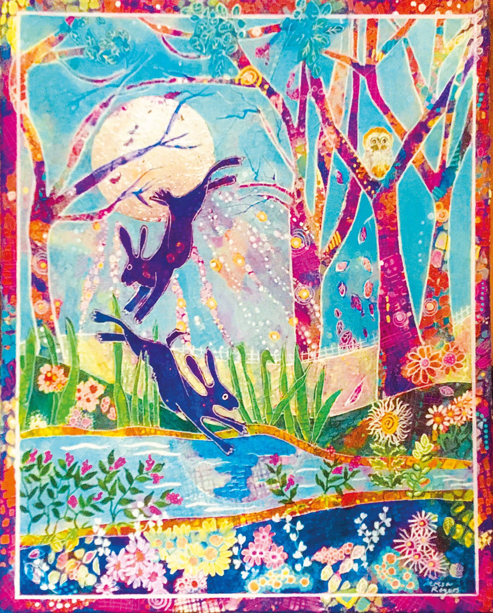
The inspiration for this painting came when I was watching my grandsons, enthralled when their dad was reading them their bedtime story. The three – soon to be four – year-old loves animal stories and especially ones which are richly illustrated with lots of detail and colour. He likes to ask lots of questions using clues from the pictures and, if it is bedtime, he can keep chatting about the story and the characters for ages! His younger brother, at 17 months, likes to point to things he knows in the story and always looks for an owl. This painting is one of a series that I hope will become a book for my grandkids.
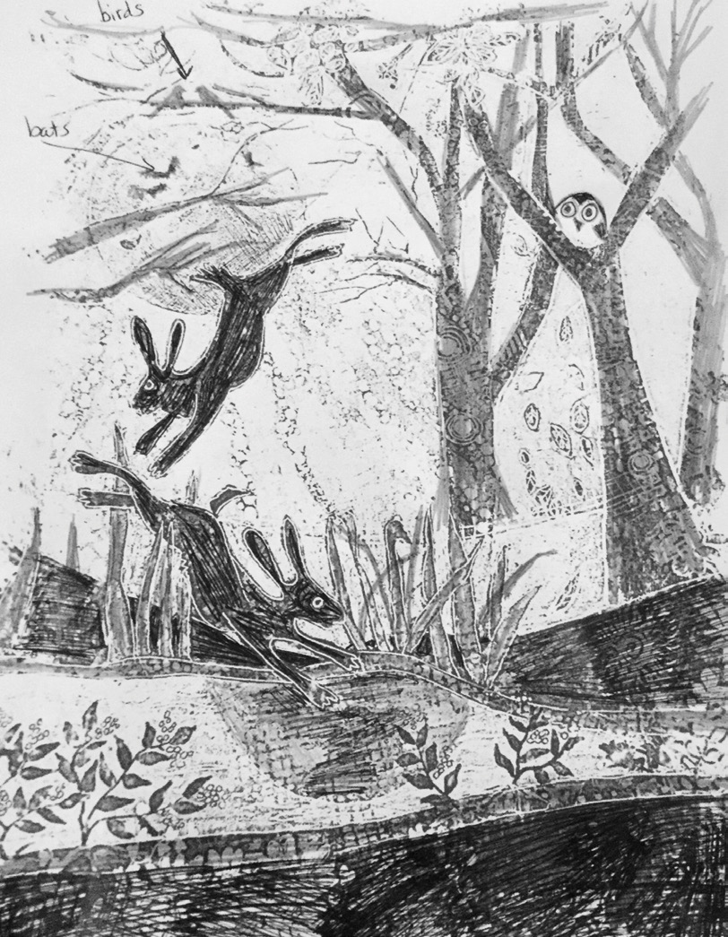 I decided that the main characters in this landscape would be two playful hares and, of course, an owl. I drew a tonal sketch to give an idea of the dark and light areas and pinned it on my easel. As this painting is one of a series, I decided they needed a signature style which would be a link throughout the pages. I have recently experimented with the use of colourful patterns as an underpainting and decided to use this method of working.
 I prepared a Frisk canvas board with gesso. I put blobs of Velvet Purple, Process Magenta, Phthalo Blue and Pistachio acrylic paint on the canvas. Then, using a credit card, I made broad sweeping strokes across the canvas resulting in areas of light and dark. I then used stencils to create patterns in lots of different colours across the whole canvas.
 Next, I drew the outline of a moon and two dancing hares and established the borders and the main compositional lines. I painted the hares with a Velvet Purple and Prussian Blue glaze, and I put Pebeo gilding paste on the circle for the moon before applying silver leaf. I ruled a border around the painting so that some of the patterned underpainting would show. This will be a feature on each page of the book. I patterned using Pebeo stencils and some of my own which I made from the plastic backing of a sketchbook. I even patterned in areas I knew would be painted or glazed over, as I like to leave a hint of the pattern showing through.
 I then painted some areas of the foreground with opaque colours and others with translucent glazes to reveal the river and the lower riverbank, carefully leaving the pattern showing for the plants, grasses and flowers. It is a negative space method I often use.
 I drew in where the trees were going to be and painted in the fields. The next stage was to enhance some lines and patterns with acrylic inks and an SAA mapping pen. Posca Acrylic Markers in bright pastel colours were used to add more patterning details and a white Posca fine tipped acrylic marker added some finer details. This part of the process always brings the painting to life.
Before starting the final stage of the painting I took a long break, looking at it from a distance and referring back to my sketch. I used an opaque Pebeo Studio Acrylic Turquoise mixed with white for the sky to make it stand out against the other strong colours in the painting and painted carefully round the tree trunks and branches including some across the moon. I also painted around some of the pattern to show a few leaves and moonbeams. I painted the allimportant owl in a tree and used thin acrylic glazes to darken or brighten some areas of the painting to enhance the different tones. Finally, in order to bring the trees and the hares forward in the painting they were outlined using the ruling pen and white acrylic ink.