
I’m not really a painter, although I do use watercolour washes in the context of my line drawings: these are not traditional, fully rendered watercolours in that I strive to use minimal colour to focus the viewer’s eye, and to let the drawing speak.
The traditional way with line and wash is to do a pencil drawing first, add watercolour washes to this, and then lay ink lines down last. My preferred process, however – which has its roots in the current urban sketching movement as well as similarities to the comic book illustrators of the 50s and 60s, which is another massive influence – is to start with a line drawing with a fine nibbed pen which almost always contains waterproof ink because of the sequence in which I work: using water soluble ink for the initial line drawing means that subsequent watercolour washes will spread the drawing’s lines, dirtying the watercolour and blurring the ink lines. This can be an attractive technique, but that’s for another post. Once the washes are dry, I’ll then assess what needs to be emphasised or strengthened with more line work, as the washes can overpower the initial ink lines, even though I try to limit the watercolour layers to a single pass, or at the very most, two.
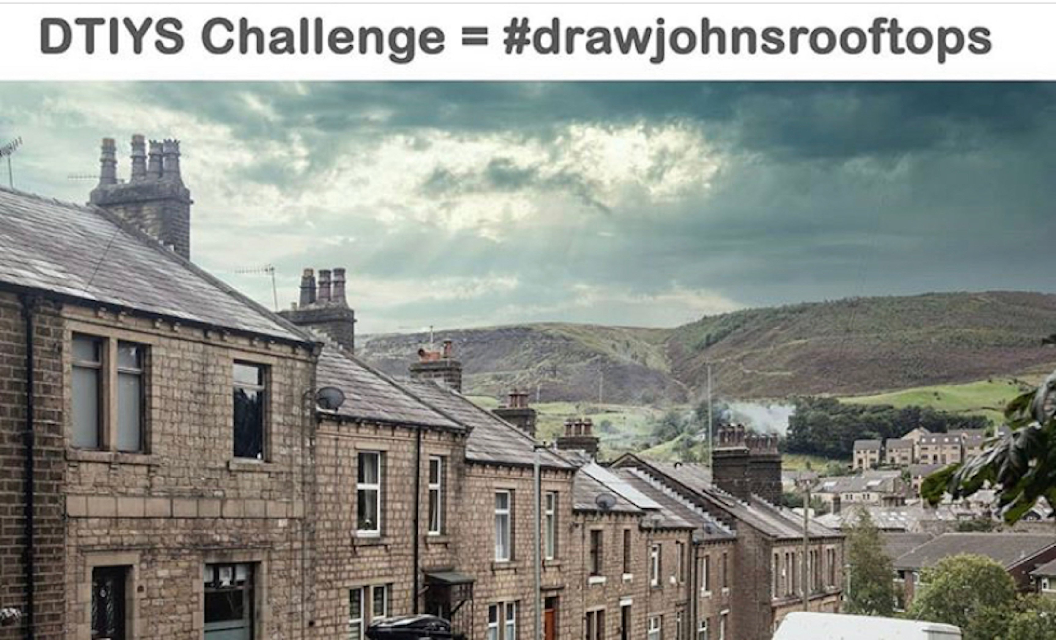
My reference photograph came from one of the many Instagram drawing challenges that sprung up in recent months – a great way to hone your drawing skills.
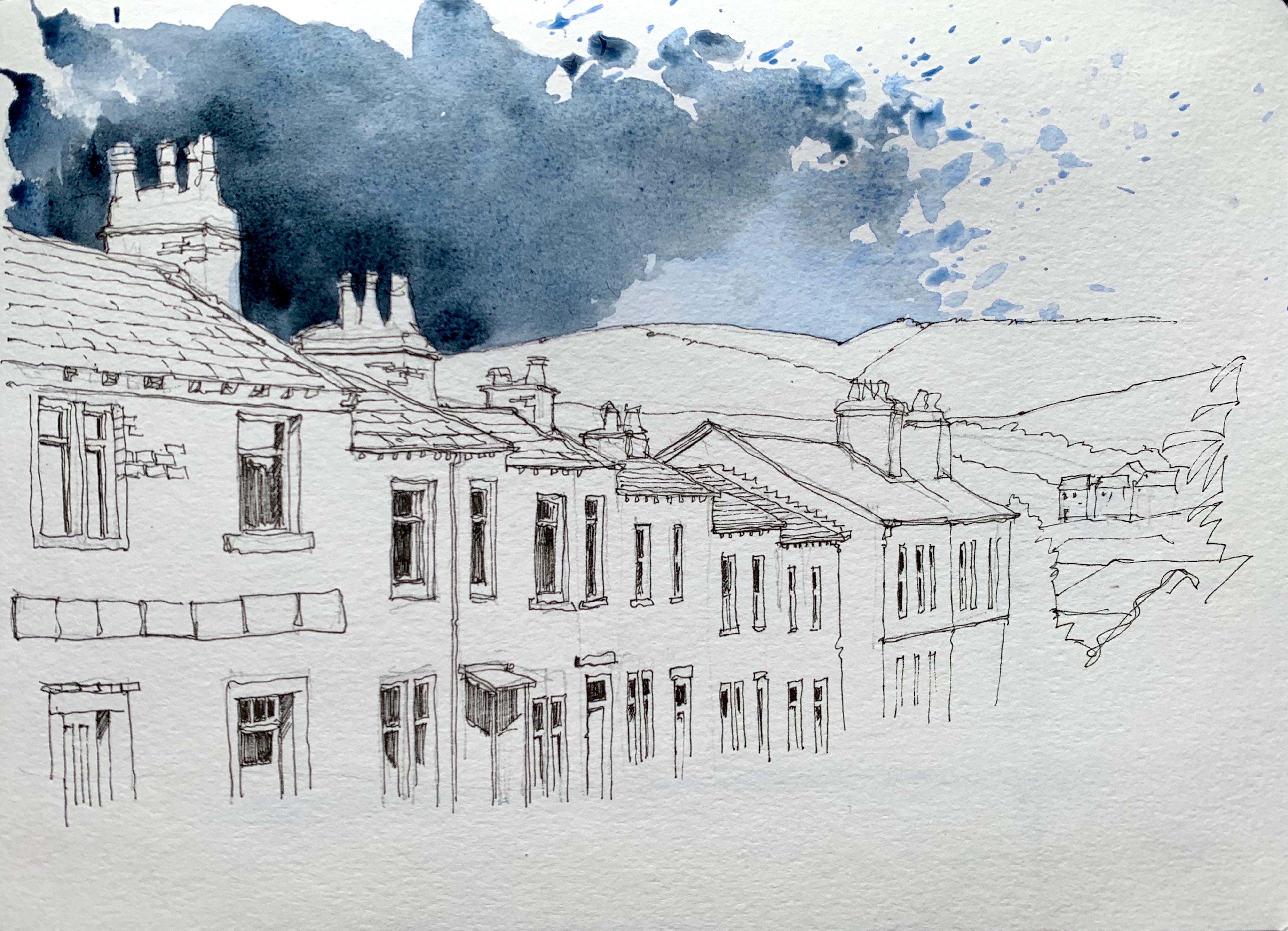
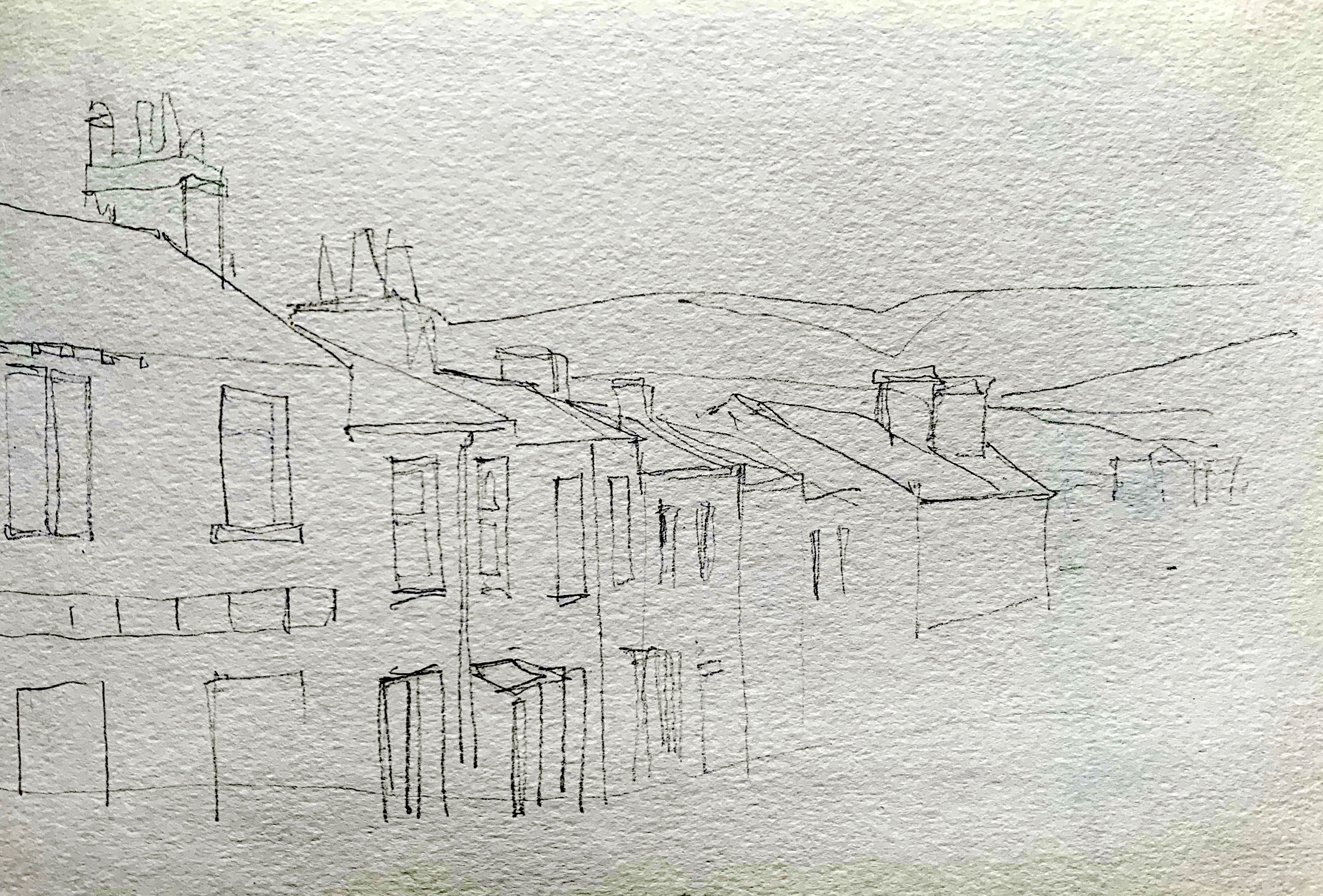 My first line work is done – I’ve used a pencil strictly for the purpose of this demonstration as I normally prefer to dive straight in with the pen – with a 2B pencil, and I’m only looking to get the basic shapes and their relationship to each other in the composition. It can be a mistake to include too much detail in this first drawing: this can lead to you carefully tracing the pencil lines in ink, and has the potential to smother the character of a freely drawn pen line, with no feeling of spontaneity in the finished piece.
 I then used a 0.1 or 0.05 pen over this skeletal framework to establish the basic shapes of the composition in ink, using the pencil shapes as a guide.
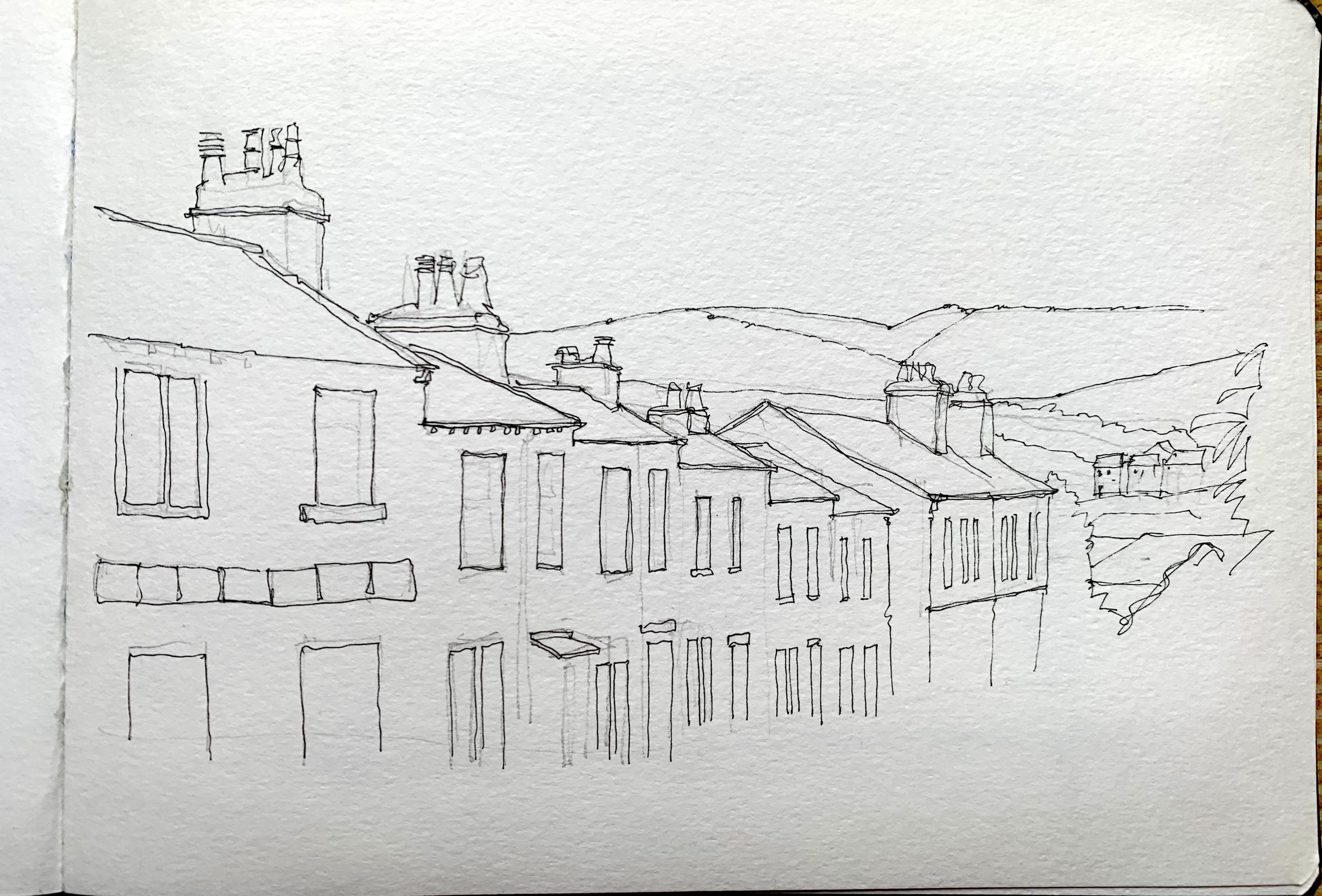
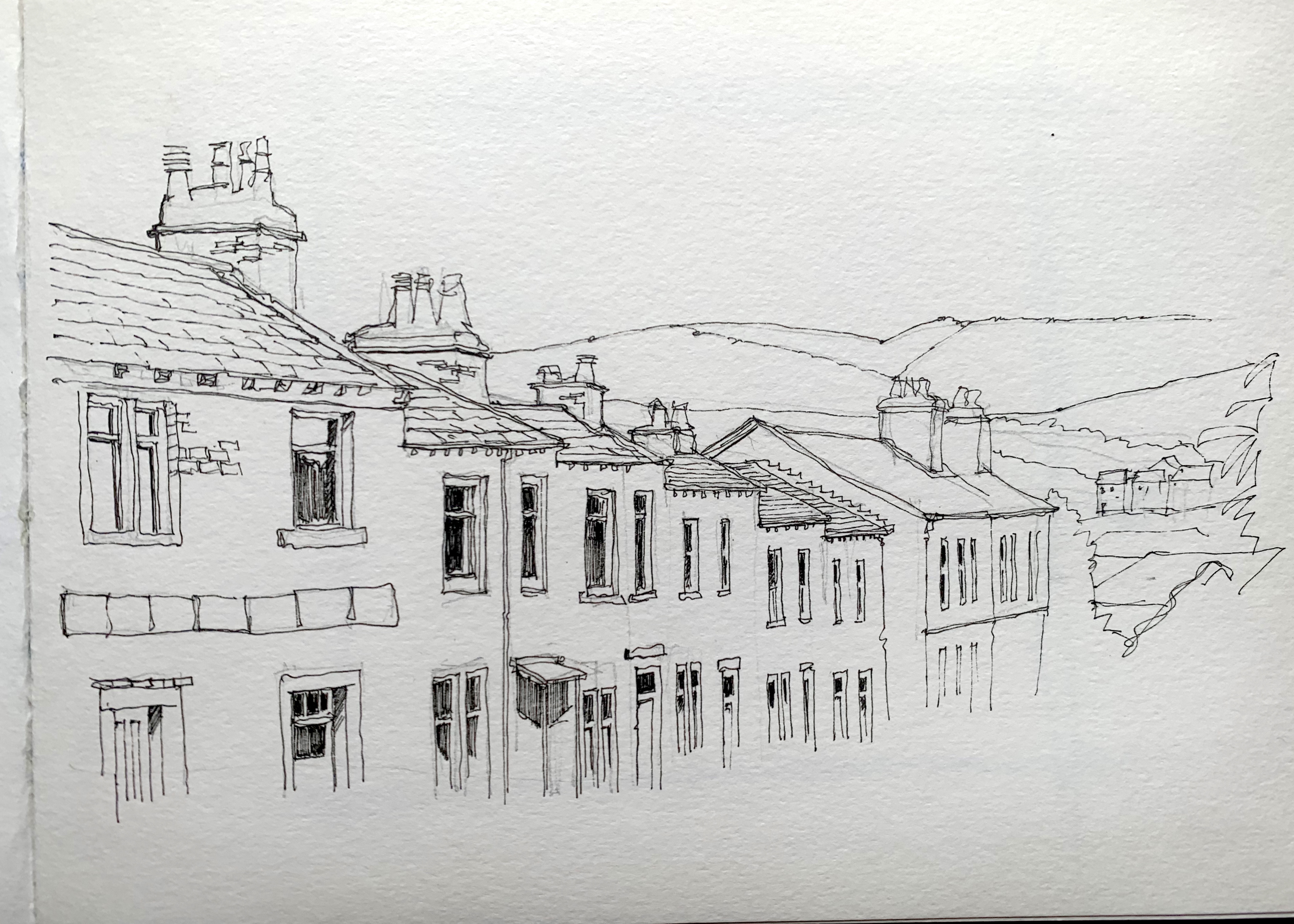 Once I’m happy with this, I used the same pen to add more of the detail in the image, with more emphasis given to the buildings closest and playing down the detail as the row of terraces recedes. For instance, the windows nearest have much more drawn detail- sashes, casement bars, sills – whilst at the end of the terrace, the windows are just as a simple pair of lines, with a mere sliver of shading used to depict the panes.
 Now it’s time for the fun bit – playing with watercolour and pretending I’m a real painter! I started with the sky as I invariably do, and from this point on, I rarely referred to the reference photo for colour as I’m always aiming for a loose interpretation rather than a 100% accurate reproduction of the colours shown.
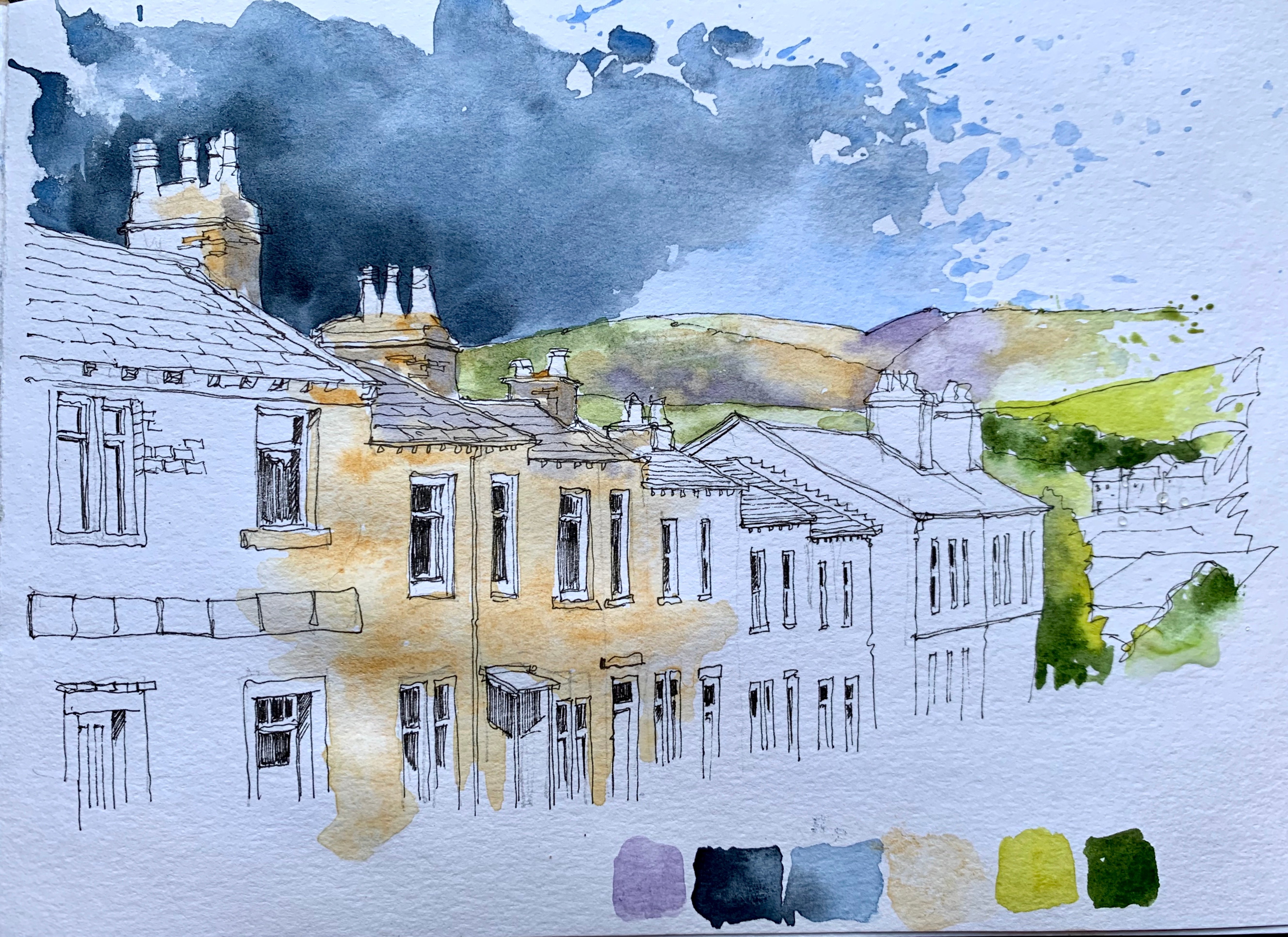 Once the sky wash has dried I laid down a really pale, wet wash of the green (Green Gold and Undersea Green) and Violet of the far hills, using a wet- in – wet technique to introduce some other natural shades: Quinacridone Gold and Yellow Ochre to blend into the green of the hills.
I also decided to bring the greenery down behind the end of the terrace to avoid the colour on the hills looking like a random stripe with no connection to the foreground. I then turned my attention to the main focus of the drawing- I chose to feature the second and third houses along- and add a wet wash of Yellow Ochre as the basis for the stonework, dropping in almost neat pigment and allowing it to do what it will rather than try to tease it into place. I also used this colour as the background for the roofs and chimney stacks, adding some Violet and Payne’s Grey to suggest the darker tones of the stonework.
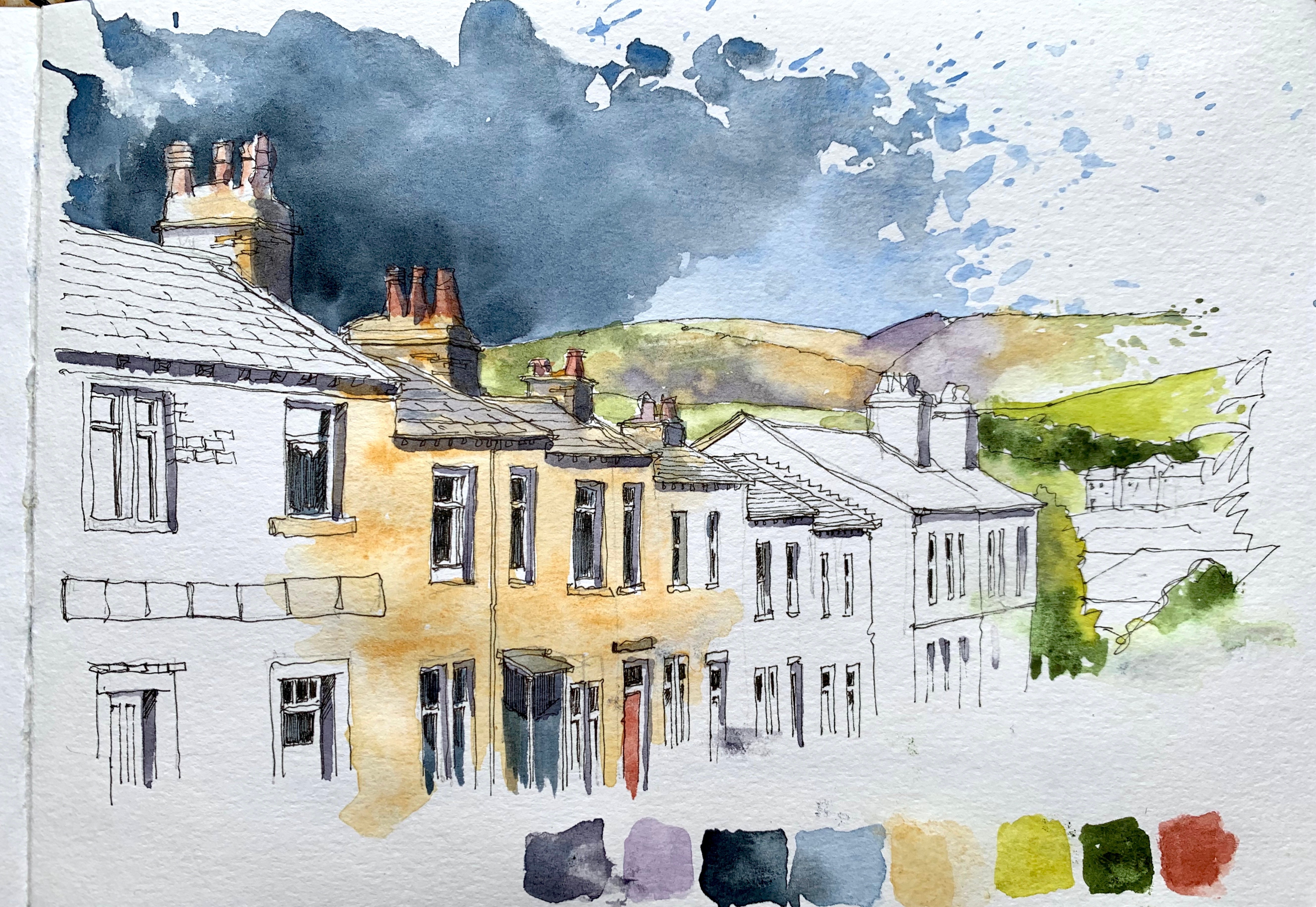 Now, it’s time for the defining bits-the part I think makes all the difference to the drawing-shadows. For these I mixed a base colour of Payne’s Grey, a little Cobalt Blue with a touch of Cadmium Red, and applied it to the areas where I’d decided to – using artistic licence- working on a fictional light direction from the top left (if you refer to the reference photograph, you’ll see there are no clearly discernible shadows, or direction of light).
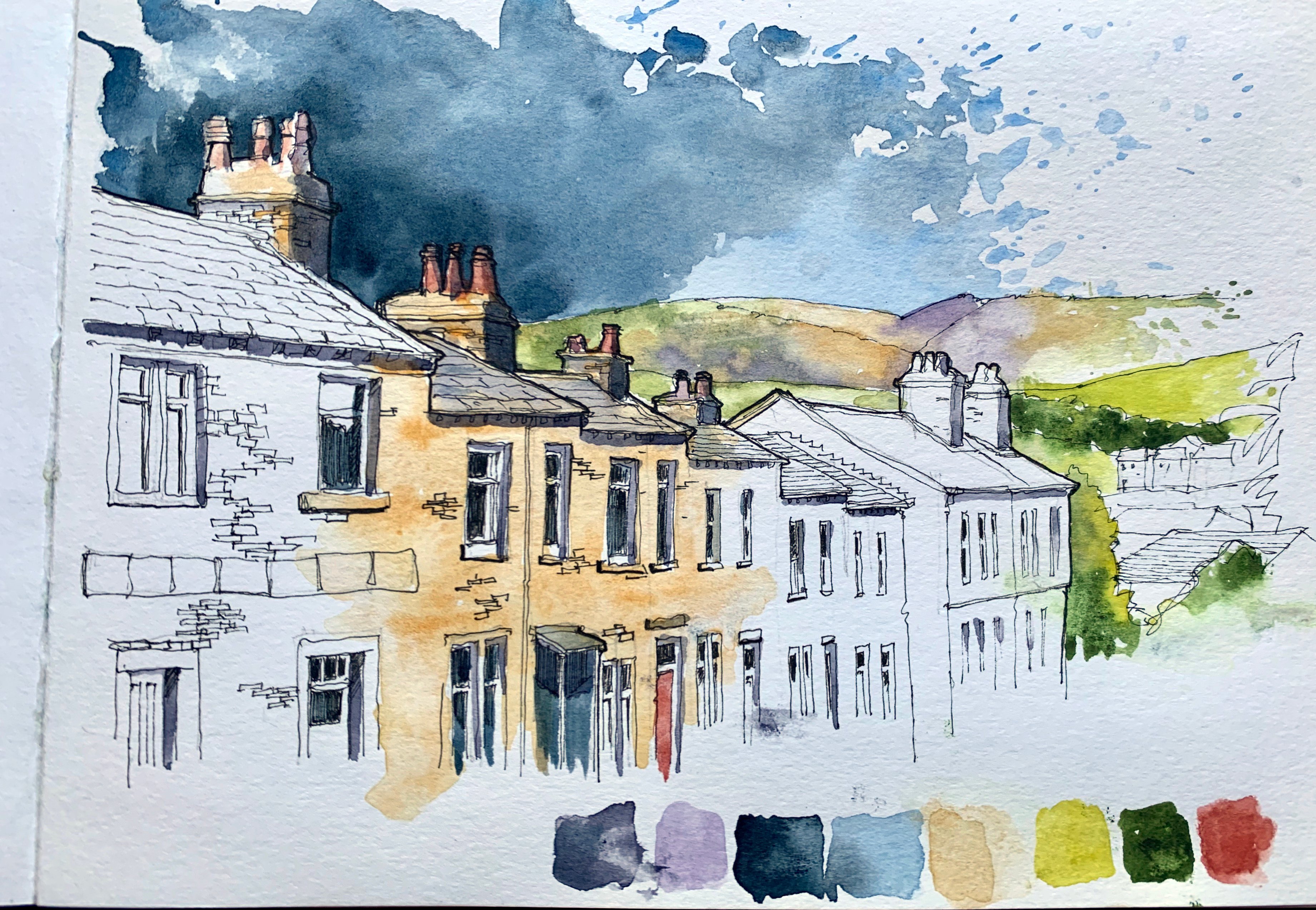 When all of the washes are completely dry, I then used my pen to add some emphasis lines in order to separate the row of terraces from the landscape in the background: in architectural terms, these are also known as profile lines. I was careful not to over-egg these, as too heavy a line will result in the finished drawing looking unbalanced and cartoon-like.
At this stage I really had to resist the very strong urge to add more line detail: it’s a feeling we all know all too well-the urge to fiddle and add ink and paint until we succeed in ruining the drawing. The old saying is true – you never know when it’s finished, but you can always tell when you’ve done too much.
In terms of how long it took to draw and paint this demo piece, I would normally expect to spend no longer than 30-45 minutes on a drawing like this – any longer and there’s a real danger of over-working. My aim is always to keep the loose nature of a sketch rather than a highly-finished technical drawing, and to this end I tend to spend more time looking at the reference than my drawing, trusting my eye/brain coordination to get lines in more or less the right places.
