
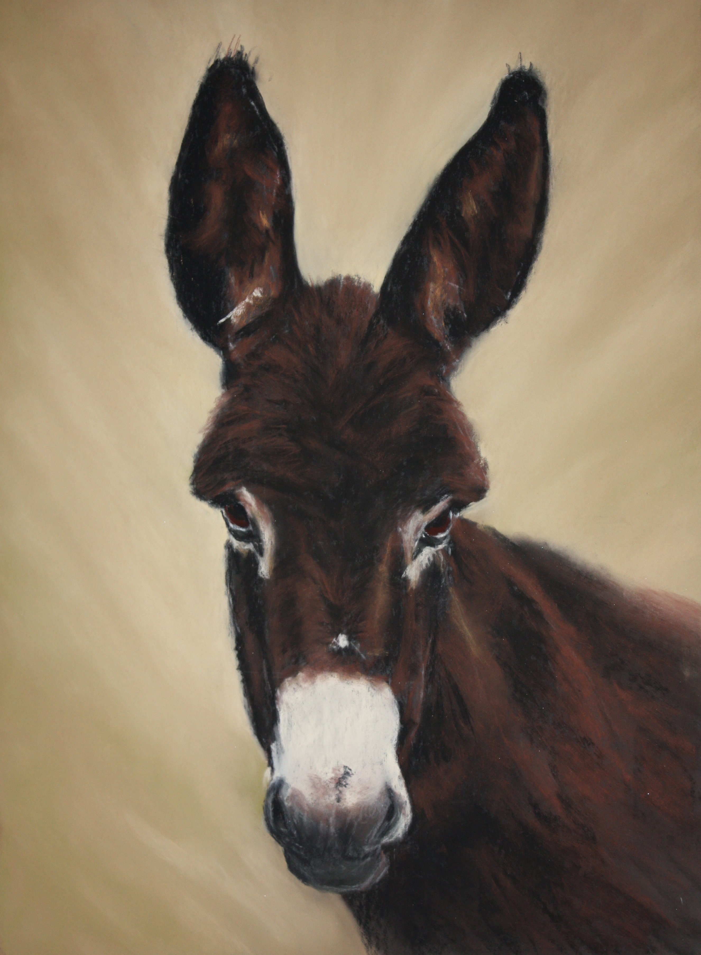
 Size of image is 300 x 420 mm in size — this will fit an SAA mount and frame .
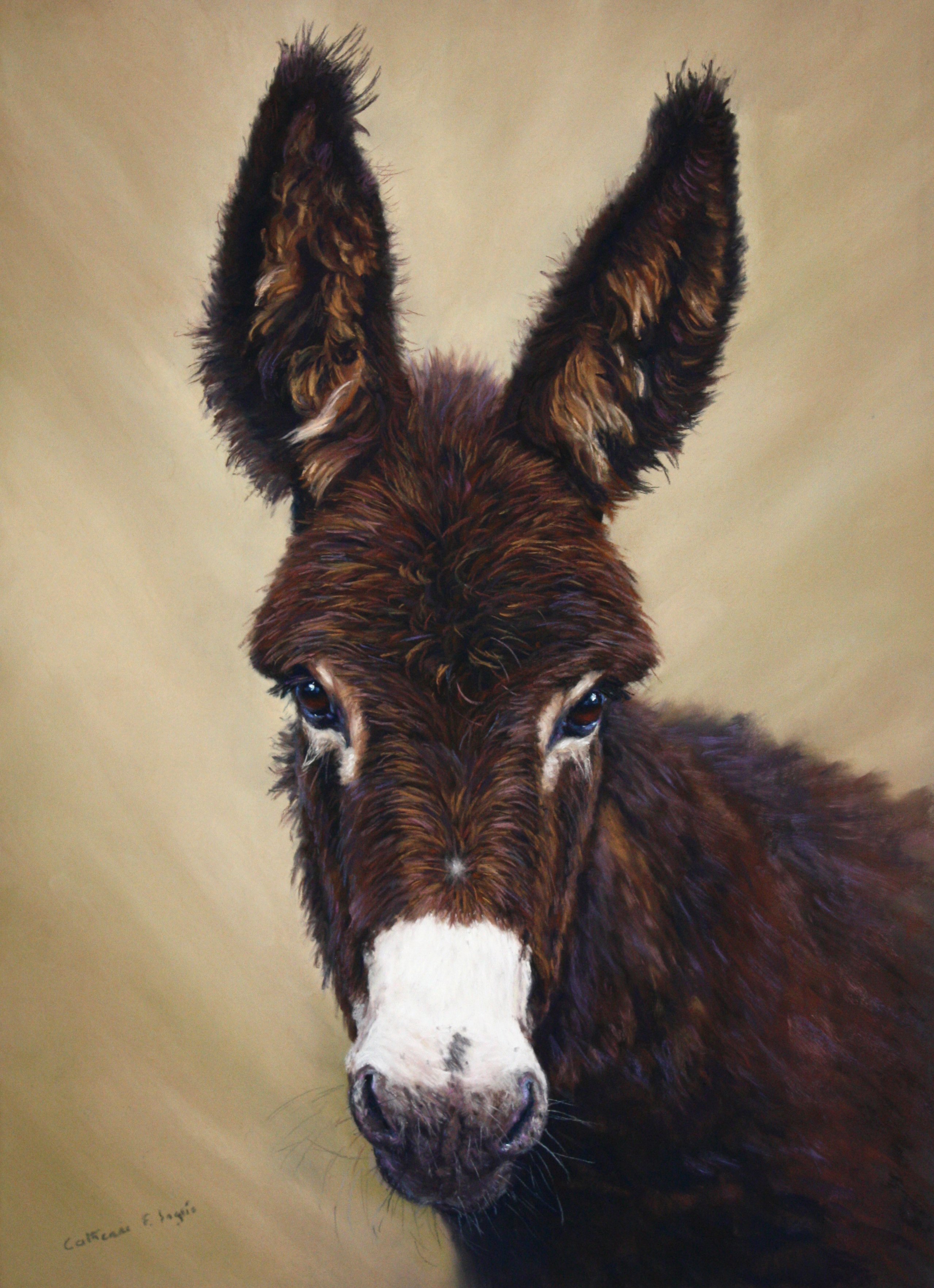
First, I sketch out The Christmas Donkey onto a sanded paper as this will accept many layers of pastel. For this initial drawing I use a white pastel pencil, do not use graphite as this will repel future application of pastel. You can see the construction lines I have marked in to help me get the features in relationship with one another.
Using a hard black pastel, the side edge for good coverage, working directionally the way fur grows, I ‘block in’ the underpainting. Avoiding overloading the paper with pastel and gently pushing the pastel into the paper with fingers.
 I add a little more black to the darker/shadow areas of the fur and then lightly apply Conte Van Dyke brown 080, this is applied to the mid tone areas too. For the lightest fur on the muzzle and around the eyes I used Conte 061 Portrait Brown with Conte 018 Nat. Sienna for the little bits of lighter browns. A Conte 072 Grey Blue is applied for the shadowy area of the muzzle. At this stage you can see only a tonal underpainting ready for future layers of soft pastel. There is no detail at this stage.
 I like to work the background at this early stage for two reasons, the fur needs to extend outwards into the background and I want a good contrast for the donkey. I have chosen a harmonious background and using a selection of Unison Brown Earth pastels which are soft and buttery to apply. I gently blend them in together with fingers and the heel of my hand ( heel gives good blending). I also use a little Unison yellow green as I have found in the past works well.
I use a Sennelier 002 Black Brown, a soft pastel, to the lower iris making sure I keep a shadow under the lid and then I work a little more on the fur and muzzle using pastel colours used previously for these areas.
 I have applied Sennelier 479 Purple Grey, this is a favourite pastel for my animal work. I apply this over the darkest areas where black was previously used for the underpainting.
Using a selection of Unison Brown Earths for the dark & mid-tones I work directionally with the end of my pastel slightly tilted to form the fur. For some areas of longer fur, in the ear and on the body, I use the side edge of the pastel. Mark making is important as is a light touch.
Using Conte Portrait Brown 061 I work around the eyes a little more and add a touch of Unison BE 16 a warm, mid tone brown. Using Conte again to reshape the muzzle a little and apply Unison BE 5 a neutral, mid brown for the darker areas. The donkey will appear quite dark at this stage and patience is required to refrain from using lighter pastels as well as detail to fur.
 Sennelier 463 is a very dark, intense blue. It is amazing over black to give the richest, most recessive of shadows. I select this for the shadow area of the eye underneath the lid as well as the black of the pupil to give good depth.
I try to work over the painting as a whole for most of the time so I apply a little in the ears and fur, especially on the neck under the muzzle to give separation of the neck area.
For the catchlight in the eye I use a touch of Unison Grey 27 and Unison Red Earth 11 a warm brown to suggest the light reflection in the bottom of the iris.
I had previously used the purple Sennelier 479 on the black skin below the eye so to suggest light and form I apply a light touch of Conte Cobalt Blue 069, Deep Ultramarine 046 and Lilac 026. These I used to work the tiny reflective light on the cornea of the Donkey’s right eye. I use a touch of blue to each side of the catchlight too.
A dark Conte will give fine lines for the eyelashes.
For the muzzle I choose Unison BE 22 for the mid tones gently pushing the pastel in. For the darker areas and creases on the muzzle I use Sennelier 479.I gently soften a little with Conte 054 and my fingers. I make small accents on the nostrils with blue & lilac Contes. I use these with a little light scumbling in other areas of the muzzle. Sennelier 463 is used for the dark of the nostril.
 For the mid tones & lights in the ears I use Unison Brown Earths, the lighter Brown Earths 7, 8, 9 and 13 are good for this, softly blending where the fur emerges from the ear but not blending the highlights, these need to be left fresh. The harder Conte pastel I find useful for the outer edges of the ears.
Working from the mid browns to lighter browns I work the head fur, taking care to leave the darks showing through as this makes the fur appear 3D. I avoid getting the highlights too light.
I use a mixture of brown, lilac and blue Conte for detail.
These colours I also use on the body fur by lightly applying the pastel on its side.
When using a sanded paper it will have enough tooth to accept these hard pastels at this stage. By leaving the donkey’s shoulder and body slightly out of focus the viewer will be directed to the head.
The muzzle I have lightened with Grey 27. I then found I needed to adjust the light around the nose and mouth as they now appear relatively dark.
I have added a little more accents of Conte lilac & blue to the nostrils. The whiskers are last and for these I use a Conte 42 Sepia and a 061 Portrait Brown
