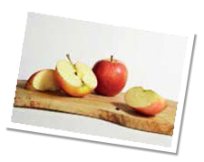
 Cindy Wider uses the new Derwent Procolour to capture the subtle colours of these tempting fruits. I love creating textures from objects found in nature and drawing them in a still life setting can be easy and rewarding. I took many photographs of this composition before settling on this final shot.
I can achieve fabulous results quite effortlessly with the Derwent Procolour pencils. The fine particles settle naturally into the texture of the paper and unlike many other brands, there is minimal chipping with very little dusting needed. As a result, my paper stays cleaner, the tip doesn’t need sharpening as regularly and I can cover larger areas without having to stop and start too often. Their strong core enables me to create a sharp tip, vital for fine lines and details like fur, face parts and, in this case, wood. Their colour is vibrant and they burnish well. They also blend with just a paper stump making them ideal for covering larger areas such as skies and landscapes.
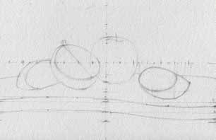 Sketch your initial drawing straight onto the page using an HB pencil. I used the Construction Drawing method (stage 3 of the Practice Makes Progress challenge) by sketching the basic shapes with a simple vertical and horizontal guideline then completed the outline drawing by eye.
 Before adding colour, experiment on scrap paper to see how you can create the textures you want. Beginning with the skin of the apples, use 06 for the yellow hues and 15 for the first layer of the red hues.
 Create deeper reddish areas throughout the middle sections of the skin (or along the darkest edges) using 66 where the apples are in shadow. As the reddish hues travel into the yellow hues, gradually apply lighter reds and oranges such as colours 12 and 10. Work with colour and texture at the same time. Notice that there are some darker red markings that travel down the full length of the apples. Draw in these markings quite carefully as curving wobbly lines towards the left and the right sides, following the shape of the apple. These markings gradually become lighter, finer and less prominent as they move into the yellow areas. Use the same colours in varying amounts for all the skins. Refer to the photo for major decisions such as the shape or main colour of an area, and use expressive strokes to make the texture up based on what you have discovered about the skin. Begin with 06 for the yellow hue areas and 14 for the red areas each time. Once you’ve built up the textured markings on the skins, burnish the final layers with paler colours such as 19 (for reflected light areas) 45 and 02 to soften the markings and send colours and details back into the distance. Use a battery operated eraser to remove the teeny markings on the main apple then add some orange and red hues into the markings to soften them. In the stem areas use greens, 47, 45, 52 and 01 as needed. For darker hues use browns, blues and reds beginning on a base of 53. For darker shadow areas around the bases of the apples and stem areas use 58 as a base then 31, 15 and 66, slowly building up layers of blues and reds creating deep rich purple hues. Gradually ease the colours out around the edges of shadows with lighter warm colours; 19 and 10 with a little bit of 07. Finish off the shadows by carefully blending with a paper stump.
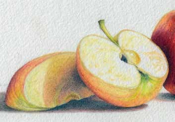 For the fleshy inner part of the apple segments use the paler, cooler hues beginning with 02 in a scribbly outward curving motion, then apply 05 for a bit of depth, some 72, 16, 45 and 38 to burnish with, sending various areas of the apple back into the distance. Cool colours to recede, warm colours to bring areas forwards.
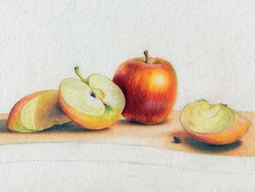 To begin the texture of the top of the chopping board, lay down a large area with 07 then some slightly darker areas with 10 and use 72 to maintain highlighted areas. Once you are happy with that layer, blend with a stump using long horizontal direction strokes.
 Add the details into that area, after you have studied the markings in the wood. Use your brown hues 56 and 65, and shade some areas with 61 to create some slightly wider lines and shade between the thinner darker lines. Make the markings wobble a little and taper thinner and thicker in places. Do your best to keep your markings in a general horizontal direction (or ellipse–shaped curved markings) on the top of the board. Finish off with the front edge of the board taking more careful notice of the patterns in this area. Use the same colours as you used on the top of the board and add some warmer hues such as 10 and 64 to bring this area forward. Use darker colours 58, 57 and 65 for the shadow beneath the board. Finally use your paler hues to burnish the areas together: 02, 16 and 72.