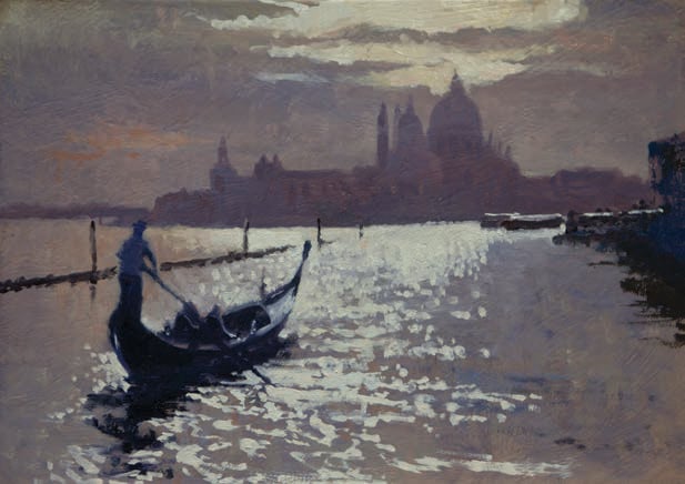
The term ‘contre-jour’ means ‘into the light’, so when we paint contre-jour, we are facing the sun or light source. This reduces the range of colours that we see but does not however mean that we will paint a dull grey painting as a result. On the contrary, many colours will be available but will be muted and the contrasts more often than not will be intense.
I prepared several puddles of colour in advance: Ultramarine Blue, Cobalt Blue and various amounts of Alizarin Crimson, Cadmium Red Light and Naples Yellow. I mixed each value variant off to one side of another enabling me to dip into each as needed.
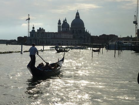 This image is from a recent plein air painting trip to the ancient city of Venice. The day was ending but not quite lost to the twilight. The intense light on the water was an incredible sight which begged to be painted! The methods I have used in this painting are suitable for oils,
water mixable oils and acrylics so I hope you enjoy the demonstration and are inspired to have a go.
 I applied three coats of Gesso to the MDF panel, lightly sanded between each. I then applied a further mid tone coat of a warm violet with a hint of Naples Yellow. This would allow me to draw in paint directly using a darker violet/purple mix. It would also allow me to add lighter values and see their impact immediately. Using just a touch of Drying Linseed Oil with the darker mix, I drew my image.
 Using the No 6 flat, I scumbled in various values of a blueish Cobalt Violet forming the cloudbank, leaving the top areas for later highlights. I added more Naples Yellow and some Zinc White to lighten as I descended to the horizon behind the buildings. Lastly I made some random marks in the water to add harmony to the image later.
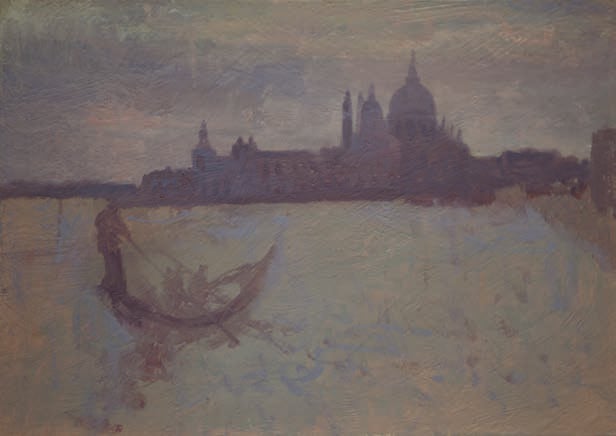 Next I added an indication of lighter clouds at the top using Naples Yellow. Using the brushes without further additions of drying oil, I added a small amount of Cadmium Orange to my mix to warm up the clouds on the lower left and around the buildings. I also repeated this, randomly placing these very warm values in the water, especially on the left. I also added warmer values to my drawing of the Della Salute, hinting at its form with differing tones.
 After looking at the foreground I decided to add some violets and suggested darker forms in the water, plus some warmer values here and there. I then further established the main focal area of the gondola, using darker values of Ultramarine combined with Burnt Sienna to form the darks (blacks). As these craft are highly polished, I paid particular attention to areas that reflect water and bright highlights. I altered the position of the gondolier from my first drawing as I felt he needed to lean more into his paddle.
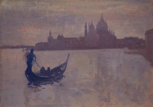
 Now the fun can start. I mixed up lots of Titanium White and in separate puddles added mere hints of Cadmium Lemon and Cadmium Orange and one puddle mixed with both (just subtle hints, no more). That done, I used some darks to indicate the buildings on the far right, where San Marco Piazzetta begins. Next I added the gondola reflection along with the floating pontoon that gives shelter to the gondolas and the square. With the ‘puddles of light’ I plunged headlong into the sky and rendered the highlights to form the clouds. These were bright, though not as bright as the water. The water was at its brightest on the horizon where the contrast between its light warm value and the dark cool value of the Della Salute met. I added two vaporetto (water buses) in the top right to seal off the Grand Canal at this point.
 From this image you can see the difference between the clouds and water, this variation is important. I built up the highlights in the water and as it descended my marks became larger and more considered. I added various highlights all over the gondola and vaporettos using some pale mauves – some of the older mixes with white added.
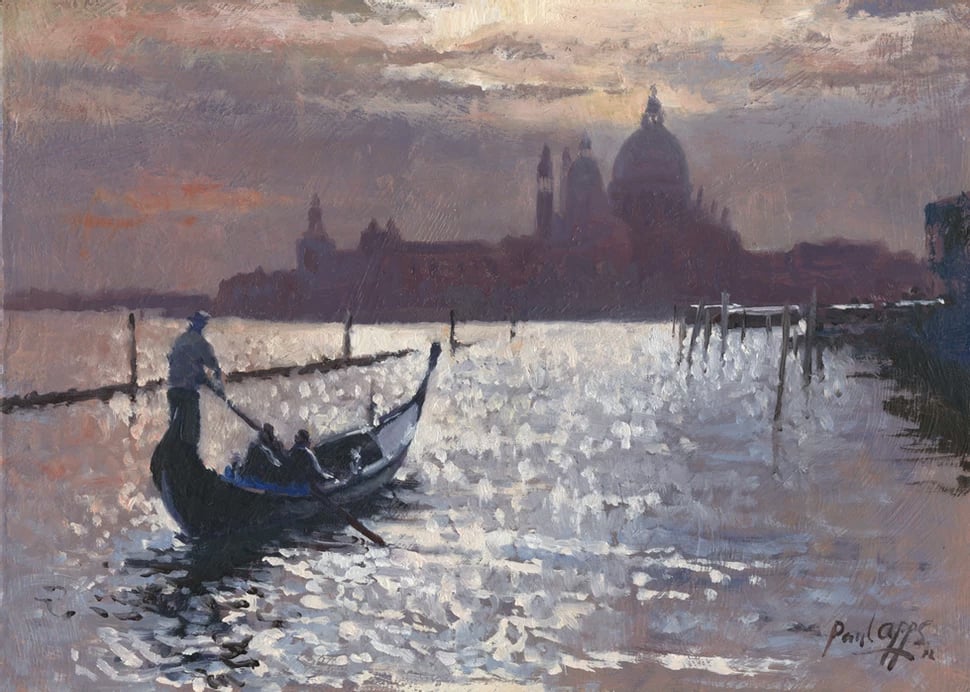 Finally I reduced the contrast on the water as it went up through the centre of the painting, by using Cobalt Blue and a touch of Alizarin with a lot of Titanium White. This created a greater sense of intense light. I added more reflections around and to the left of the gondolier increasing the warm values with Cadmium Orange mixes at the same time. I added the thin dark mooring posts with a No 2 round. I saved special punctuation marks of my brightest highlights for the gondola. If you look carefully here and there I have deliberately destroyed an outline of something with a highlight value. To me this gives rise to the way intense light reacts with silhouetted forms when we view them.
To finish, I blended the sky and spread its effect outwards with ever decreasing values of Naples Yellow and Orange mixes before giving a final touch of a little muted colour to the vest of the gondolier.