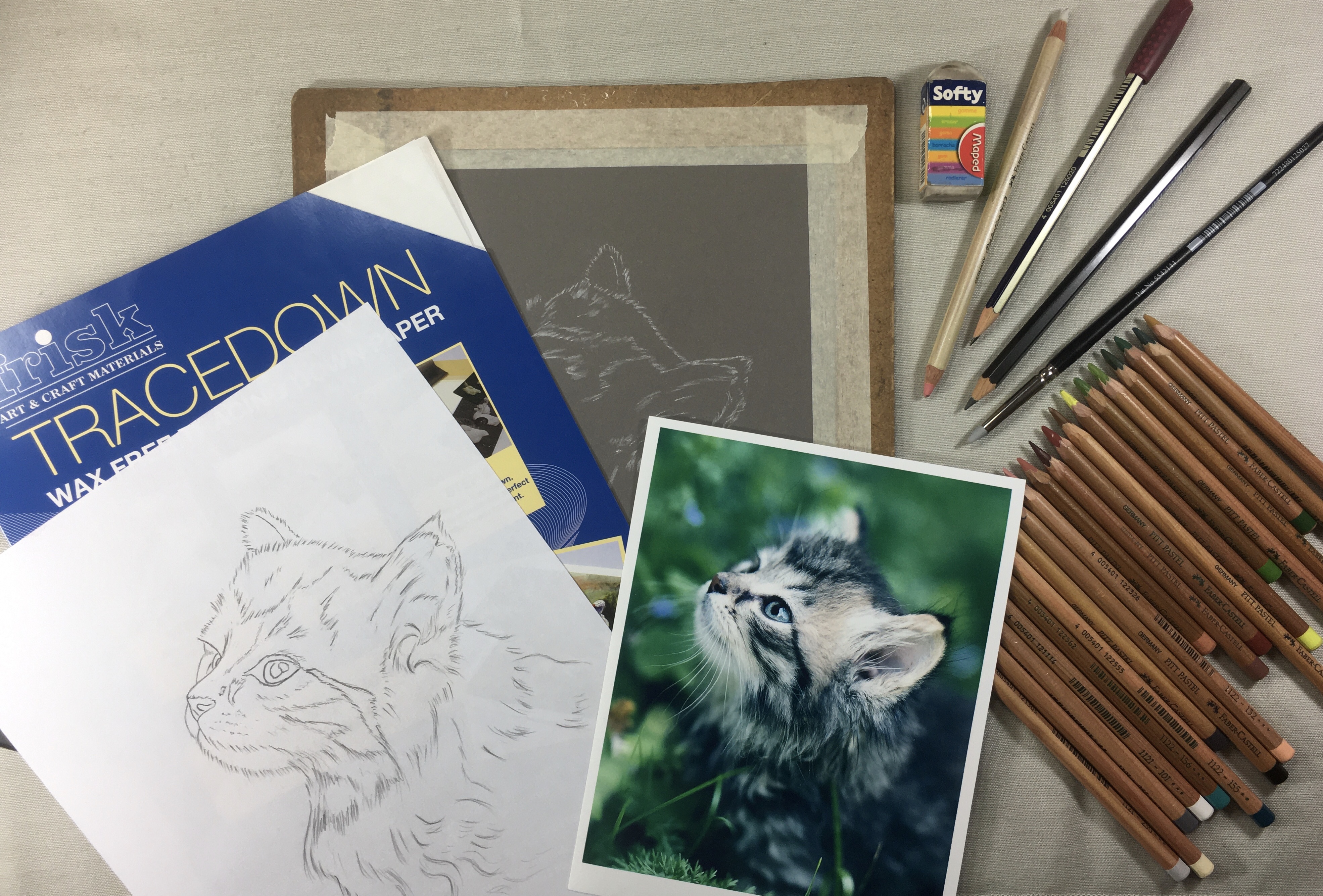
 Once I decide on the pastel painting I want to do, I then have to choose a suitable paper and colour tone which will suit the subject best. For this cat image I thought that the dark grey Pastelmat Paper would work well. I have used this paper many times before with excellent results.
Before any pastel work can be done, the image has to be drawn out either directly on the Pastelmat paper using a white or light grey pastel pencil or, in this case, produce a line drawing on thin cartridge paper first.
This is a good idea as any errors can be corrected or erased without spoiling the Pastelmat surface. My preferred method of producing a line drawing is using the grid system. This ensures that the image is accurate which is important when drawing animal images.
With the line drawing complete I am now ready to transfer my drawing to the Pastelmat paper by means of White Tracedown. This is an excellent product that can easily be erased if need be. I taped the top edge of the line drawing on the top of the Pastelmat paper forming a flat, this enabled me to view the transfer intermittently as I went along. I slip the Tracedown between the line drawing and the pastel paper (carbon side down) then use a sharp HB graphite pencil to go over the line drawing, thus transferring the white carbon image onto the dark grey Pastelmat paper.
Once the transfer is complete, I remove the White Tracedown and the line drawing. Although it is not really necessary, I like to redraw the image using a sharpened light grey pastel pencil; adding a little more detail as required. Once I am satisfied that my drawing is complete, I am now ready to start using my pastel pencils.
 Pencils Used in this stage:
I prefer to work from top to bottom to ensure that I don’t smudge the picture while I work. I do use a sheet of cartridge paper to protect the pastel paper surface and this will also protect the work should I need to revisit any area to adjust or add to.
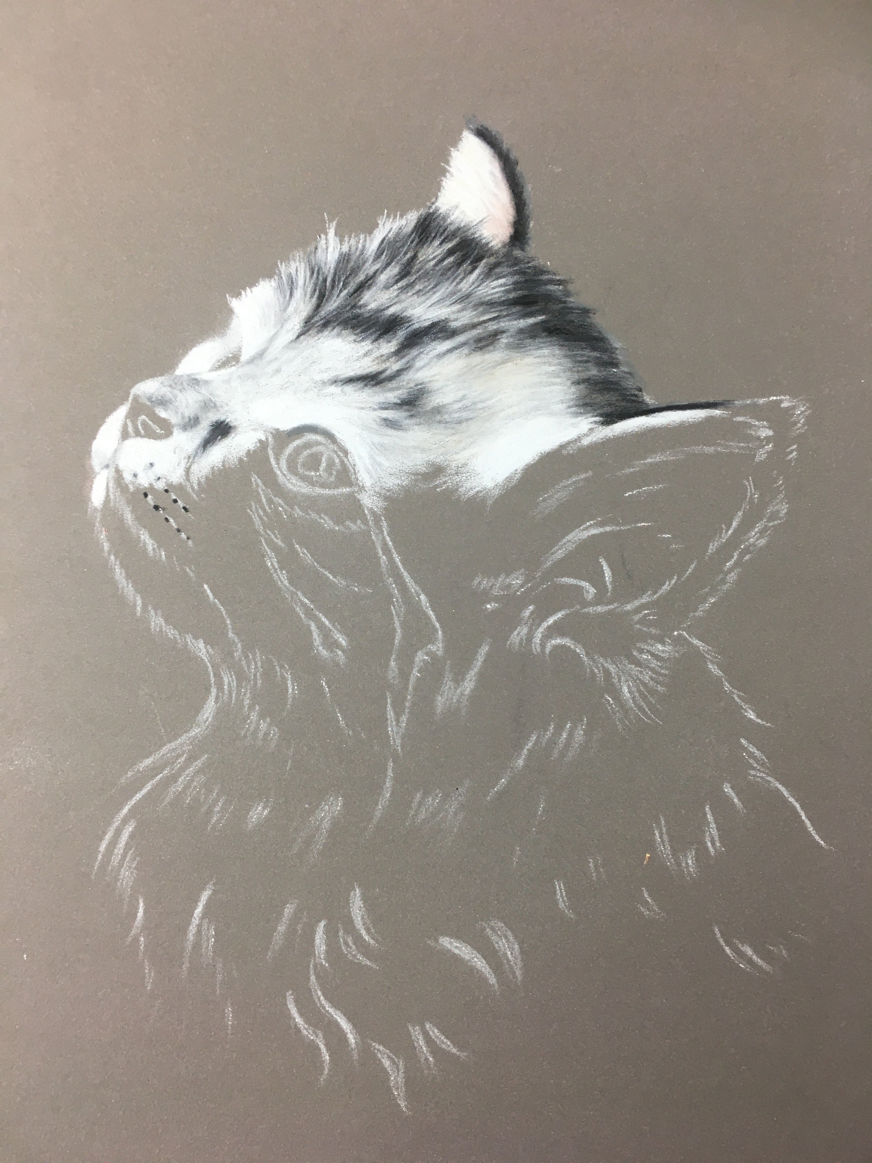
I start by drawing the ear using the 101 white pastel pencil working my strokes in the direction I see the fur lying in. This action gives added realism to the overall effect of the image. I added a little 230 light grey on top of the white then just a hint of 233 mid grey to add depth to the white fur. I also added just a hint of 103 ivory and 132 pink to the white fur too as this adds colour.
I applied the 233 as a base to the dark area on the outside edge of the ear for the darker tones. This colour is almost identical to the colour of the paper and therefore difficult to see, however it is still necessary to cushion the rawness of the two dark tones that are to follow. I applied 181 Payne’s Grey on top of the 233 grey base followed by the Black 199 which went on top of the 181.
These colour sequences were repeated over the whole top of the head as shown in the picture with the white areas having 230, 233, 103 and a weaker application of 181 to create the lighter tones and 233, 181 and the 199 for the very dark markings. Remember at all times I worked my pencil strokes in the direction I saw the fur lying in.
Additional Pencils added:
With the fur in place on most of the head it was time to place in the eyes and nose. This is certainly the most exciting and rewarding part of an animal picture and as such has to be accurately depicted with plenty of time allocated to the areas. This means constantly referring to the reference picture each step of the way. I say this, but there is still room for artistic licence to be applied if desired. For instance, this could be a slight change of colour, larger pupils, larger or smaller light or white highlights etc.
Starting with the main eye I applied a strong 101 white to the highlight first, then a slightly weaker application for the remaining white area and 233 into the pupil and eye surround. Into the weaker white application I applied 156 Cobalt Green (avoiding the white highlights) then followed this with 155 Helio Turquoise. I applied 181 followed by 199 on top of the grey in the pupil and eye surround taking great care not to stray onto the lighter sections already completed. There is always a little shadow at the top of the eyes and this can be carefully placed in with 155 and 181.
I applied 230 to the lighter part of the nose followed by 132 pink and 233 to the darker sections of the tip of the nose and nostrils. I then applied 189 on top of the 132 pink followed by 169 Caput Mortuum. I also used a little 181 to strengthen the tone where required. I applied 181 on top of the 233 mid grey on the nostrils and dark section of the nose followed by a touch of 199 Black to deepen the tone further still. Using a sharp 181 I carefully outlined the surround of the nose and also used a lighter application of 181 to add detail and depth to the lighter white surround.
 This stage sees the completion of the head and main ear detail as well as introducing a new colour – 182 Brown Ochre. This was added after all the other colours had been applied. This can be seen on the white fur between the main eye and the ear. This served to add an attractive tone to the cat that would otherwise be a large mainly white area.
The main ear was the focus at this stage and like the eyes and the nose, demanded careful attention. I started by applying the white hair on the ear surround using 101 then 103 and 230 to add colour and depth. Further depth was achieved by applying 233, adding shadows. For the inside of the ear I first applied 101 followed by 103, 230 and 132. These colours were blended using the colour shaper then all these colours were applied again to form a smooth solid base tone. Into this was added 132 and 181 to achieve the strong dark tone. Once this was completed I used a sharp 101 to add the strong hairs as seen in the picture.
It was at this stage I had to make a decision how to finish the cat at the bottom section as I had never intended to complete the rest of the body. Hence the tentative random white strokes shown in the picture.
Another decision I had to make at this stage was the colour and design of the background. I thought it would be rather nice to use some of the colours used in the eye i.e. 156 and 155. However, on their own these colours would have been too vivid so I had to consider a base colour to quieten them down. I decided on 230 to start the ball rolling and this was applied over the whole background area and this was rubbed in with my finger. I added a little 156 then 155 on top of this grey mix to see if this combination of colours was going to work. Happily, I liked what I saw so decided that this was going to be my background colour.
 Before continuing with the background I had to decide how I was going to sort out the fur at the bottom of the cat. At this stage I really didn’t know just how this was going to turn out. What I chose to do was to fall back on the original reference photograph for guidance. I noticed that the dark fur swirls every which way and I thought this would be an interesting effect if I could achieve something similar.
As you can see from the finished picture this did work out. All that was left to complete was the background, whiskers and also extend the hairs all around the cat into the background. I was very pleased with how it turned out and I hope that you have found this exercise interesting and will inspire you to try the pastel pencil medium for yourself.