
In this demonstration at the village of Albourne in Wiltshire, I have tackled a fairly tricky subject not only because it was raining on and off whilst I did my sketching and referencing but because the end result needed muted colours and subtle values. I taped grey Canson Mi-Teintes pastel paper to my drawing board. It offers a choice of a rough or smooth side to suit the method, subject and medium. I decided the smooth was more suitable for this subject and chose grey because it would help capture the atmosphere of the day.
Contè Carrè Crayons offer such a flexible medium – fabulous for line making and fine marks as they are fairly hard but beautifully pigmented. Conversely, for a broader stroke, they respond well to firm pressure or using them on their side. The range of colours in the box of 48 I used here is truly an Aladdin’s cave of endless opportunities.
1 I did my initial drawing using a white crayon, putting a very faint centre line horizontally and vertically and matching it to my reference (not visible here). This simple exercise is a pretty foolproof way to ensure your subject is positioned correctly on the paper.
2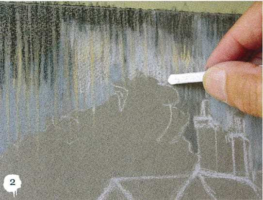 The sky was grey and in places almost black with a few light areas where the occasional shaft of light came through. I used a vertical stroke with one colour and then inter-laid another colour between to ‘optically blend’. I don’t use rubbing at all to blend or smudge because I believe it damages the quality of the pigment and makes the resulting painting muddy. Once I felt happy with the sky for which I used greys, white and a little ochre to lift the lighter areas, I gave the piece a quick spray fix.
3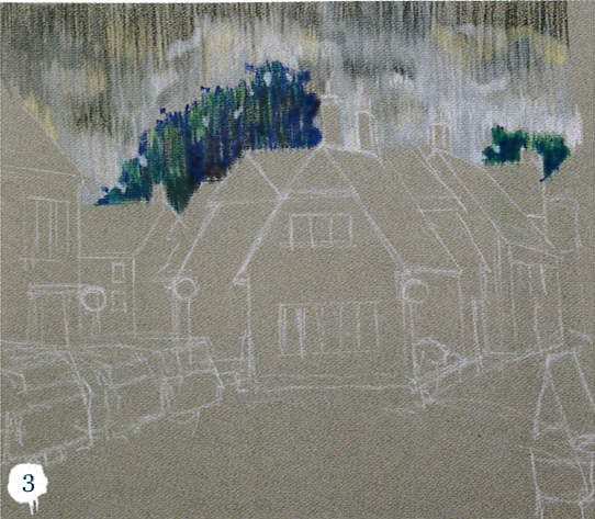 The trees were next. Even though the sky seemed dark it was nowhere near as dark as the trees. I used a purple and a blue with two or three of the darker greens, as before laying one colour alongside another and keeping my strokes vertical encouraging a harmony in the painting. Retaining values across a scene is what will convey mood and atmosphere – hence the saying I often use: ‘the colour gets all the praise but the values do all the work’ – this is never truer than in a dry medium.
4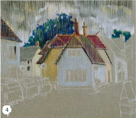 Next for the roof areas. I was concerned that the myriad of subtle values and colours may confuse the viewer if I didn’t approach them with caution. I completed the chimneys being careful to see the perspective and relay the square form of the tall stacks and their changing colours as the light caught them.
5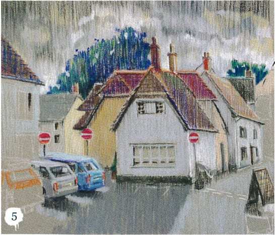 The cars on the left were lit mainly from the top as the buildings cast a subdued shadow, but their shape and colour offer a welcome respite from the straight lines of the buildings and bring to life the painting. The lack of folk was due to the intermittent rain. I was glad that under my umbrella it was at least dry even though a little gloomy. The cottages were mostly painted white, the values therefore subtle. I was grateful for the Ochre on the left off-centre walls as it broke up the overall shades of grey. For the main building facing me, I used a light grey.
6 I finished with the table and ‘A’ board of the cafe on the right, providing a dark value and sense of depth, giving the scene a foreground, middle and distant layer which the eye almost expects in a landscape. By the time I’d finished and spray fixed for about five seconds all over the piece I was confident I had Aldbourne Village captured in Contè.