
One of my greatest pleasures when working with pastels is layering. I love watching the colours mingle and interact and find this technique works best with Unison Soft Pastels on Pastelmat. The buttery pastels bind with both the paper and each other and the smooth tooth of this surface offers control and definition. Don’t worry if you haven’t got exactly the right colours – it’s all about interpretation. Let the photo be a starting point to creating your own work. Use the side of your pastels unless otherwise advised – the ideal size is a half stick so, if needs be, peel off the paper and snap in half… sorry, this may be painful for some of you! I don’t do any initial drawing but if you wish to, use a pale pastel like cream or light grey. Begin with thin layers of vibrant colour – more vivid than the colours you eventually want to dominate the piece. The paper has a strong tooth – put one stroke of pastel on it and then try blending…not a lot happens! Don’t worry, as you add layers it will blend more readily.
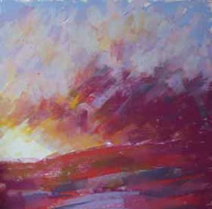 Block in the cloud bank and the hillside using short strokes of pink and orange with the side of the pastel. Add yellows, orange and cream where the sunset is most vibrant. Use light pressure and mark making that echoes the movement and direction of the clouds and land. Towards the top of the cloud bank, introduce lilac, pale greys, and blues, using darker blue towards the top. Use a hint of yellow amongst some of the grey cloud area. Use darker pink and purple colours to block in the hillside loosely. It will look messy but there is no need to panic!
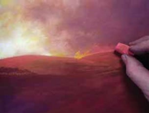
 With loose circular movements, rub in the pastel using your index and middle fingers. This first blend can be hard work and if you find areas that won’t blend at all add more pastel. When blending on the hillside, use the base of your palm and pull the pastel along in the direction of the hills, up and across.
 Focus more closely on an area of the sky – for example the top right quarter. Look more carefully at the colours and detail. Add light and dark blue, mid grey and lilac in smaller gestures than before. Pay more attention to where the cloud ends and sky behind begins. With small strokes of dark grey and pink, move further down into the darker part of the cloudbank. From now on, use your little finger to blend using small circular movements.
 Add further pale tones to the top left quarter of the sky, introducing more yellow and pink shades. Apply stronger reds and oranges as you work down to the brightest part of the sunset then more cream and yellow before blending. Next use the pale grey/lilac and the dark grey in short strokes where more depth of tone or highlights are needed, then blend again.
 Now using the tip and edge of the pastels, apply pale cream shades of yellow to add detail to the sunset and brighter edges to the clouds. With the Colour Shaper apply a gentle pressure to soften in these areas, then repeat adding detail with more pastel as needed.
 Use the pale blue to create areas of sky coming through behind the clouds in the top left quarter, then soften these in with the Colour Shaper. Add light tones on the edges of the clouds and soften in again, repeating over and over the edges until you get the detail you want.
 Once you are happy with your cloud work, start on the hillside – you can bring the edge of the hill up over the cloud to create a sharp skyline. Using dark pink, reds, browns and purples, create the shadows and warmth using long strokes and blend in the direction of the contours. Use brown and pink for the trees and the ochre to add light behind the trunks and across the hillside behind. Use the strong pink and yellow to add warmth to the sunset behind the larger hill and to define the edge.
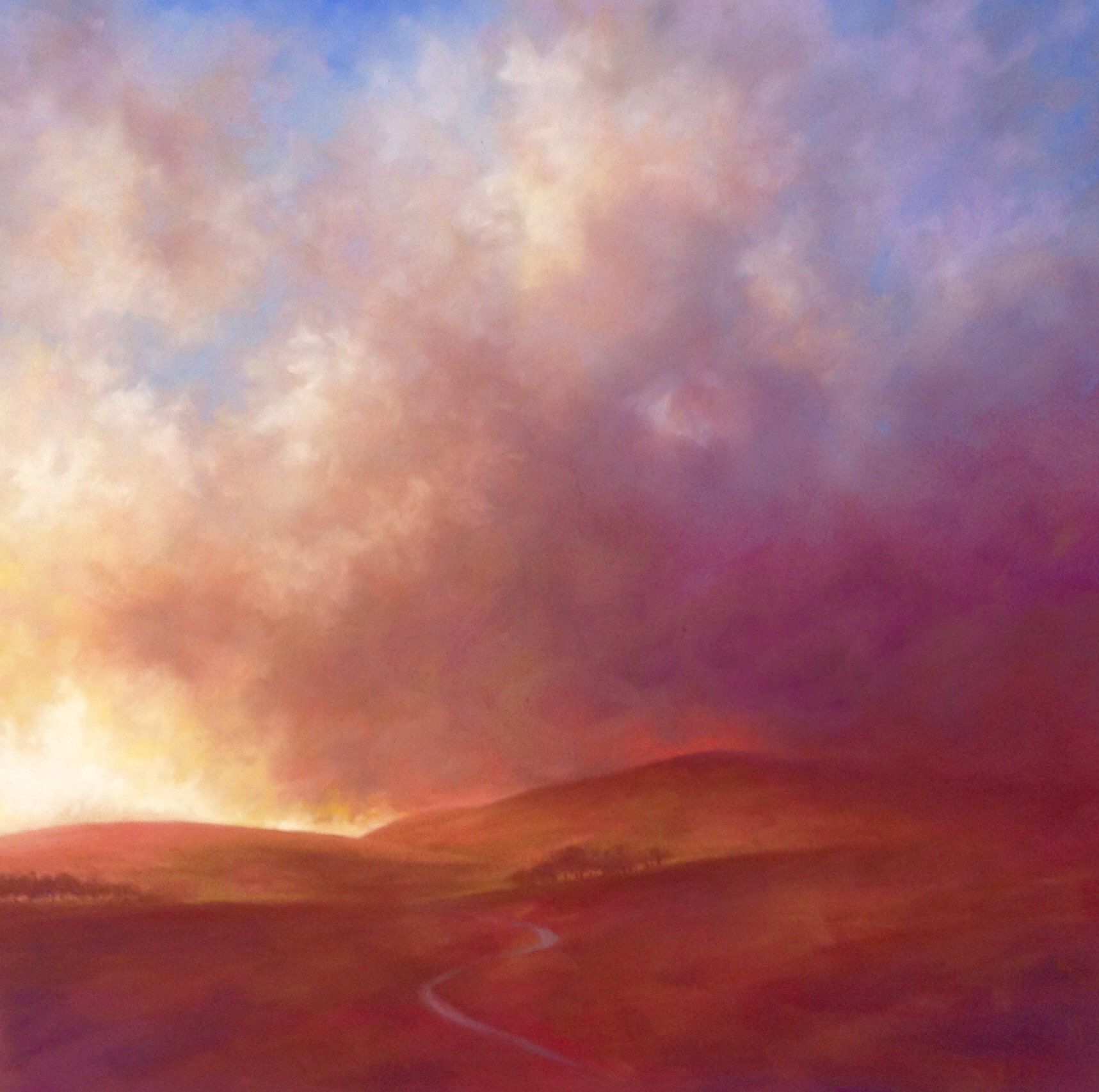 For the finishing touches, with the grey and the lilac suggest the winding lane leading up the hillside from the foreground and use white to add light above the horizon and to catch the tops of the left quarter of the clouds.