
 Full of colour and different shapes this bunch of flowers is the inspiration for a step by step guide, using the bright and brilliant Royal Talens Ecoline Watercolour ink. The Ecoline Watercolour ink is a range of 60 bright and vibrant colours. They are dye based with a Gum Arabic binder which means they can be rewetted like a watercolour.
I am using the Primary set of 5 colours which offers great mixing potential and should provide all the colours and tones for this vibrant bouquet.
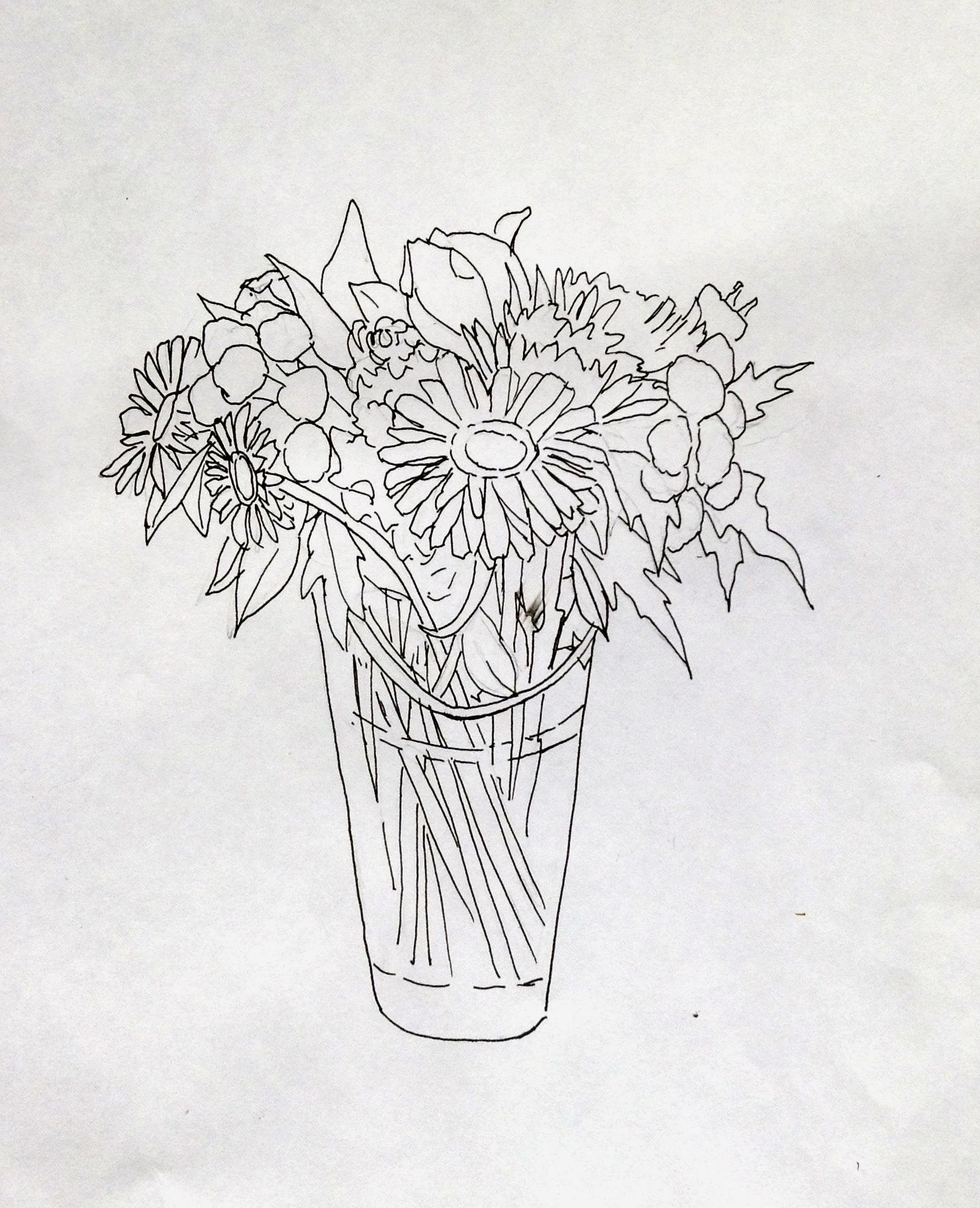 Firstly, I sketched out many of the main shapes and details only moving a few bits of foliage here and there to add balance. I have created an outline so you can have a go yourself.
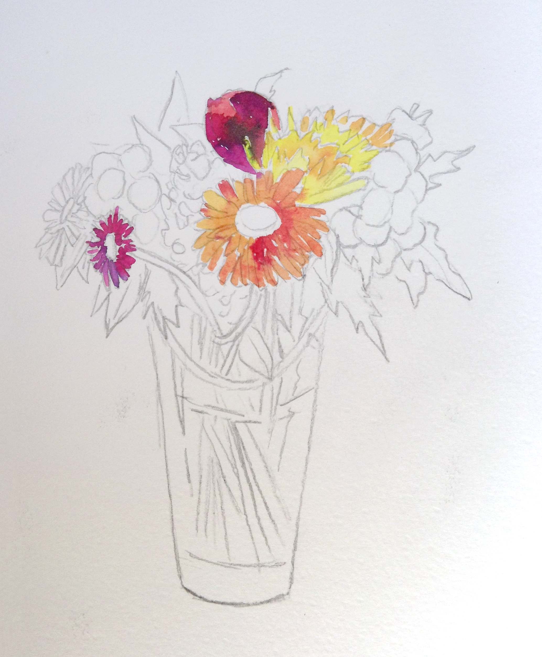 I started with the lightest colour, which was the yellow and noticed that it was very fluid, transparent and brightly coloured. It can be diluted with water to create softer tones. I applied the diluted yellow to the yellow flowers, not as a solid block but using the shape of the brush to help create the shape of the petals.
Then mixing the yellow and the magenta I moved on to the onto the orange Gerberas starting with a light wash and letting a darker colour wash into the wet areas, I love the way in which the colour moves organically.
 Moving around the composition I continue to build up the colour. The Magenta, Blue, Green and Yellow in this set are very transparent but very bright so dilution is key when building up the colours. I was mindful of leaving areas of white to help define the shapes and keep the highlights.
There is a bright green in the set, and it is a little artificial, but this can be altered with a little of the other colours making to make a more natural green.
To get the darkest shades I mixed a little of all the colours and painted around the flowers in a negative painting technique Even though in the Primary set of 5 there is a black, which has a slightly thicker constancy and much more opaque, I was able to achieve the darkest dark tones from mixing 3 colours together.
 The glass vase is a little challenging as you want to give it some structure without losing the transparency. I used a very diluted blue and purple picking out some of the more solid areas. Look for some of the more definable shapes in the glass structure – less is more when painting the glass.
A little wash of blue or purple under the vase will ensure that image is grounded and looks like sitting on a surface rather than floating.