
We are fortunate that at any time of year we can find beautiful flowers and display them with other objects to create striking compositions. Still life painting offers an opportunity to hone your skills when the weather prevents being ‘en plein air’! More than any other medium, watercolour requires you to pay particular attention to negative spaces. So first you must be able to see them. Take your time setting up your still life, considering these negative spaces as well as the subject matter – how the shapes of the subjects relate to each other and how they connect. The shapes that you ‘leave out’ or ‘don’t paint’ in watercolour are usually the ones that speak.
 Mix up separately large pale washes of Cobalt Blue, Naples Yellow and Permanent Rose. Using your large oval brush cover the whole sheet of paper allowing the colours to merge naturally. Keep your board at an angle of not more than 15 degrees so that you can control the flow of paint. This takes a little practice but is worth it! Don’t think about your subject matter at this stage. Just enjoy the procedure. The colours will ‘rainbow’ on the paper. Allow this first wash to dry completely. This is very important – if you go in too early your painting will muddy up before you’ve even begun.
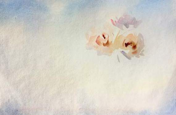 Using the same colours as the wash, start to establish the shapes of the flowers fanning outwards from the centres. You can add a little Vermillion at this stage. Try and get as dark as possible in the centres – keep dropping in colour damp into wet.
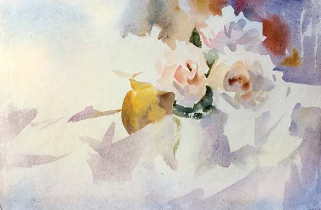 Put in the darks around the flowers using a mix of Cobalt Blue and Yellow Ochre, thinking about the edges that hit the flower as well as the dark shapes that create the leaves and dark negative spaces.
Start to map out the jar using shadow play with washes of Cobalt Blue and Permanent Rose over the areas that are dry, creating lovely glazing effects – this brings out the transparent nature of the watercolour. Make sure your washes are dry underneath! Be patient. Decide at this stage which of your other objects you want to paint in. I have used New Gamboge and gentle mixes of Burnt Umber and Cobalt to get the elliptical shape of the gold vase. This is where your drawing experience will show – try to achieve the shape carefully but without overworking. Cobalt Blue and Umber were used for the dark shapes on the vase wet into wet.
Keep going with the shadow play – this will ultimately give you form in your painting, until the shadows connect all the objects. Trap the edges of the subject with large, colourful, liquid washes – plenty of colour and plenty of water. With less liquid in the brush and more pigment drop some Vermillion into the background washes and let it merge. These negative shapes will throw the subject forward. Get the light of the paper functioning with the shapes you leave out.
 I wanted to keep the rose, bottom left, soft so the shadow shapes were painted with a gentle wash to create the light side edge of the flower. Don’t do too much – only until you see the flower appearing, then the viewer will do the rest. An impression starts to be created. This is the stage at which you must decide how much more you will do to it. A combination of Cobalt Blue and Yellow Ochre was again used for the leaves.
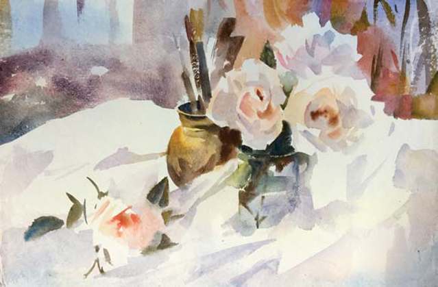 Check your palette and replenish with colour if necessary. You don’t want to run out mid-wash! Develop the other objects – jars and brushes. Put the brushes in the pot – work quickly with immediate strokes but consider the shape and tone. Don’t hesitate, just paint what you see and don’t tighten up or get fearful. Keep plenty of liquid and pigment in your brush. Here I have used a bit of dry brush – even more pigment and less water in my brush allowing it to ‘skip’ over the paper creating a sparkle. Again, a little practice helps with this technique. Look at the shapes and their relationship to each other.
Work up the darks and half tones in the jar using the Burnt Umber wet into wet into Cobalt Blue washes. Try to follow the shapes – they are complex as they fracture through the water. You need your powers of concentration here. Don’t worry – worrying will stop you getting what you want. The lights should take care of themselves!
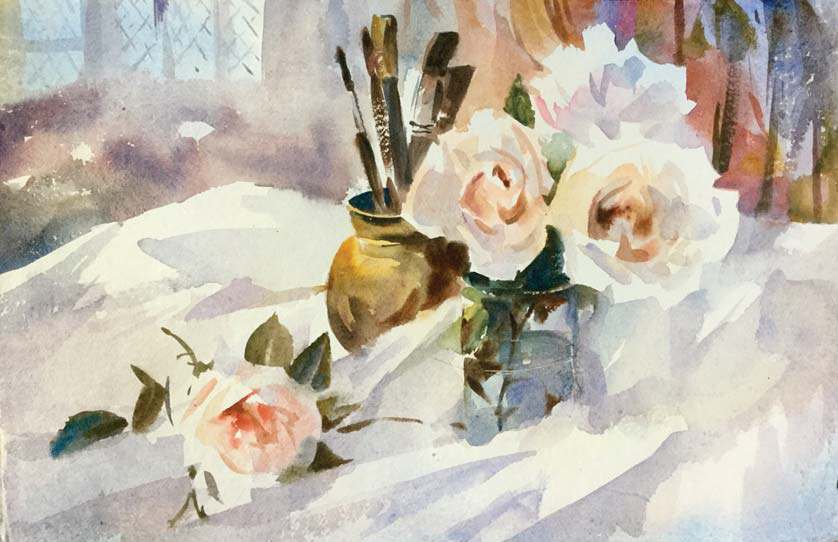 Take a look now and see what else is required, if anything. Take your time. Check your shapes and tones – are the lights and darks well seen? Are the shadow shapes working for you? You may have to strengthen some of the tones of the shapes underneath the subjects to help them to read correctly. At this stage of working your painting should be as dry as possible so that any mark making stays fresh and doesn’t become muddy. Gentle fluid washes, keep it simple, it’s really all about negative spaces and shapes. Draw the eye of the viewer by looking at accent details – I have been careful to introduce the leading on the beautiful church windows of my studio – a reminder that I live in such a wonderful place which is very personal to me. Your painting is personal to you – make every brush mark with care and remember that sometimes less is more!