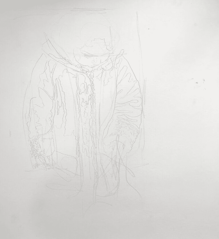
 Working on Clairefontaine Pastelmat board in white, I sketch out the figure in pastel pencil, lightly at first and then more strongly. Finally, I sketch using black acrylic ink. The ink will resist being washed away in the under-painting.
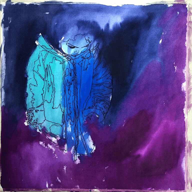
 I try to keep the tone of the under-painting consistent with the final work, as well as using cool colours under the warm areas and warm colours under cool areas. This technique (a favourite of Jacob Tintoretto) will add a sense of space and volume round the figure, accentuating the absorbed isolation of the child. The acrylic ink is absorbed by the Pastelmat, giving a vivid surface without sacrificing the surface of the board. The value of using board is that the surface remains flat and ready to work without further pressing. I love this part of the work. When demonstrating to groups, this is the time of greatest drama and disbelief. A little tension can help learning as well as aid creativity.
 I am aware that I must keep all the tonal values at least two degrees darker than I would normally like, because I only have white for the sparkler and the rest must allow this to shine. I have a second area of focus, which is the child’s face. The composition should spiral from the sparkler, through the lighter tones and brighter colours of the arm holding the sparkler, to the face and then down the other arm, back to the sparkler. Using a few vibrant marks in the dark, the eye is then led into the darkness and the space, showing the isolation of the child in her concentration.
 By putting in the darkest area first and using a piece of card with white pastel on it, I can judge my other tones. To help this, I use a piece of neutral grey card on which I mark my lightest colour (white.) Through the left square can be seen the colour of the lightest part of the photo after the sparkler (this is the cuff of the sleeve holding it); through the left hole can be seen my painted colour and, against that – on the card – the white of my pastel. This simple trick helps me to ensure no tone will outshine the star of the show.
 Having my dark background can cause problems when I lean on it and spread dark into the area where I want my lights to shine. To preserve my lightest areas, I mask them with Clairefontaine Crystal Paper. This allows me to cover what I’ve already done and rest my hand on it while I work. It is also great for covering work in progress, protecting it from dogs, cats, children’s fingers and over-eager dusting!
 Having ensured my tonal range, I then work against the dark background to get the face right. I deliberately warm the colours in the face. The sparkler produces a cool light which tends to yellow the colours of the face. To help draw attention to this, I use warmer tones and to cool the colours in the coat I use a combination of oranges and purples. The two combine to give the right tones and colours without big areas of dull brown.
 The sparkler will be a bright hard-edged shape and will draw attention. I need the other edges in the painting to be softer. To achieve this, I use either my fingers or a soft fan brush, which can be used to get the most delicate variation in texture.
 In painting the sparkler, I know I have one chance with each stroke. Any fudging will compromise the background and the shine will go. I take a new white pastel and break it into shards. Each shard will make a single mark, each contributing to my sharp and sparky sparkler.