If you haven’t tried Brusho yet, you’re in for a treat! I’m a great fan of watercolour, and love the way paint and water mingle exquisitely on the paper. So I was very excited when I discovered Brusho a few years ago. It’s an intense paint powder that dilutes with water to give glorious bursts of colour. Manufactured by Colourcraft Ltd in Sheffield, Brusho comes in 34 highly concentrated colours, which the company says are as lightfast as watercolour and completely safe and non-toxic. Although there are similarities with watercolour, it has some different quirky and delightful properties. I can well understand why Brusho has been described as ‘little pots of magic’.
1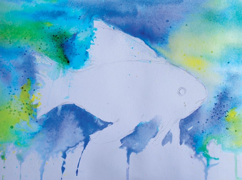 First draw your fish outline. Then, to create the background sea, mix some Yellow, Leaf Green, Ultramarine and Turquoise with water, in separate wells of your palette. Use a large, clean brush to wet the paper from the top to roughly three-quarters of the way down, working around the fish shape. Randomly drop in the four colours you have mixed and allow these to mix and mingle on the paper. Just as the wet sheen is beginning to disappear from the paper, sprinkle some salt into the damp wash. Sea salt creates larger ‘bubble shapes’ but you can use regular table salt. Leave to dry.
2 The whole coral bed is created just by sprinkling Brusho onto dry paper, then spritzing it and moving it around a bit with a brush. Use the same colours as in step 2, along with some Brilliant Red and Purple. First, protect the fish shape with paper towel, then use the Brusho pots like a saltshaker to sprinkle a few crystals of each colour randomly along the bottom quarter of the dry paper. Use your water sprayer to lightly spritz the colours a couple of times. Again, don’t overdo it. If you apply too much water, you will lose some of the lovely texture that you want to retain. Using the tip of a small damp brush, go into the paint and push it around to create some abstract coral and seaweed shapes. Leave to dry.
3 For the fish, use a wax resist stick or chunk of clear candle wax to preserve the white paper for the white of the fish’s eye and several linear marks on its fins. Choose from the colours in your palette to paint the body of the fish – you don’t need to slavishly copy the colour arrangement in my image, our sea-world is home to a spectacular variety of fish! When the body colour is dry, either mix some Ultramarine, Yellow and Brilliant Red to make your own black, or use Black Brusho, to define the eye and mouth shapes, and add a few dark linear marks to the fins, then leave to dry.
4 Add a few purple-blue stripes to the body of the fish, making sure these follow the rounded contour of its shape to give it form. Use a damp brush to blend and soften them into the body so they don’t sit like a row of tram lines on top. Have a look at how your own painting has progressed and make any other enhancements needed. Leave to dry. You could stop here or, if you’re happy working with bleach and are feeling adventurous, try the next step.
5 To create the pale bluey-turquoise underwater bubble effects, I lightly sprayed the whole image with diluted bleach, in several applications. The ratio of bleach to water is somewhat experimental as the result depends on the type of paper being used and the amount of paint on the paper. I tend to mix a 50:50 ratio to start with, and increase the bleach content if needed. If you spray too much bleach, you’re in danger of bleaching out your whole painting, so exercise caution and leave the painting for a few hours, or overnight, for the bleach to take full effect. Then you can assess how much more, if any, is needed.