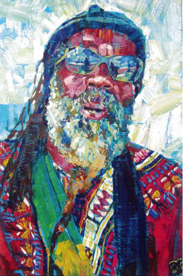

I love painting portraits and was inspired by this character from one of my student’s holiday snaps from the Caribbean – many thanks to Christine Hopper for the lovely photo! The colours are great and the guy looks really interesting.
In my painting I want to capture a flavour of the scene rather than a super realistic representation. He looks laid back and so should the painting.
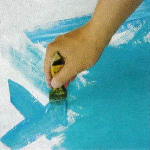
 I start with a 2″ brush and apply a base colour of Coeruleum Blue and a touch of Phthalo Green, mixed with white to soften the tone. The base colour works well if it is complementary to a dominant shade in the scene. In this case the warm reds should contrast the blue/green base.
The base also acts as a warm up, utilising the entire arm with long diagonal strokes. A bright base will make you assertive as you’ll need to dominate the pigment with other strong colours. The blue will unify the painting if flecks are left at the end.
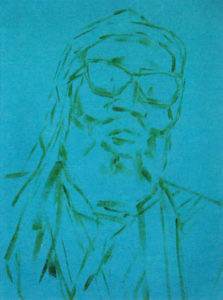
 Once the base is dry I use a 3/4″ brush to roughly sketch a basic outline. I try not to be too obsessive about drawing as this will restrict my painting arm. You should be liberated when painting and even paint over your ‘drawn lines’. I find it helpful creating deadlines at varying stages in my painting, perhaps 10 to 15 minutes for the initial sketch.
 For the initial painting strokes I use my largest brush first, the 2″ Sky Flow. I lightly damp the brush and start applying flesh tones. I dab my brush in Magenta, Burnt Sienna, Cadmium Red, Yellow Ochre and a touch of Violet and drag the brush down and at various angles covering the face. Quantities vary but I’m very generous with paint because I’m looking for interesting streaks. I also vary the pressure when applying paint and seldom re-work areas. No white is used with the early applications and I avoid cleaning my brush too often, allowing subtle accumulations of paint to interact with fresh paint.
For the hat, hair and sunglasses I use Coeruleum Blue, Phthalo Green and Violet. The blue acts as the lightest tint and takes the edge off the darker pigments. As I work further down the hair I start to add Sap Green and Burnt Sienna to the original shades to vary the mix.
 To build up the painting I use the 1/2″ brush for smaller areas but still remain loose with my strokes. Occasionally I try colour on a mixing tray before applying to the canvas, this gives me a record of pigments and the paint may well be usable in the later stages.
I drag Yellow Ochre, Coeruleum Blue, Cadmium Yellow and Burnt Sienna with varying pressure over the beard; specs of the darker shade were placed when applying the hair. Cadmium Red and Magenta are dragged over the shirt with dabs of Cadmium Yellow mixed with Yellow Ochre for the decorative elements. Coeruleum Blue also provides the colour for the shirt decoration as does Phthalo Green mixed with Cadmium Yellow for the scarf. Acrylic dries pretty quickly and you’ll find it easier to apply layers but avoid over-working or over-blending as pigments will turn to mud. I leave fragments of the base colour showing and finish off this stage by applying, with a 1″ brush, small, assertive dabs of colour to tidy things up.
 The next stage involves adding white; I start with the background and mix White with small amounts of Lemon Yellow, Cadmium Yellow and Phthalo Green. Using the 2″ brush and diagonal strokes I fill in the background and shape the head. The beard is the next largest area of light and White is added to Yellow Ochre and Coeruleum Blue with small shots of Cadmium Yellow and Phthalo Green. I use a 1″ brush to carve out marks and the edge of the brush for sharper definition. I try to steer away from painting every hair because it gets too obsessive and everything will then need to be over defined. The same tint with more White is applied for the light decoration on the shirt and in the glasses’ reflection. Finally the softer flesh tints are a combination of White with Magenta, Cadmium Red and Cadmium Yellow. I’m still looking for minimal brush work and up close you could count the number of marks used.
 As I get to the last stages I use my smallest brushes and the purest quantity of white with touches of Lemon Yellow. The level of finish is down to personal interpretation; I’d rather under-work a painting than overwork it. I work the facial features utilising stronger Whites with Lemon Yellow in the beard, on the nose and more highlights in the background to punch the foreground forward. White and Lemon Yellow are added with Magenta and Cadmium Red to brighten the shirt. Everything is sharpened with touches of rich colour added with white and shots of Lemon Yellow. Small defining strokes applied with the edge of the brush define the sunglasses, beard and other areas of detail, but definition is kept to a minimum.
 I make a few final marks, but never use Black or Payne’s Grey instead preferring a combination of Violet, Cyan and Phthalo Green. I use varying amounts for the inside of the mouth defining the glasses and general detailing.