
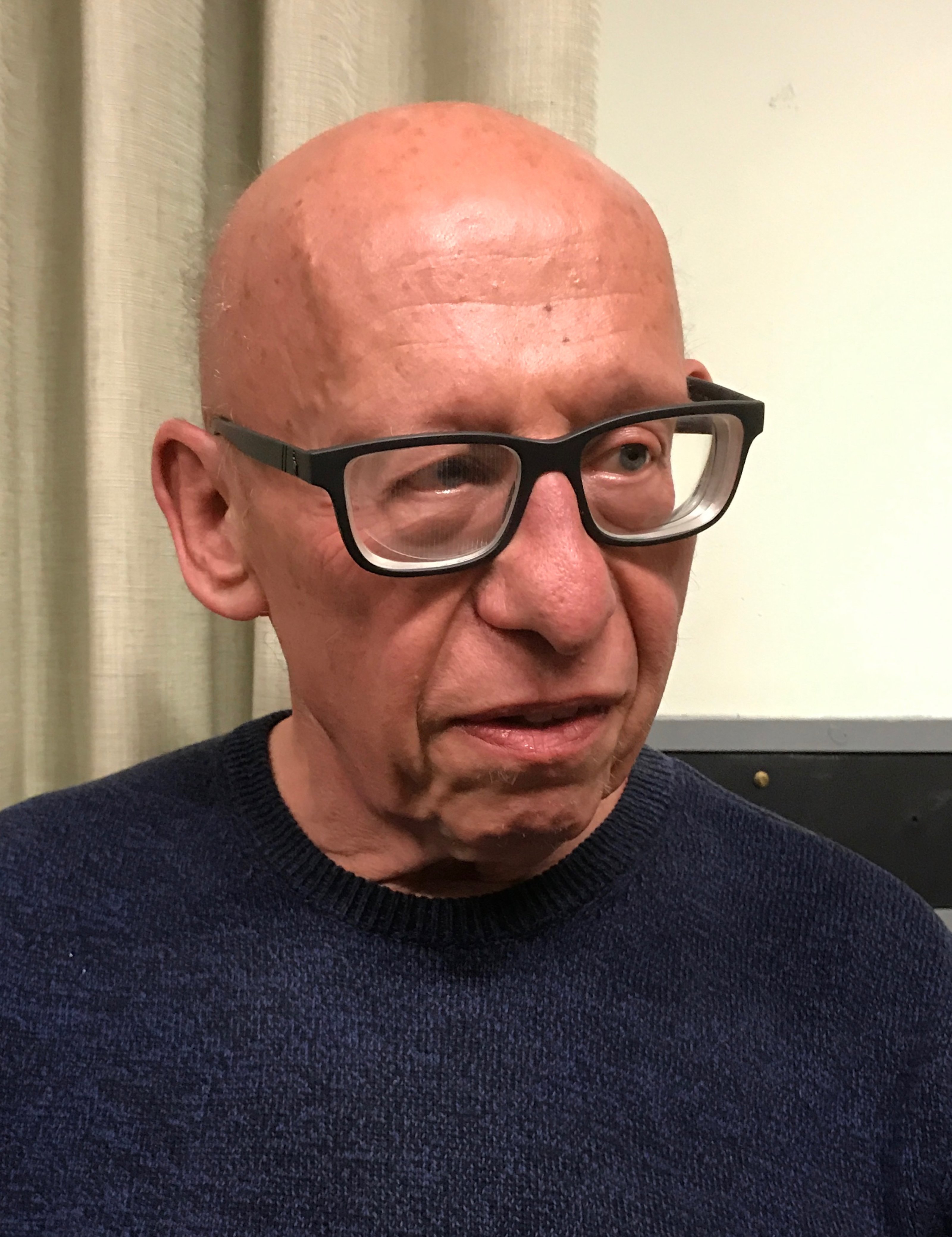
 I paint with acrylics as they allow for lots of experimentation. You can use the paint thick, thin, add various enhancers, they’re quick drying and have a huge range of colours. I also work with large flat head brushes, even for detail. I treat every painting with a sense of exploration. This is especially true with themes that have a relatively rigid format, such as portraiture. Many will think of traditional formal portraits with lots of earthy, brown hues dominating and polished brushwork. However, I like portraits with colour, ones that reflect the sitter’s personality. This is a chap called Rob who I met while I was giving a demo for Theydon Bois Art Society; I immediately thought he had such a great face for a portrait. The colours reflect his cool exterior and an incredibly warm interior. Meanwhile, expressive brush strokes add a sense of animation. The likeness is still important but everything else is up for grabs. With such a long history and the fact that selfies have made the portrait more informal, contemporary portraiture has to keep up with the times.
 I start by applying a light blue/grey base colour, made up of Phthalo Blue and Sienna mixed with Titanium White, and allow it to dry. Using a damp 2″ Flat, I apply neat Pyrrole Red and Carmine, merging into violet, which leads into a Cobalt and Phthalo Blue. White is introduced to lighten the blues with a light turquoise, Phthalo Turquoise Green, applied to the top corner.
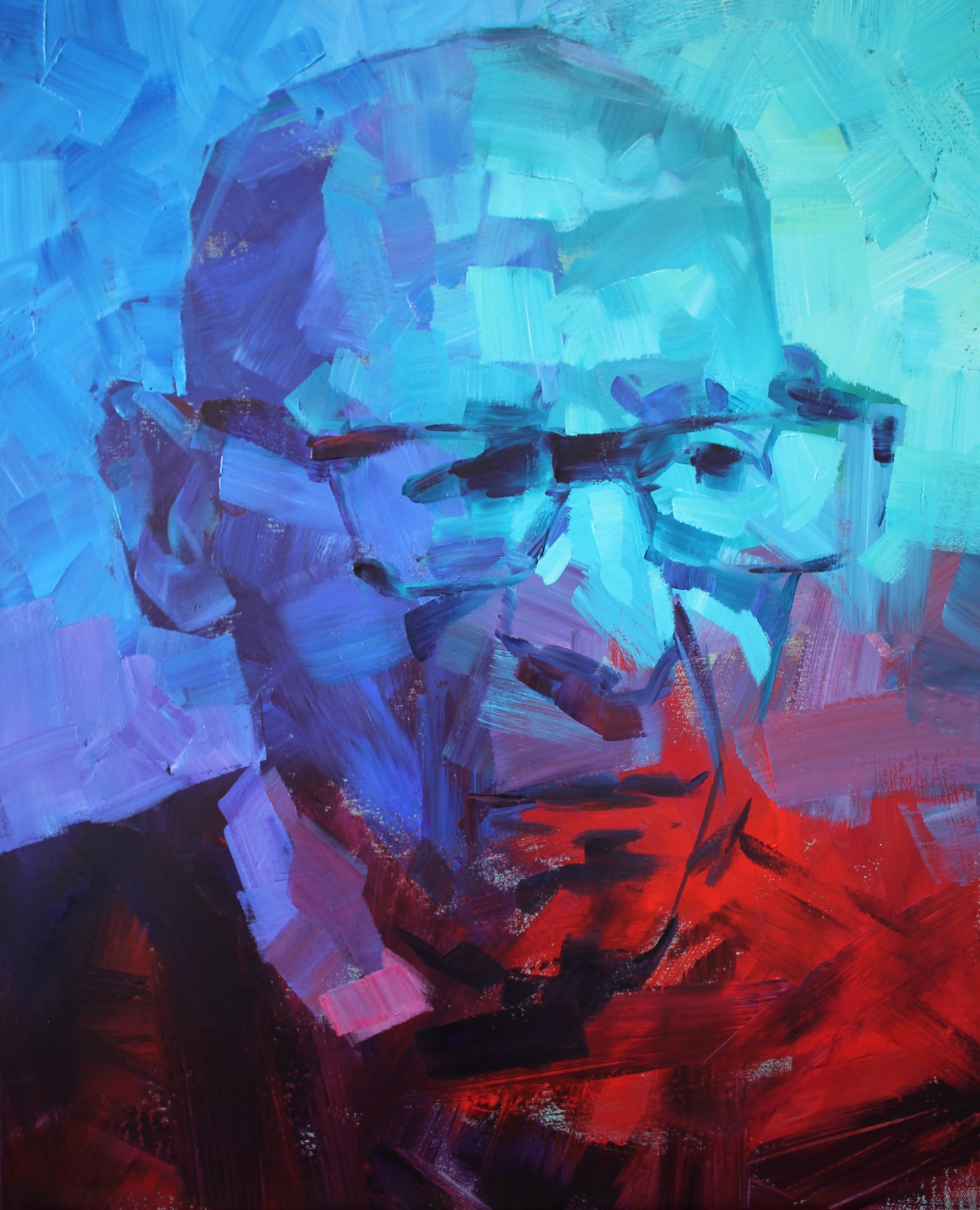
 Once these colours have dried, I use my 1″ to sketch the portrait, using violet and colours I find on my mixing tray from the initial applications, including light blues. Some of the early random marks fit nicely into contouring the face.
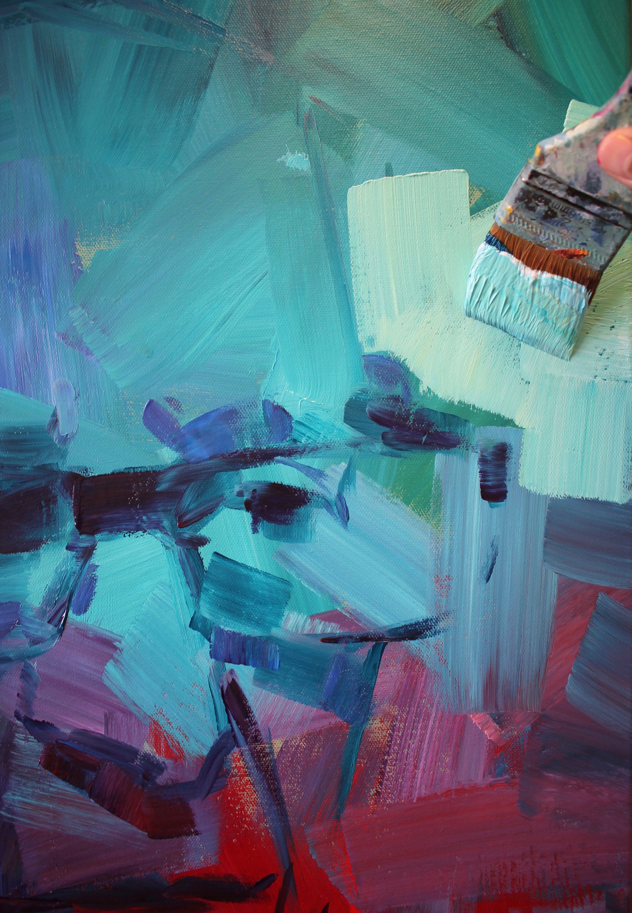 The shape of the face is helped by lightening the background. For this I mix plenty of White with Turquoise and fill in the background, taking care to follow the shape of the head. Light blues are used on the left which slowly meld into a light violet and red. Applications are made in single strokes and, as more are applied, they begin to interweave into each other to create a consistent appearance.
 I use the same light tints in the background to sculpt the face in order to draw the features forward. Where one colour meets an opposing one there can be some tricky mixes, but as most of the colours are rich you can afford a couple of dull shades. Generally, to create clean mixes always have one colour that dominates over another, even when using white.
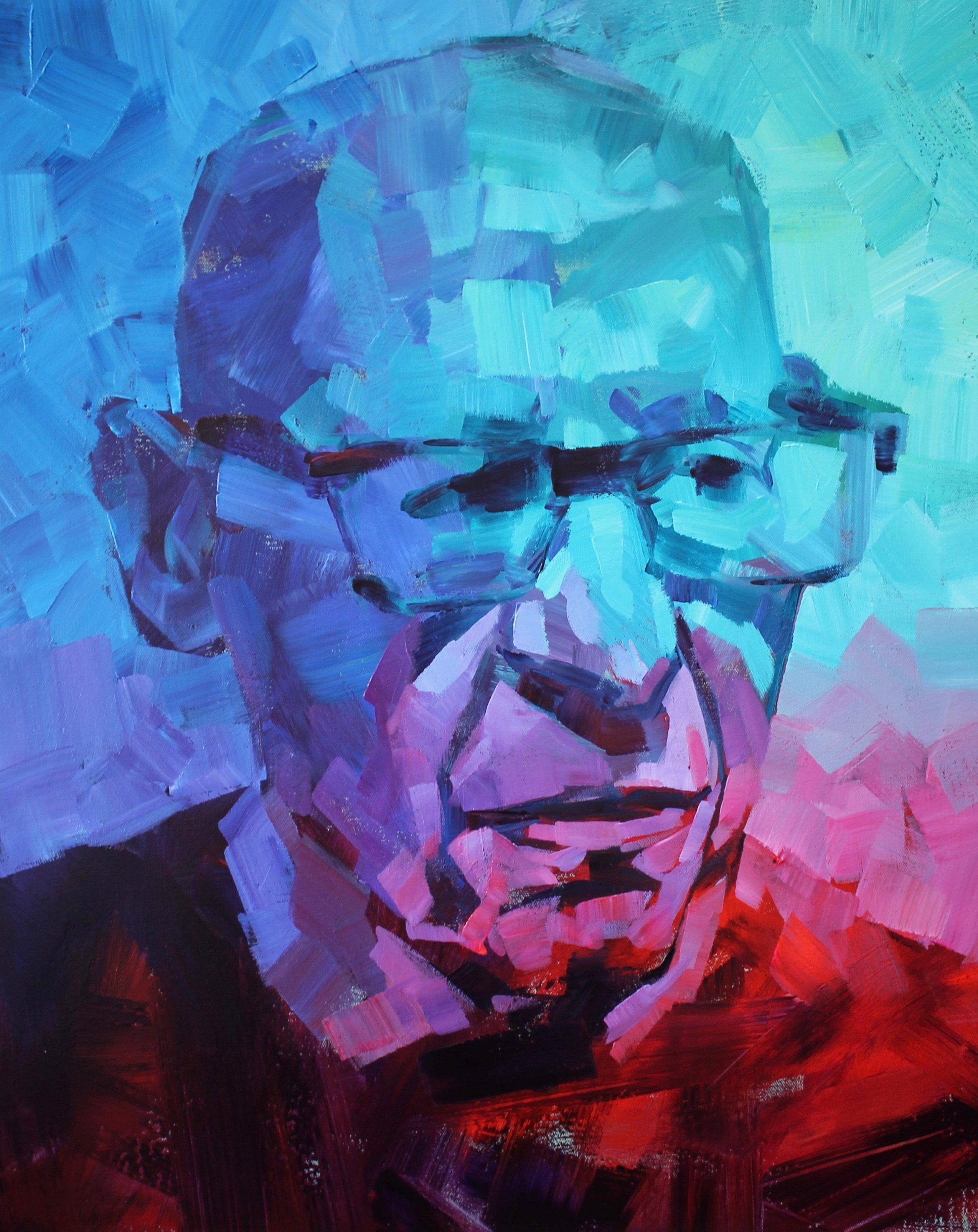 I use tonal ranges based on the colour of each section to build the portrait. These include light reds to dark violet or light blue to dark blue/violet. The violet does bridge the colours together as it’s echoed throughout. At this stage as the portrait evolves, I spend more time on the likeness and the blocks are more considered.
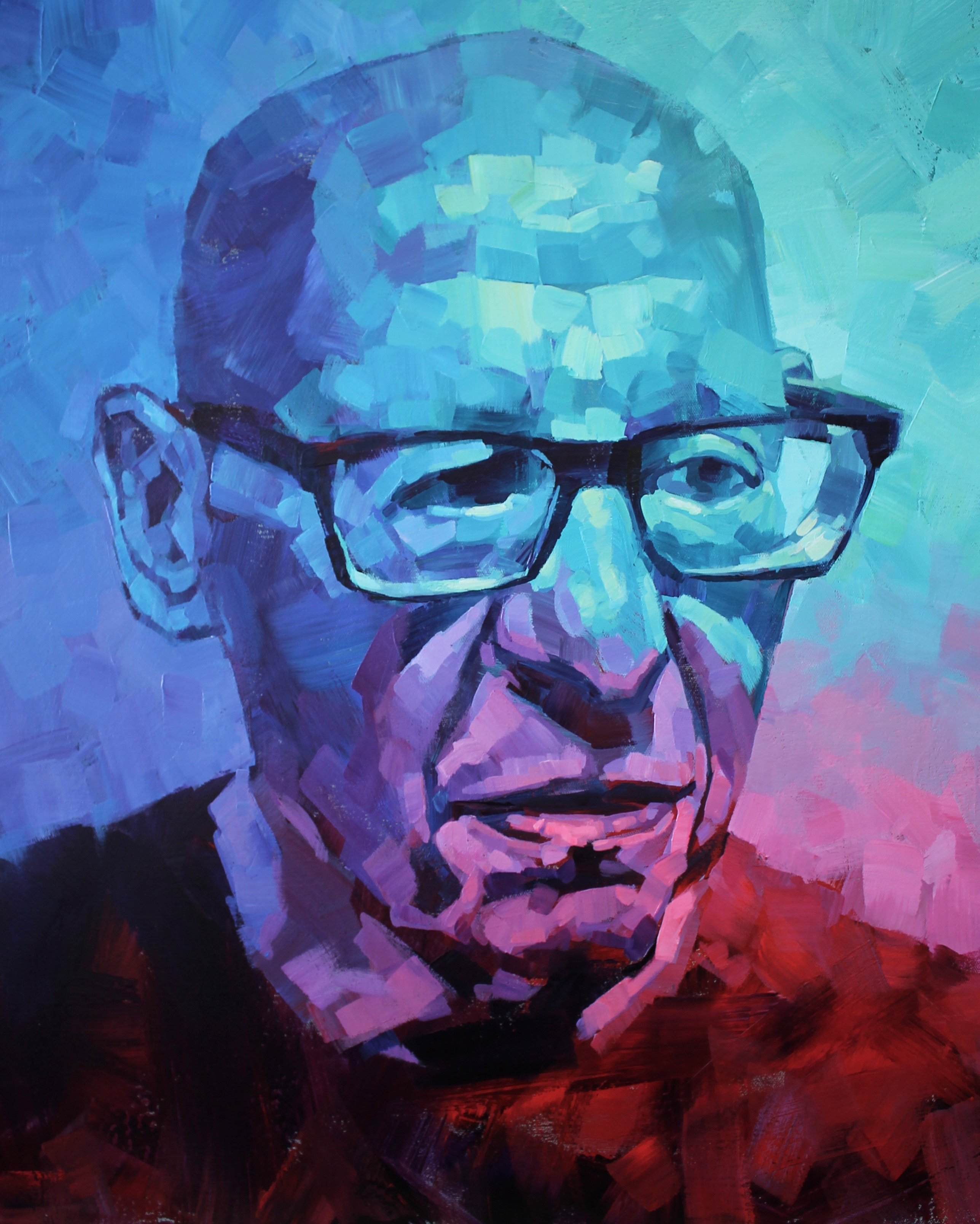 The latter stages of the painting include sharpening up features using only the 1″ Flat. I use the very edge to crisp up lines, with either my dark Prussian Blue or my lightest tints, which includes plenty of white with a hint of Greenish Yellow Light. This is especially useful in the top left highlights to draw the viewer in. Practically all applications are neat, undiluted paint to maintain colour strength.