Living on the coast it is little wonder that the wide-open spaces of sea, estuary and sky have been the main spring of my art for well over 20 years. Although I divide my time working both en plein air and in the studio, I am most at home when I am painting directly from nature. However, when I am in the studio I often paint from monochrome sketches in charcoal using them as an aide-memoire. I use photographs as a back up if necessary, but the sketches bring back the emotions of the place more readily.
 Working solely from a sketch has many advantages. Not only have the vital priorities such as composition and tonal values been sorted out, but the scene has been simplified. Also, without a colour reference I can interpret the colours more intuitively. The sketch used for this demonstration is a good example of this – however, I decided to change the composition slightly by making the larger dinghy the focal point. The addition of a figure helped, but more importantly it also added an element of life to the scene. For many years I worked solely in watercolour – the most exciting medium in my opinion, but also the most difficult. More recently I have enjoyed the challenge of combining other media with watercolour, particularly soft pastels. The transparency and fluidity of watercolour and the vibrancy and depth of pastel work extremely well together.
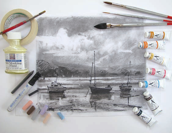
 I pre-stretched my paper onto a board with brown gum tape and applied masking tape around the edge to act as a mount. I then sketched in the initial drawing using a 4B pencil and added some darks with a black permanent marker pen. I drew round a coin to create the setting sun and preserved the highlights with masking fluid applied with an old brush.
 While the masking fluid dried I mixed up plenty of my chosen colour washes on a large palette. I prefer using tubes of watercolour to pans, as this gives a much stronger consistency of colour. Using a large oval brush I applied bold, sweeping strokes of Nordic Blue and whilst still wet merged this with a mixture of Cadmium Orange and Naples Yellow. This not only established the mood, but also the foundation of the overall painting. I prefer to work with the board almost vertical, so with the highlights already reserved I have the freedom to take risks and paint with much more expression.
 When this was dry I applied Raw Sienna plus a mixture of Nordic Blue and Cadmium Orange for the foreground mud using a No.10 All Rounder brush. For the background hills I applied a mixture of Rose Madder and Cerulean Blue and also echoed this in the boats and in their reflections.
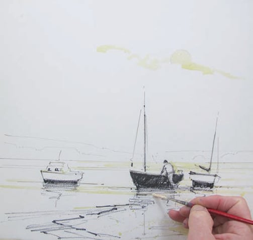
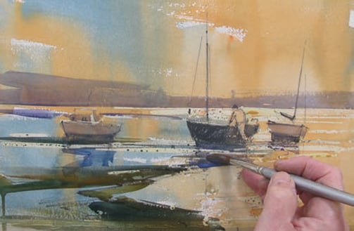
 I went back into the initial wash for the distant hills whilst it was still damp and dropped some Raw Sienna ‘wet in wet’ to suggest trees and add further recession. I also added the Raw Sienna in the foreground mud, creating texture using the ‘dry brush’ technique. I rubbed off the masking fluid with my finger to reveal the highlights. To add further contrast as well as cover the initial marker pen drawing I used a mixture of Nordic Blue and Warm Sepia. The masts and rigging were put in with a Rigger brush using the same colour.
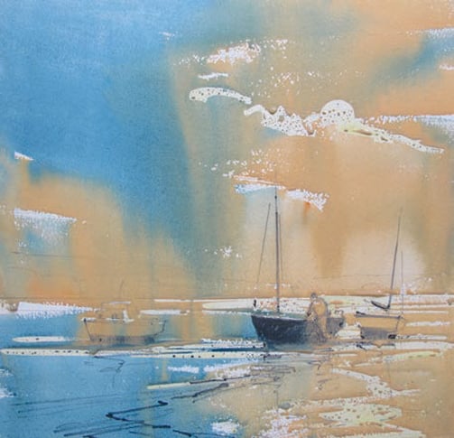
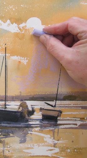 Now time to apply the pastel – once the washes were completely dry I began working over the sky with lightly applied strokes of Dioxazine Violet (8). This complementary colour was also echoed in the water and created some interesting effects. I also blended the pastel on the top of the clouds with a tissue in order to soften the hard edges and whiteness left by the masking fluid.
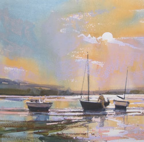 Next I worked more pastel into the sky using Cool Grey (9) on its side and also added further darks in the foreshore with Burnt Umber (5). The tooth of the paper picked up the pastel and helped to create the texture simply. I then used English Red Tint (7) to cover some of the highlighted areas in the water. This pastel was also used for some negative painting to help define the reflections of the boats. I also darkened the bottom right hand corner with Light Red (9) in order to add more depth and emphasis to the whites.
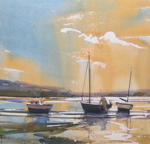
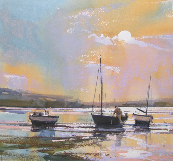 I firmed up the drawing of the figure and boats with a black Conté Crayon and used a 4B pencil to add a few flicks for the ropes and rigging. Finally using the tip of the pastel I added tiny touches of Cerulean Blue Tint (8) in the water. I now decided to stop before I started to ‘fiddle’ and overwork the painting. Knowing when a painting is finished can be a real problem – even for a professional artist!