
 Discover the art of wet-on-wet townscape painting with Mike Jackson’s “Simple Six” technique. Sometimes, less is more. Embrace the freedom of loose painting as Mike guides you through his process. Follow the six simple steps to create a lively townscape with subtle shadows, vivid characters, and charming details.
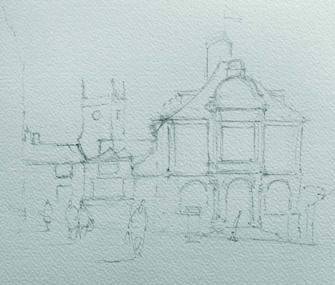 As this is a very loose wet-on-wet townscape painting, I first like to draw a fairly accurate pencil sketch which isn’t too tight. Being wet on wet, we need to allow the paint to be free to run into other colours. Also, have your paper on a slight tilt to allow the paint to run down gently. The idea is to let the paints paint the picture for you. Draw the image with a soft 2B pencil, making it dark enough so that you can see through your washes, yet light enough to erase later.

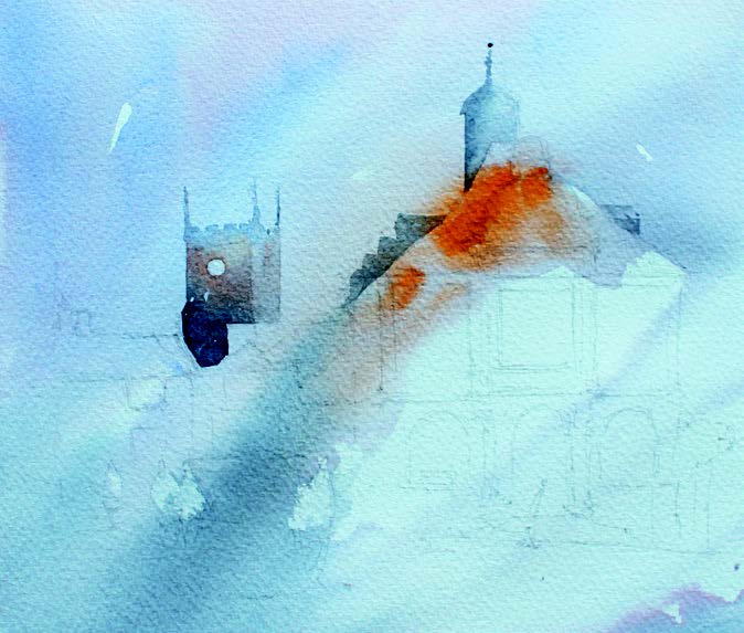
Run a wet mixture of Cobalt Blue Hue and some warm tones of Cadmium Orange across the background and more orange where the roof is. Allow the orange to bleed into the sky a little. Remember to keep it light!

Paint the back buildings in a slightly heavier colour than the one you used for the sky (Cobalt Blue Hue and a touch of Cadmium Orange). Mixing Burnt Sienna and Prussian Blue Hue, run in some shadows at this point. Make them cooler and darker as you move down the picture. Leave the characters white. Now, use the spray bottle to wet the paper to blend the shadows in. Use a tissue to add texture and to lift out light areas.
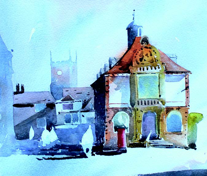 Introduce a strong foreground shadow (again, mixing Burnt Sienna and Prussian Blue Hue) for balance and to strengthen the painting.
Enhance detail to the windows (mixing Burnt Sienna and Prussian Blue Hue) and colour to the people – I like to use neat Cobalt Blue Hue and neat Cadmium Orange on my characters. Add a Cadmium Red Hue for the letterbox box and more Cadmium Orange on the roofs. I used Burnt Sienna for the walls of the main building in the middle ground. Finally, a strong shadow in the lower foreground, transitioning from right to left, will add weight to the composition.
For more information on Mike and his work, visit: saa.co.uk/michael-jackson