
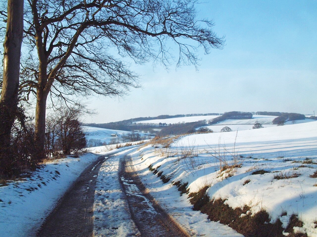
This tutorial by Catherine Inglis on using soft pastels to create a Winter Wonderland scene in Yorkshire encourages artists to consider perspective and tonal values throughout the process, concluding with advice on highlighting details for a cohesive composition.
Before you start sketching, spend some time studying your composition. I usually place the horizon above or below the middle of the paper. Here I have it above because it is the landscape element that is of interest to me, not the sky. Sketching in the lines of perspective along the lane and banks, leads the eye to the focal area, to the right of the plantation. Always work upright, using an easel with another smooth sheet of paper under your support.
 Using a pastel pencil on the smooth side of the paper, work a loose drawing to establish the composition. Don’t use graphite pencils – they’ll repel the pastel. For the sky around the tree trunks, lightly apply Yellow Ochre to the area where the sun is going down behind the trees, using the side of the pastel for this. Then apply English Red above the Yellow Ochre, followed by Cobalt Blue and lastly Cerulean Blue. Lightly blend each one into its neighbouring colour using your fingertips. Complete this stage by blending a little Dioxazine Violet to the top right of the sky. Keep this light; if your pastel is too heavy it may affect subsequent applications.
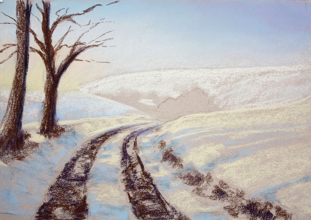
For the distant fields, apply a little Ivory and Cobalt Blue with the side of the pastel. Work these strokes diagonally to indicate the slope. For the trees and tracks of the lane, use Deep Purple and Burnt Umber to give good tonal depth.
Make sure the trees have a good base – not too narrow – and use broken marks for the tracks to give them texture. Warm lights will be added later to the sunlit areas. For the snow in the foreground, middle ground fields and along the banks, use Yellow Ochre for the warm areas and Cobalt Blue and Cerulean Blue for the cool shadows cast from the trees onto the snow. Push in a little with your fingertips and make sure the tree shadows blend up and over the bank. Add some Cobalt Blue into the far end of the lane to suggest distance.
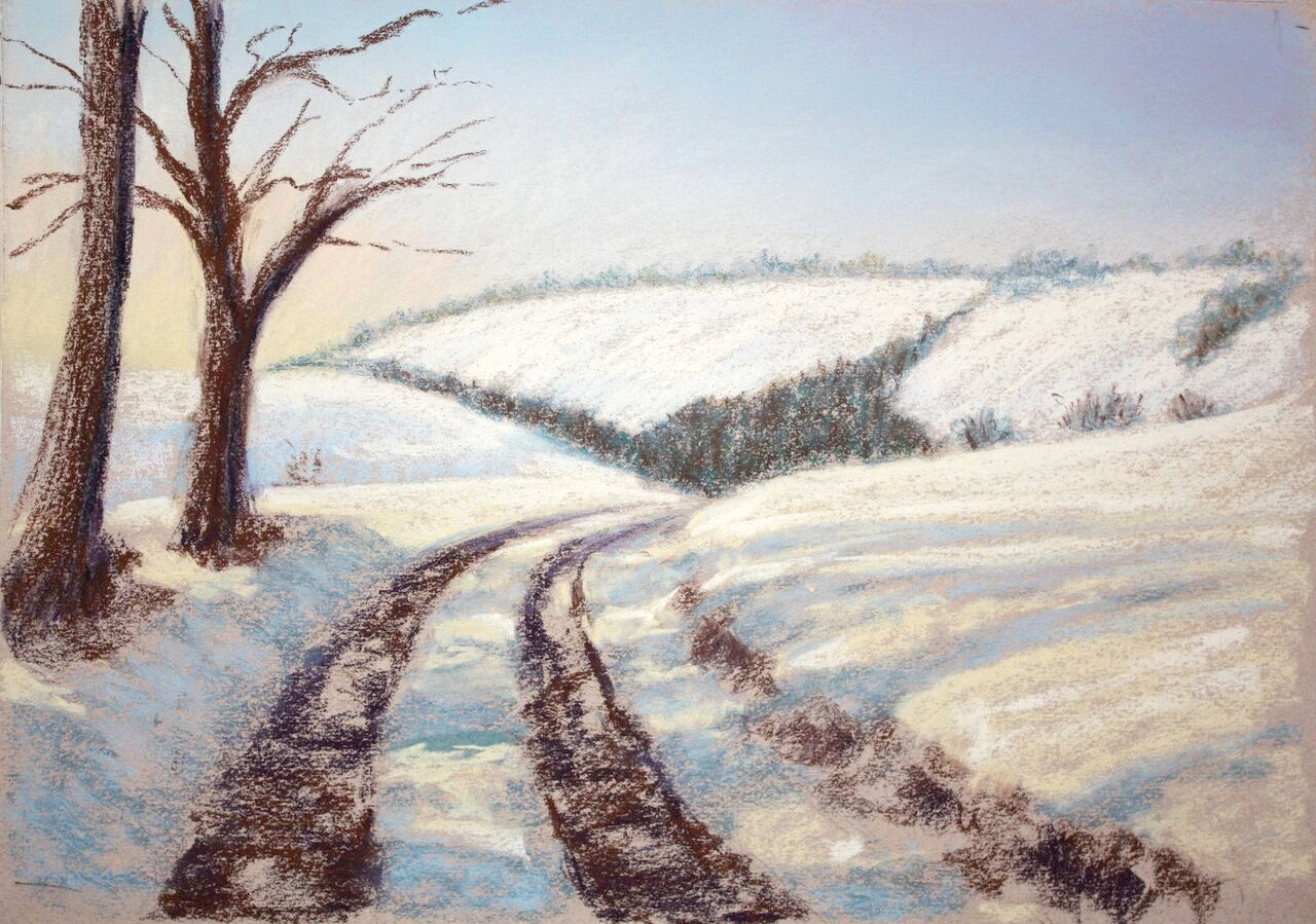
Work the tree branches with Burnt Umber and Deep Purple. For the plantation, make little vertical marks using Burnt Umber, Deep Blue and a tiny bit of Permanent Green. Repeat this on the line of trees adjacent to the plantation. The distant trees need to be lighter, so use Cerulean Blue and tip them with a little warm sunlight of Orange. Lightly smudge this to show recession (see Tip 2).

For the bushes underneath the trees, use strokes of Burnt Umber, Deep Green and Deep Purple. To show the warmer colours at the top apply Burnt Sienna and Orange. You can achieve fine detail here by using the very edge of the pastel with a light, relaxed movement. This is repeated along the tree trunks, branches and twigs, again capturing the warm sunlight. A little Orange can also be added to the plantation and mid-ground trees and smudged in. For the far fields and shadows cast by the trees, add some Cobalt Blue and Dioxazine Violet, then strengthen the shadows in the tracks and snow to give more texture and depth.
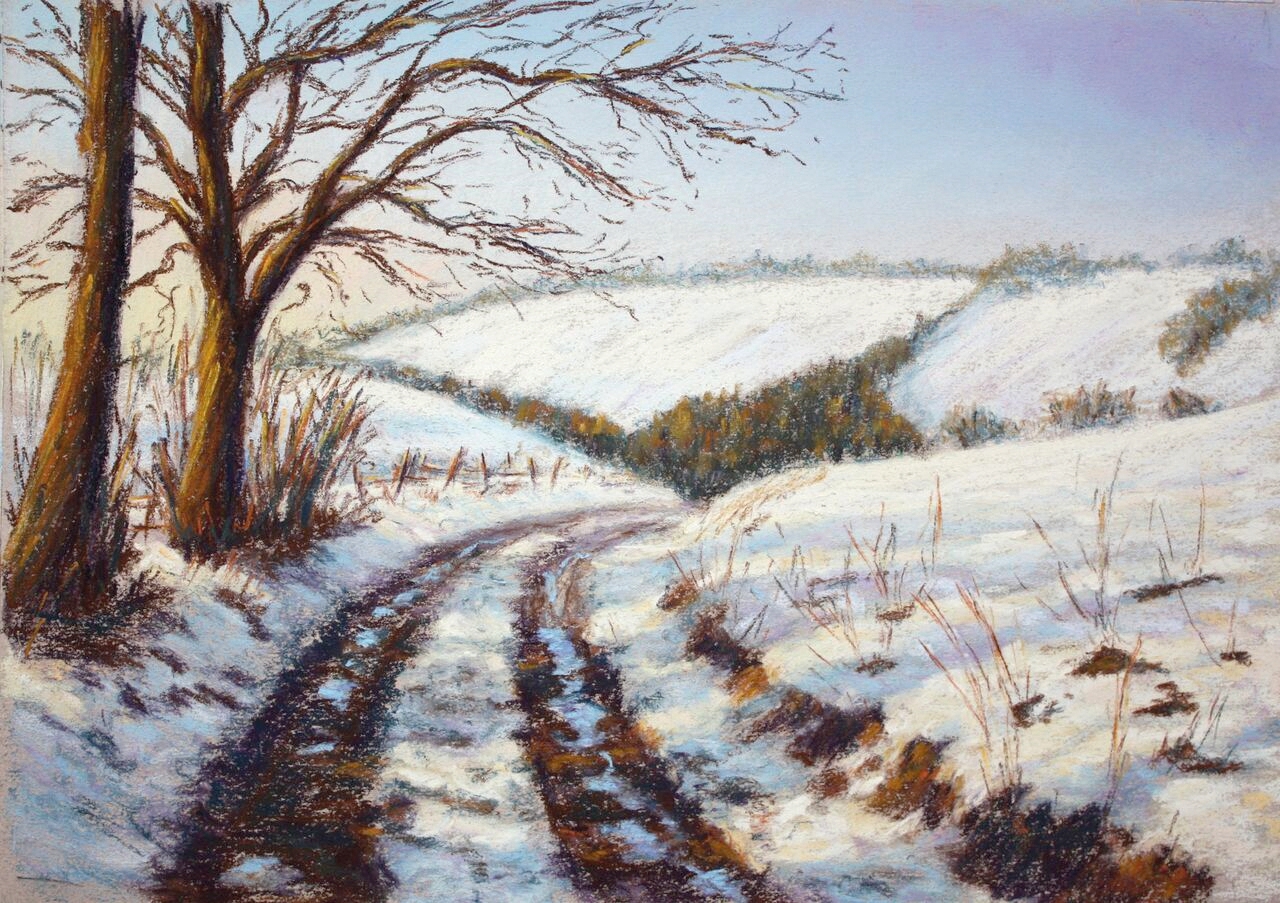
Use Burnt Umber for the fence, with Orange for the sunlight, making sure it has a recession, because as the fence posts get further away down the lane, they will become nearer together, smaller and less coloured. The fence has a cast shadow in purple and blue, and the puddles of melted snow reflect the sky colour, so use the blues you used previously for that. If you work the pastel in a horizontal movement, it gives the impression of level water, and these puddles will stand out because of the dark contrasts against them. For the soil, use the same combination of earthy darks and warm lights that were previously used for the bushes. Remember perspective, and adjust the heights, colour and tonal values accordingly. Finally, use orange-yellow to highlight the tree trunks, branches, fence top and grasses – not too much though! Don’t forget to smudge a little bit into the middle ground trees and plantation.
For more information on Catherine and her work, please visit www.cathinglis.com
This article was originally published in Paint & Create, the magazine of the SAA, one of the many benefits of SAA Membership.