
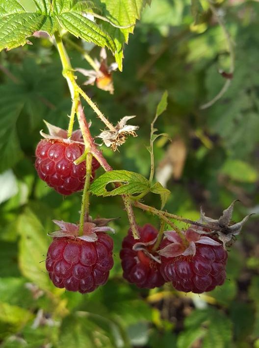
The Raspberry is a popular edible summer fruit, from the plant species in the rose family, which also includes apples, pears, almonds, peaches, plums, apricots, cherries, blackberries, and strawberries. Originating in Turkey and having been consumed and cultivated for thousands of years these now grow easily in temperate areas across the world. The etymology of the word Raspberry possibly originates from several sources describing the fruit’s texture and appearance, from the old French word “raspise” referring to “a sweet rose-coloured wine”.
Raspberries, like their cousin the Strawberry are not technically a berry in botanical terms as they are an aggregate fruit formed from a single flower with 50 to 150 ovaries, each in a separate drupelet which are clustered together around a central core, each with its own seed. True berries stem from one flower with an ovary which contains several seeds.
These rich pinkish red fruits are the inspiration for this pastel drawing using the Caran d’Ache Pastel pencils as I try to capture the richness of colour and the succulence of the fruit. The surface I have chosen to use for this step-by-step is the Clairefontaine Pastelmat paper Anthracite, which offers a smooth but grippy surface for the pastel pencils creating very little dust. Pastel pencils will smudge if you lean on them, so it is best to start from the opposite side to your dominant hand and work across, reducing the need to lean on the surface.
Shop Caran D’Ache Pastel Pencils
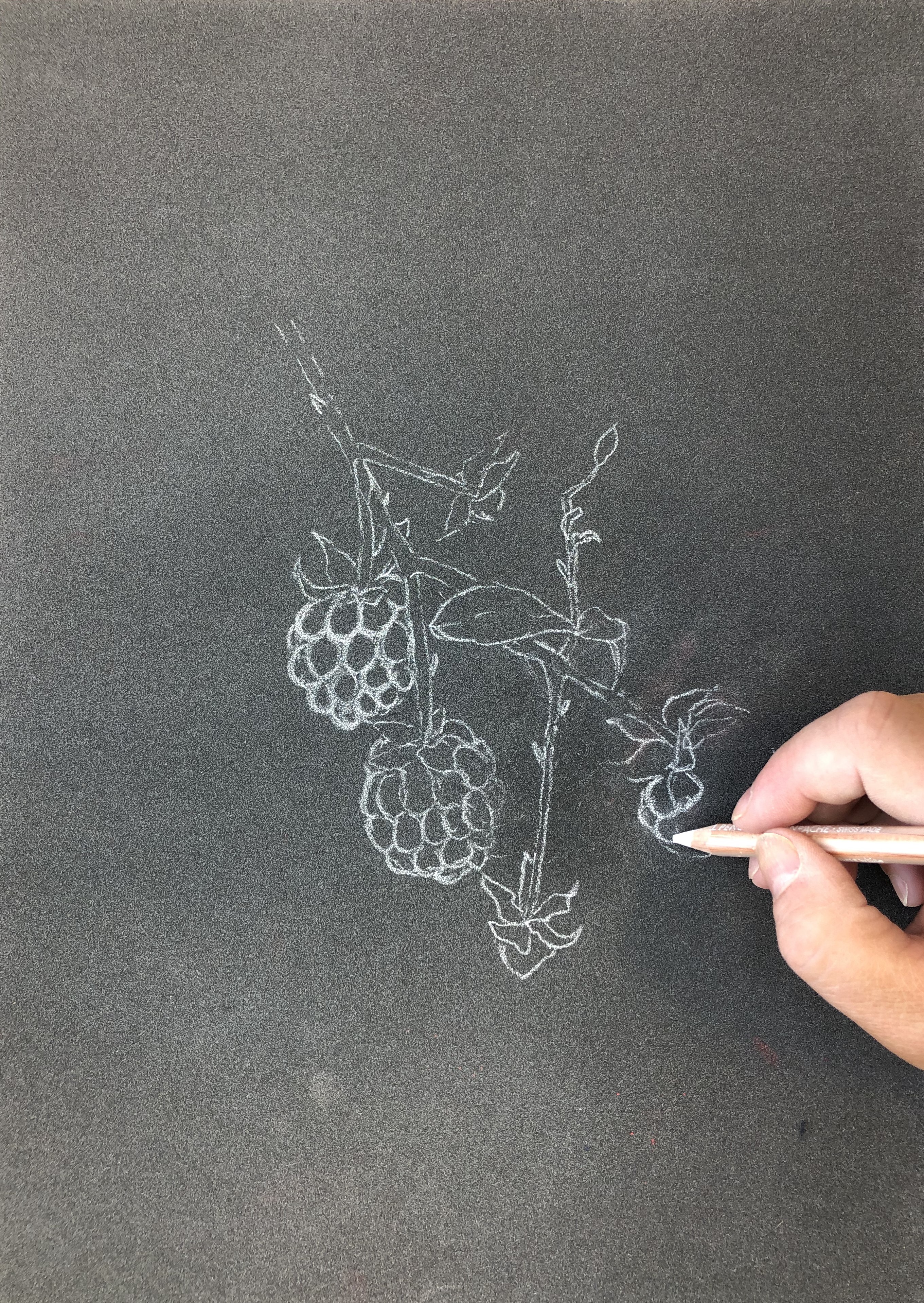 Lightly sketch out the raspberries with white pastel pencil, plotting the shapes and positioning on the surface. At this stage you can chose to amend or alter the layout of the subject in the reference photograph for a better or different composition. In this case the Raspberries have been made a little bigger, some of the stalks and raspberries have been removed. Any excess or unwanted lines can be gently lifted off with a kneadable putty eraser. Dab off any excess white pastel so the lines are very light and less likely to smudge.
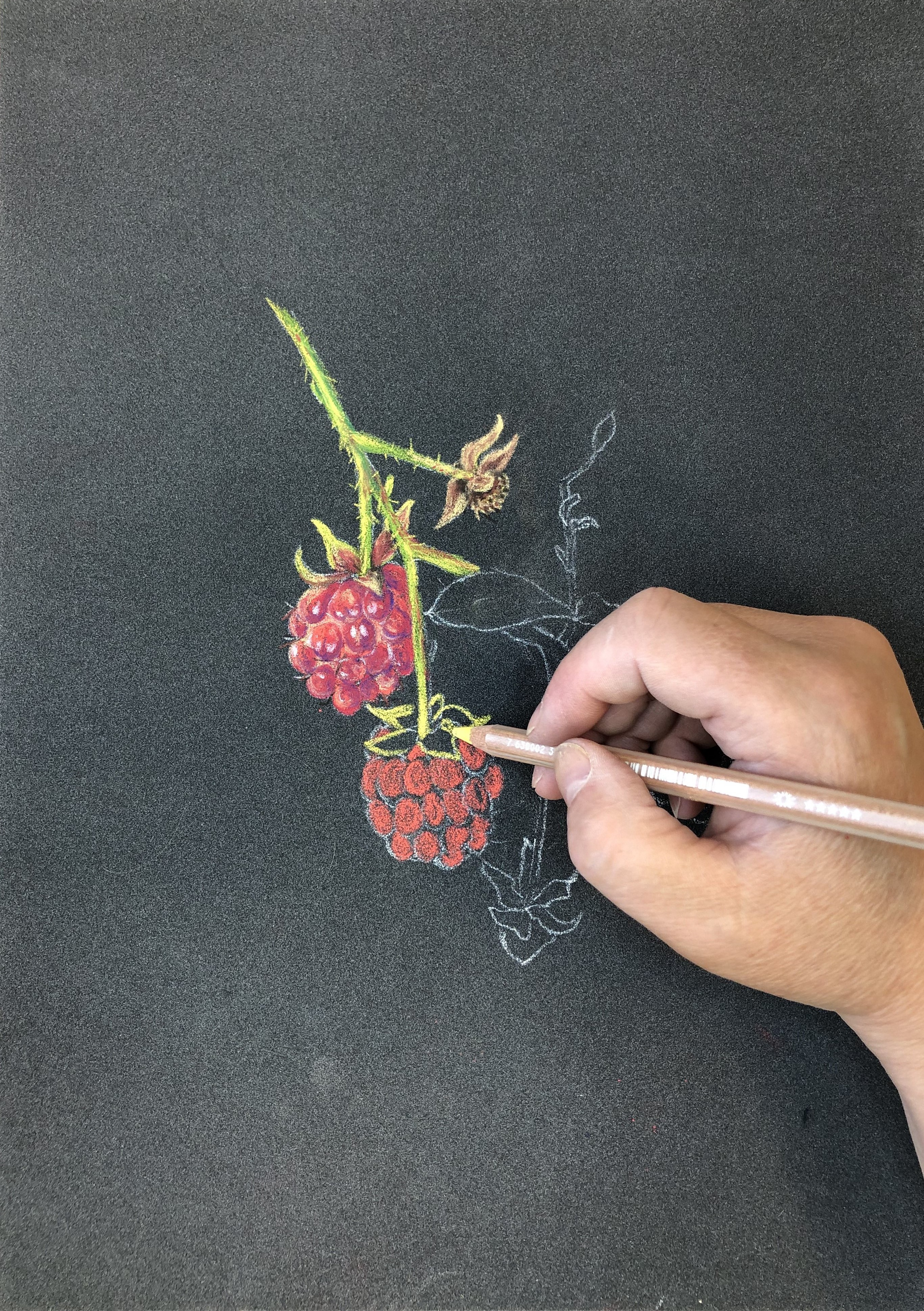
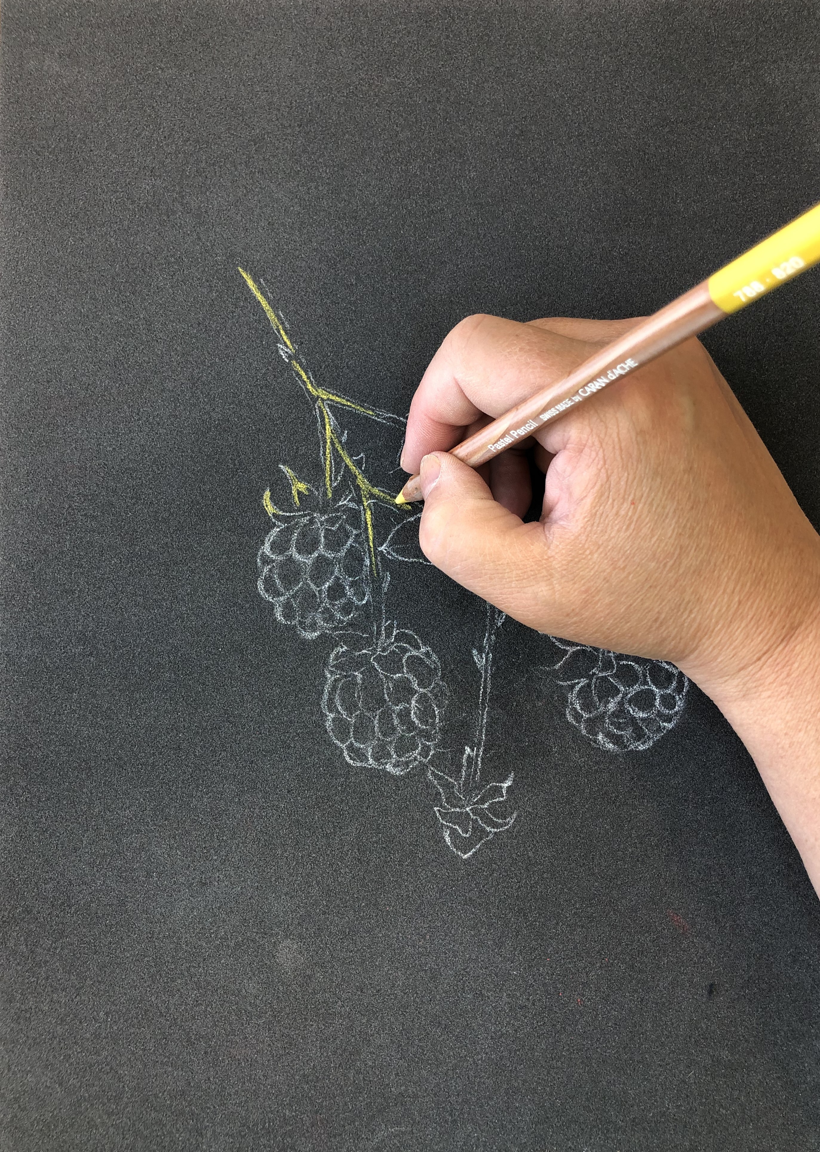 Starting with the Golden Bismuth Yellow (820) apply to the stems starting on the left side (as I am righthanded). Pastel pencils will smudge if you lean on them, so it is best to start from the opposite side your dominant hand. Working down the stems with lines of colour and around the edges of some of the smaller leaves at the tops of the first raspberry fruit.
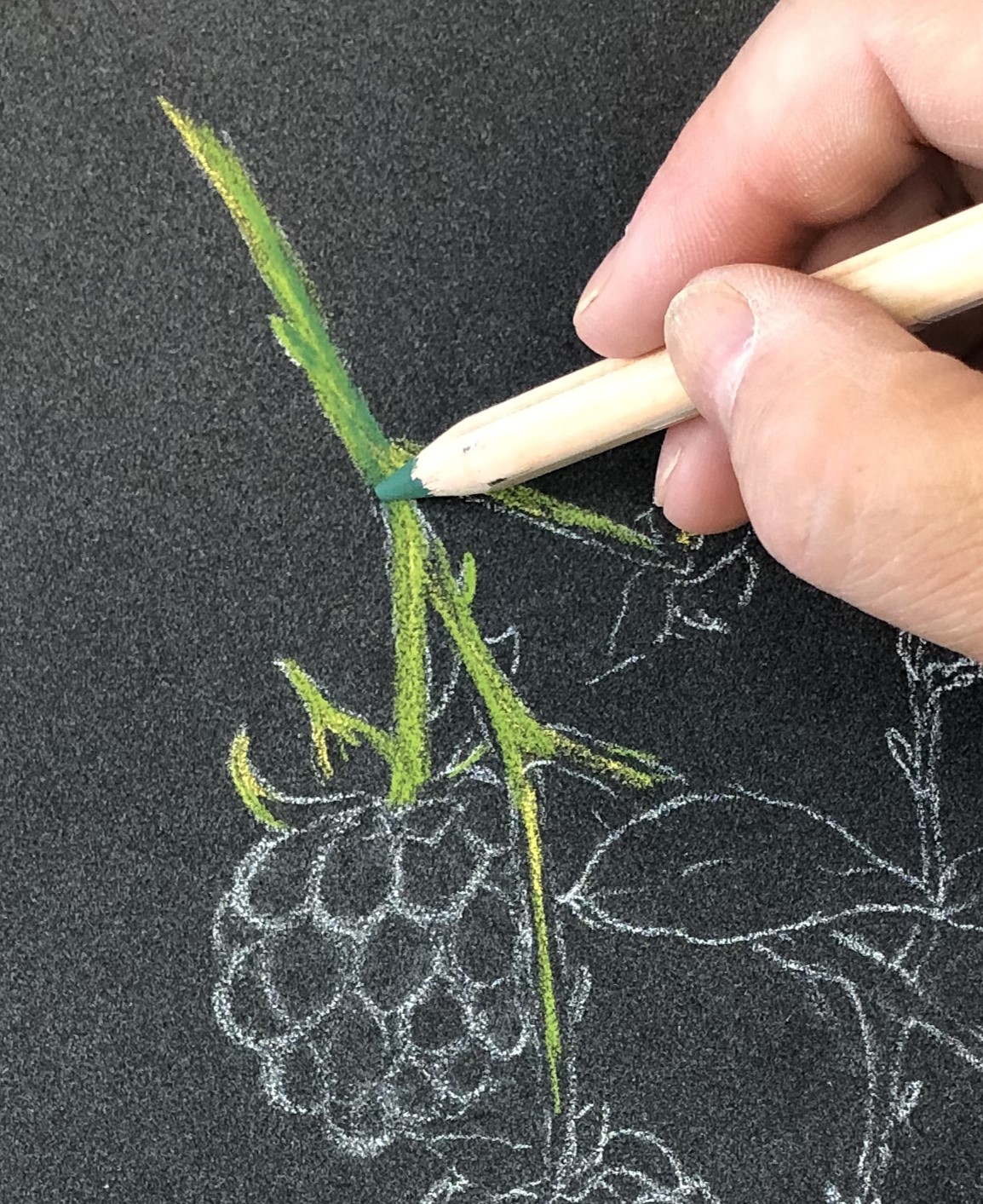 Then the Light Olive 40% (245) is lightly applied over the original colour to blend the colours together smoothly. Darker greens, Moss Green (225) and Mid Phthalo Green (718) are added to create definition and value to the stems. Return with the Golden Bismuth Yellow (820) to brighter the edges of the stems.
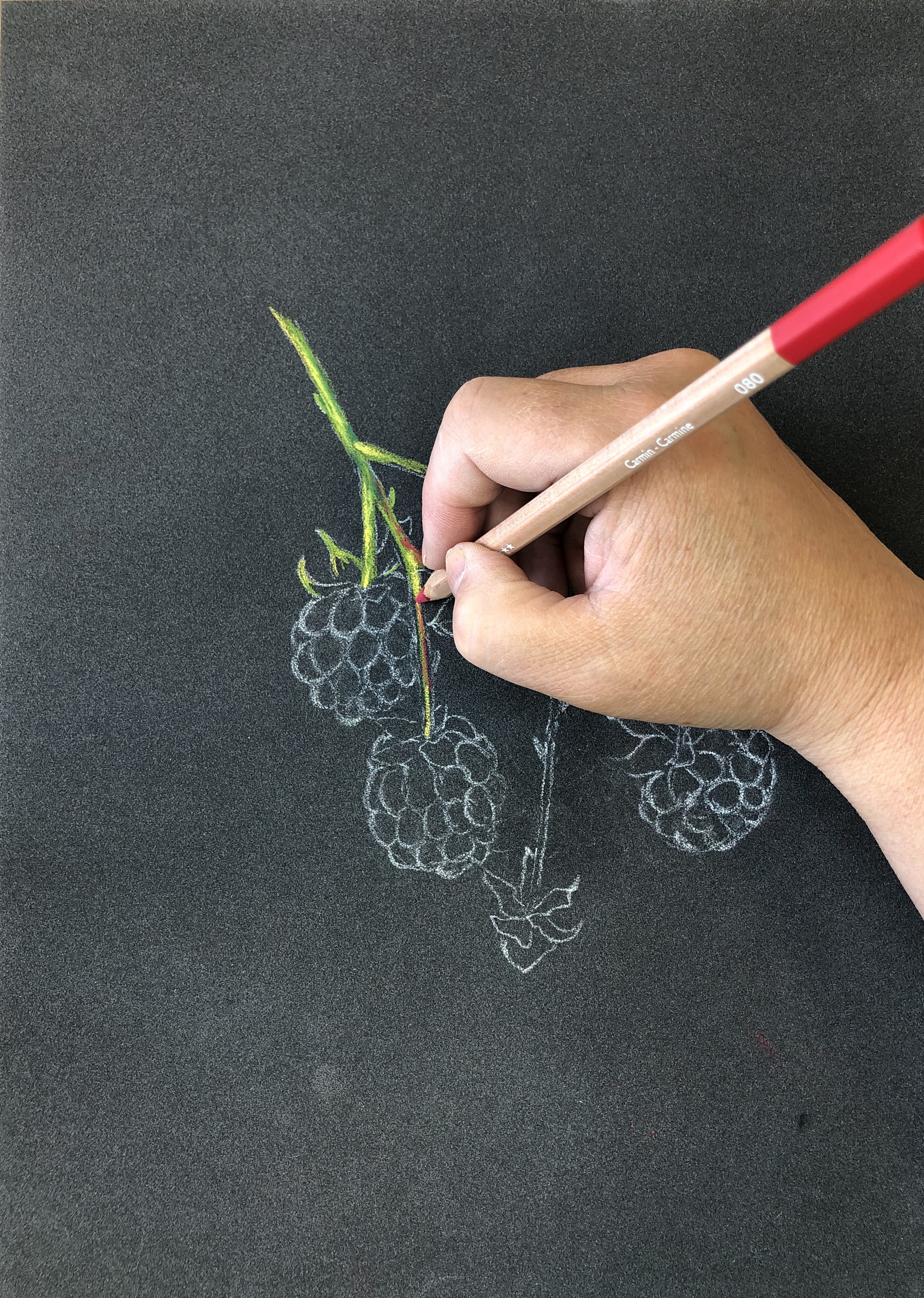 There are touches of a darker red near the intersections of the stems and using the Carmine (080), which is a strong colour light touches of colour was added into these areas.
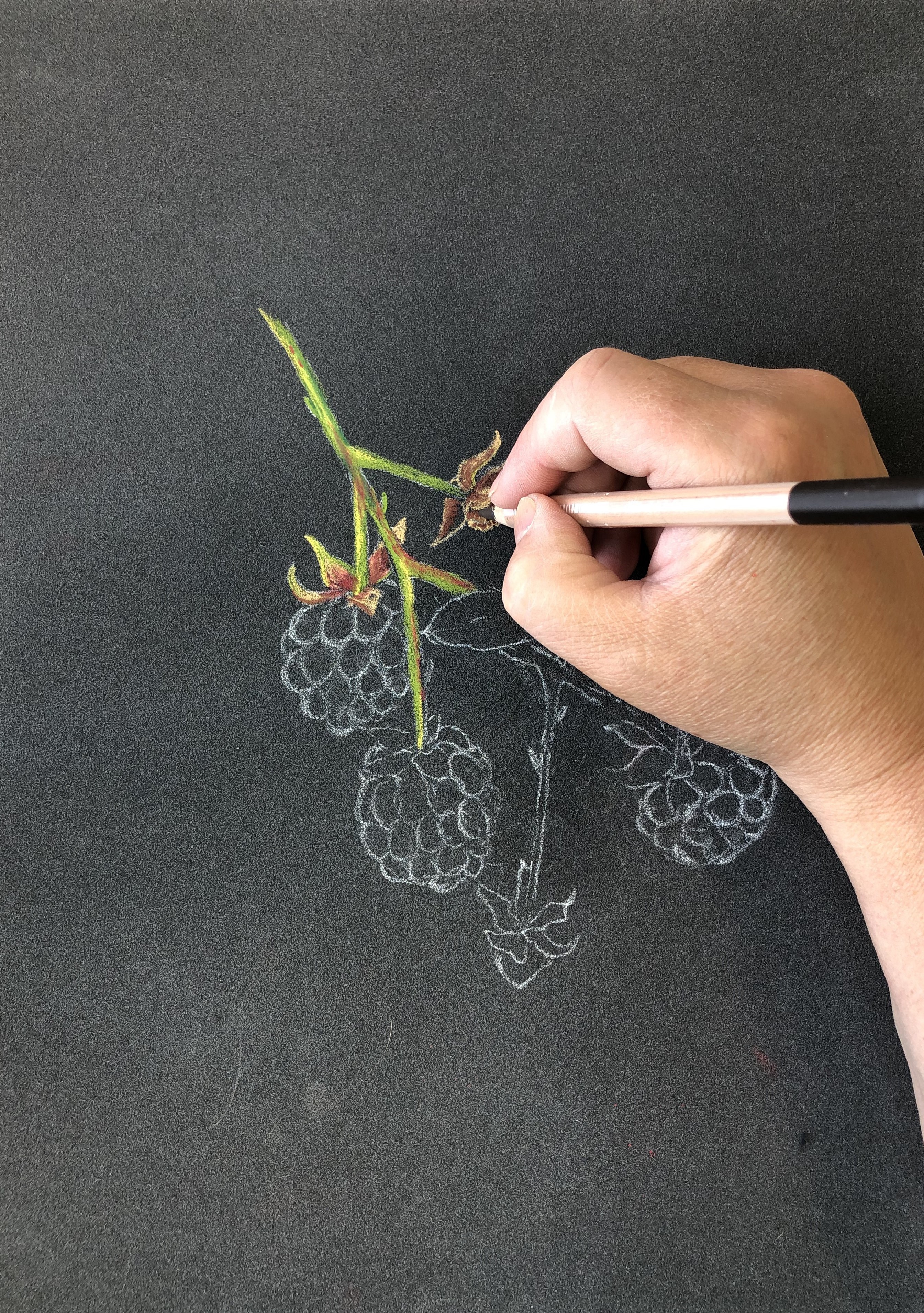 The leaves on the tops of the raspberries are a lighter brown sandy colour with touches of green and a deeper redder brown colour toward the base where the stem is attached. The leaves are lined with Golden Bismuth Yellow (820) and with the Light Olive 40% (245) and Desert Rose (042), colour was applied and blended. Then the deeper inner areas are created by a little Carmine (080) and Burnt Sienna (069) and a light layer of the Desert Rose (042), can be applied to blend and soften the colours. Colour is reapplied as needed to build up the desired effect. Moving across the drawing to where the fruit has been removed leaving behind a remanent attached to the stem. Use the same technique and colours used to create the smaller leaves in the first fruit, layering and blending as you go. Dots of darker colour with the Dark Sepia (408), are added to create depth under the leaves and the rougher texture of the receptacle.
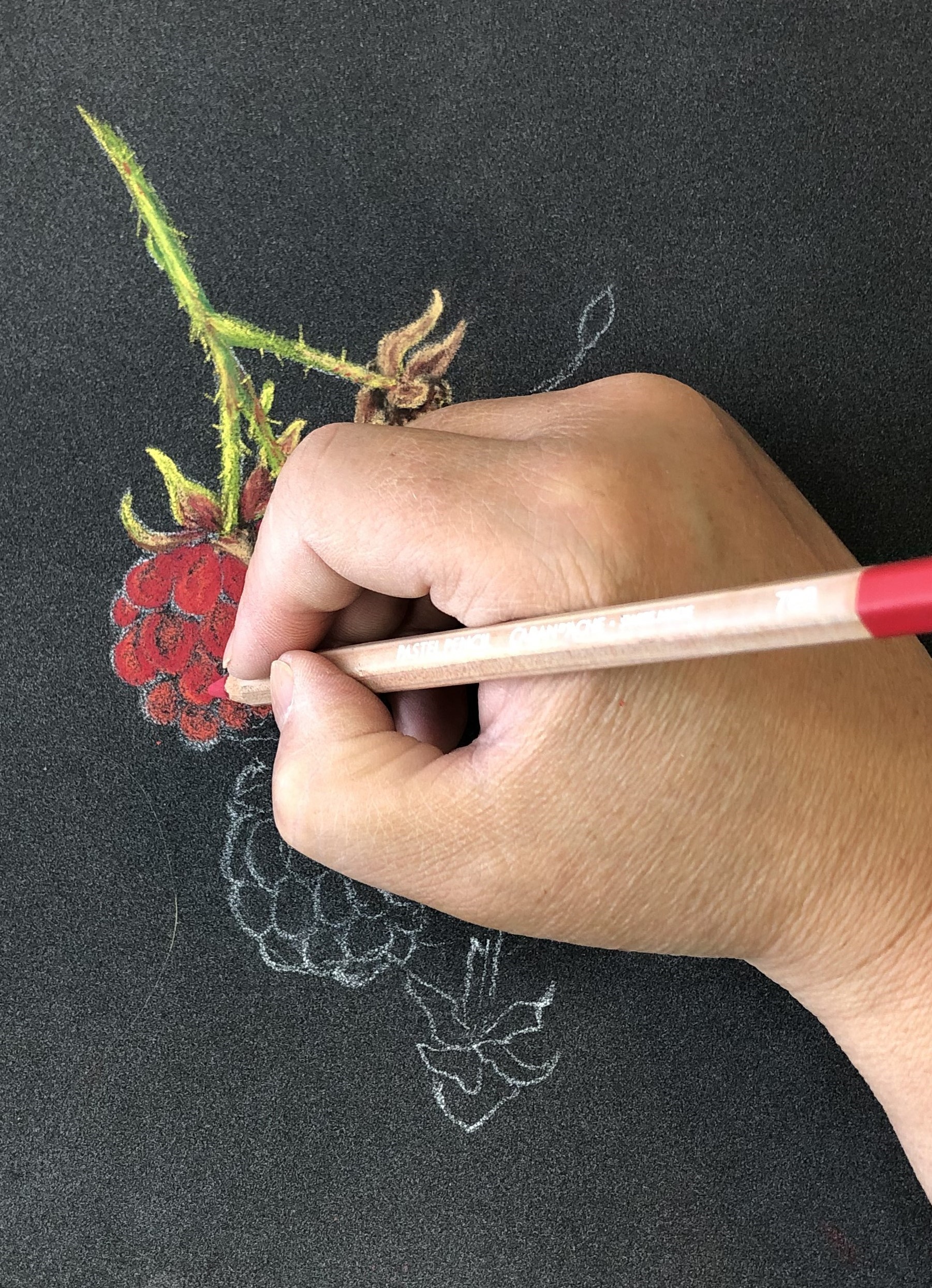 Move on to the rich bright berries by blocking out the shape with the lighter red Vermillion (060), using a circular action to fill in the shapes of the succulent round segments. Leave the white of the pastel pencil drawing still visible, as this helps to see the original drawn shapes. Use Scarlet (070) to build up the colour and Vermillion (060) to outline the rounder shapes. Darker Red Carmine (080) is added to create more definition in each of the drupelets and purple Cobalt Violet (620) around the bases and edges of sections. The purple can be a little too harsh, but this is easily blended with layer of the red.
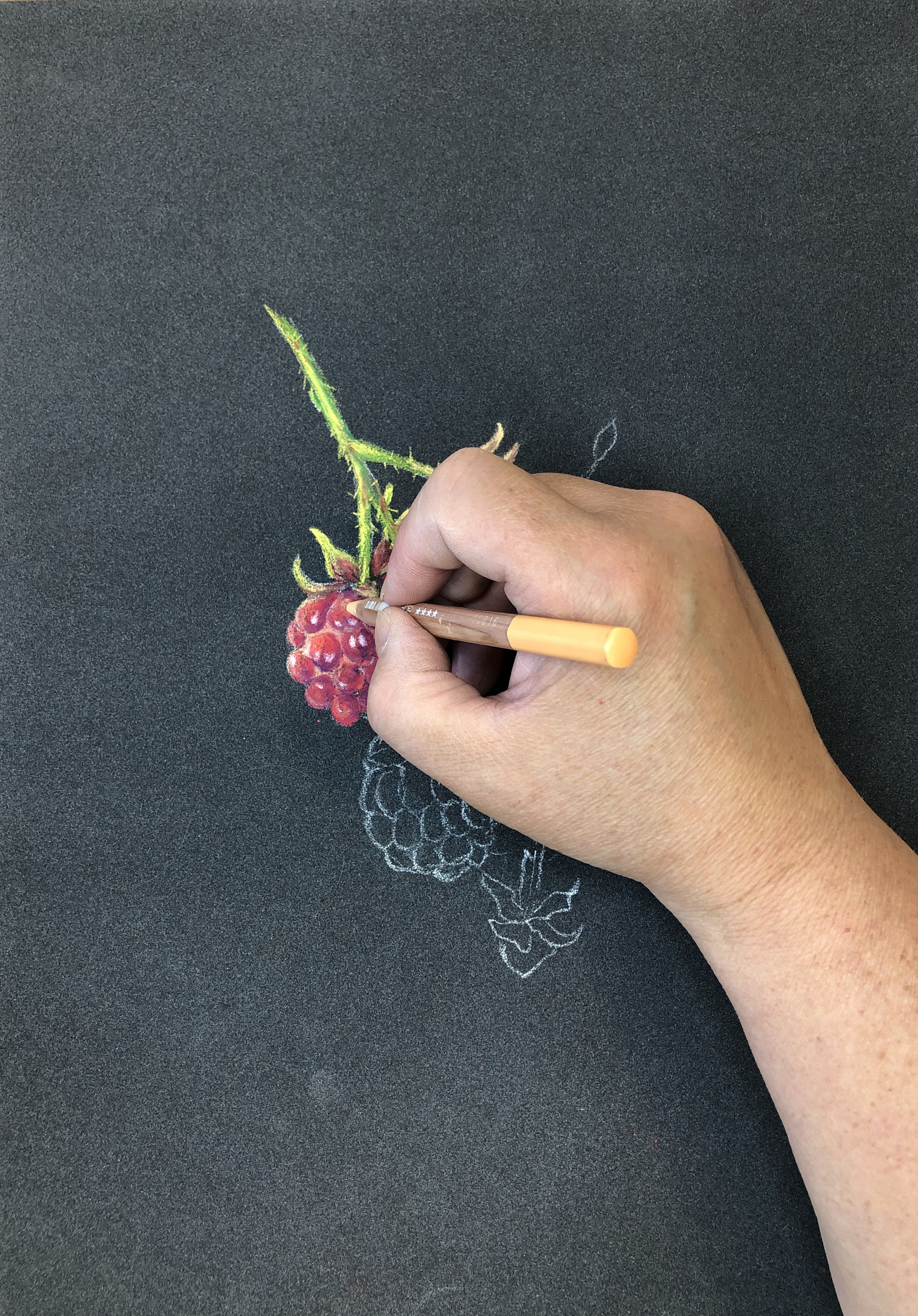 Continue to blend the reds to create the succulent shapes. To create the highlights where the light catches the highest points with Desert Rose (042), this is a softer colour to enable gentler areas of light. Notice how some of the Drupelets have a dimple which catch two spots of light. The white is added to create the very lightest areas of light, continuing to adjust the shapes, shadows, and light. The very darkest areas especially under the sepal leaves are achieved with a few touches of the Dark Sepia (408). Repeat the process moving on to the lower section by working down with the colours for the stem and leaves and for the next raspberry fruit building up the colours in the same way as the first fruit
 Moving across the drawing on to the right side and on to the Light-green, oblong, toothed edged leaves, which are highlighted with the Golden Bismuth Yellow (820), and in the same way the stems were created by building up layers of colour the leaves are formed using layers of greens and yellow. The darkest green, Dark Phthalo. Green (719) is used for greater depth and shadow as well as the fine veins on the leaves. The Desert Rose (042) pencil is a soft warmer light colour teamed which stops the white highlights becoming too bright.
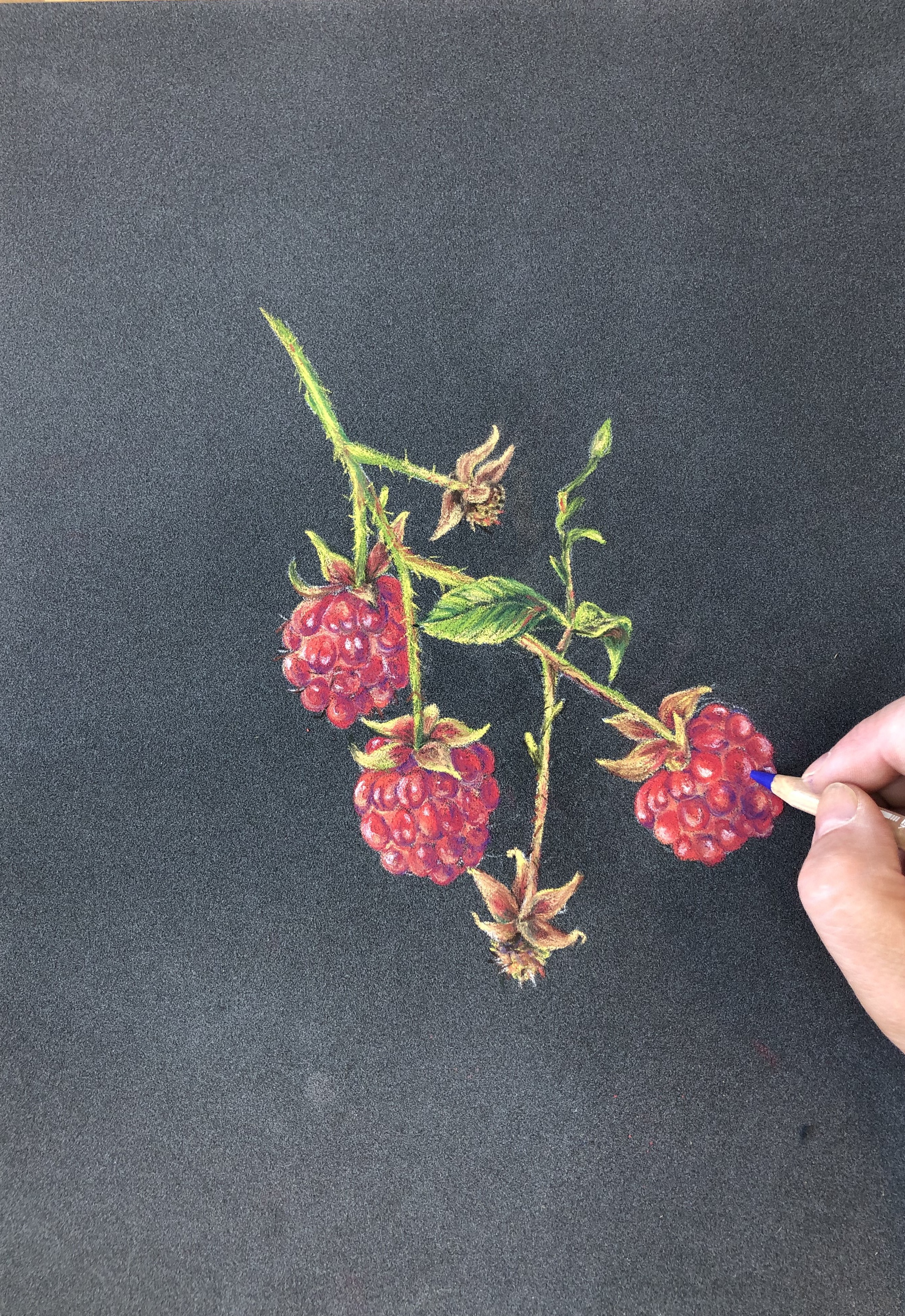 The remnant of the receptacle left behind when the ripen fruit is removed, is created with the same colours as use in the one higher up and the final Raspberry is blocked out with and in the same way the other fruits and been created layer and blend colour to form the shapes, shadows and highlights. Finally revisit any areas which may need a little more colour, light, shadows, or details until you are happy with the results.