For drawing and painting people, whether they are moving or at rest, soft pastels are the perfect medium. What else can give you such a wonderful combination of speed, with a huge variety of marks at your fingertips but also the ability to make corrections as you work?
My work is based fundamentally on a simple understanding of the structure of the figure. Your figure drawing will improve rapidly with some time spent learning the basic proportions of the human skeleton, and then looking at how the body moves. There are many good life drawing classes around, but personally I learnt a great deal from books about drawing the human figure.
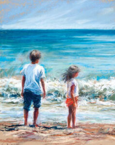
I think of the skeletal structure as I sketch out my people, but simplify them to stick figures, and try to imagine how their feelings might affect their body language. Are they feeling excited, competitive, full of fun or mischief? How does this make them stand or move? I can often be seen in my studio adopting positions I’m trying to capture, which must be hilarious to watch!
I use a mixture of Unison pastels, SAA pastels and Pitt pastel pencils, and I work on a whole range of pastel papers, including sand paper and Art Spectrum Pastel Primer painted onto card.
 If you are working from photographs, the reference has to be really good, with a strong pose and if possible good light. Often my best pictures come from real moments that I was lucky enough to snap quickly. I take lots of photographs, and do quick sketches of several poses to decide which works best. I never know until I actually draw them which will make the best painting.
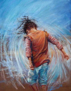
For me, having captured the body language of my figure correctly, it’s the mark making that will bring it to life. To start with, a loose drawing rather than a careful tracing will introduce some energy, and get your work off to a lively and courageous start. Looseness comes with practice and confidence; the more you do, the easier it gets. It’s easy to be bold and brave with pastels, because you can always make changes if it isn’t quite right. Then, don’t confine your marks and colours to where they ‘should’ go, let them overlap, dance around and blend with other colours around them. The freer you are with your marks, the more movement you will capture, even if it is just the feeling of a fresh breezy day. Smudge some of them, leave others fresh and clear.
 By combining strong energetic marks, and little flicks, dashes and broken lines, I build up the image gradually. By varying the weight of those marks and lines, I can enliven the image more. Skin and hair can be softened with my finger, as can the edge behind the figure as it moves through space. I make the leading edge strong and often make it a dynamic tonal contrast with the background. This, combined with a softer edge behind, can appear to ‘pull’ the figure forwards. Contrasts in tone create strong focal points or areas and I love using these to give my work some drama.
 One of the many joys of pastels is that you can use them to draw as well as to paint. By using lines as a tool, you can guide the viewer’s eye around the picture, and use strong lines or marks to point like arrows. Twists and turns in the body can be added to by taking the lines beyond the edge of the figure, and linking with another area of the picture.
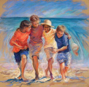
 Colour isn’t a simple subject, and for years I found it quite terrifying. I choose a limited palette, and I like to dab and flick colours from one area of the picture into another place to surprise the viewer. My favourite game at the moment is to use complementary colours of similar saturation next to each other to dazzle the eye in places, such as bright orange on the edge of a figure against the bright blue of the sky. You can almost create the illusion that the surface is moving just by your combinations of complementaries. Take a look at the later paintings of Monet or Seurat to see what I mean.