The dark truth behind some of the most popular paint pigments is one of art history’s best-kept secrets, but do you know how gruesome your paints once were? In this article, we explore the history behind 4 of the grizzliest paint pigments.
First up in our hall of horrors, is Bone Black or carbo animalis, which is exactly what it sounds like – a black paint pigment made from finely ground animal bones. These bones are charred and carbonised to create the rich black pigment found in paints. This process means that the paint has around 10% carbon. Nowadays, Bone Black and Ivory Black are used synonymously. Traditionally, Ivory Black was made similarly but used ivory pieces instead of animal bones. However, due to the illegal poaching of animals that are natural sources of ivory, they are now under international protection and many species are recognised as endangered. Now, Ivory Black, or any paint with a PBk9 pigment number is still produced using animal bones. For artists, Ivory Black is considered better than Bone Black due to its higher Carbon count.

‘Girl with a Pearl Earring’ – Johannes Vermeer
Recent studies on the works of Rembrandt have shown the use of Bone Black in his initial wash-like sketches. Similarly, Bone Black was commonly used by Johannes Vermeer to create shadows and a Chiaroscuro effect in his paintings. This pigment was used for the dark background in the iconic ‘Girl with a Pearl Earring’ by Vermeer.
But is bone still a main ingredient in modern paints? Actually yes! Certain manufacturers still use animal blackened animal bones

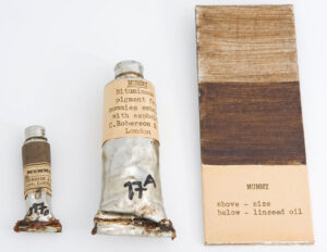
Mummy Brown Paint (photo credit – President and Fellows of Harvard College)
Mummy Brown (also known as Egyptian Brown or Caput Mortuum) is a rich brown pigment that sits between burnt and raw umber and has great transparent qualities. As the name suggests, this pigment was made with the flesh of mummies and was extremely popular in the mid-eighteenth to nineteenth century. However, as supplies of mummies diminished and artists became unhappy with the pigment’s finish and permanency, the pigment fell out of favour.
Egypt fever swept most of Europe during the late 1600s, and mummies were prized for their ‘medicinal’ properties. The trade and export of mummies from Egypt took the world by storm and became a huge market. The Europeans happily ate, drank, and rubbed mummies on themselves, so it is no surprise that they used it to create paint pigments as well. This rich brown pigment was created with the ground flesh of mummies and mixed with white pitch and myrrh. This paint pigment was available right up until the 20th century but could be bought as early as 1712.

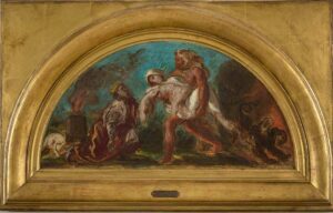
Detail from the Mural in the Salon de la Paix, Paris by Eugene Delacroix
Documentation of Mummy Brown being used in paintings is hard to come by, as the pigment composition was very varied and difficult to determine with the use of expensive specialist testing. However, there is a general acceptance that this was commonly used amongst artists in the 1700s for glazing, shadows, and flesh tones. It was one of the pigments used by Delacroix for the piece ‘Salon de la Paix at the Hotel de Ville’ in 1854.
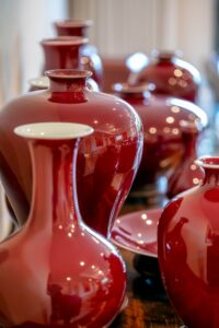
Oxblood Red (or sang-de- bœuf in French) is a deep red pigment which dates to the start of the 1700s. The name is derived from the colour of the blood of an ox. Originally, the blood was used to dye leather, fabric, and paint. Known for its deep drown and purple undertones, the blood-based dye would change from a bright red to a brown-red as it oxidised over time.
According to legends, the boats of the corsairs from the 14th – 19th century were painted using oxblood to mimic the blood of their victims and make them appear more gruesome. Beef red, derived from cows instead of oxen, was a common dye used to paint bridges and barns in the United States during the early 1900s.

Vases glazed with Oxblood Red Pigment
Nowadays, ox blood is not used in paints but is still a common colour name and is still a very popular shade for leather goods.
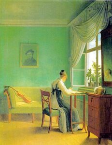
Scheele’s Green (also known as Schloss Green) was an extremely popular green paint containing arsenic. This pigment was invented by Carl Wilhelm Scheele in 1775. By the end of the 19th century, this pigment had virtually replaced all other green paint pigments. From the start, Scheele knew that the pigment he developed was highly toxic, but the lucrative lure of manufacturers using this dye in clothing, wallpaper, paint and more proved to be too irresistible to Scheele.
The toxicity of arsenic compounds was not readily known, and in the 19th century, there was a rise in cases of children ‘wasting away’ in rooms painted green, or ladies swooning in their green dresses. A reported case of acute poisoning was reported when children became sick after attending a Christmas party, where green-dyed candles were burnt.
Although some European nations started banning arsenic-based byes and pigments in the 1830s, it was not until the 1860s that the dangers of the pigments were fully recognised by the public. 19-year-old Matilda Scheurer died as a result of her job, where she had to dust artificial plants with Scheele green powder. She suffered repeated illnesses because of arsenic poisoning, which led to her death. A detailed autopsy discovered her fingernails and eyes were stained green as a side effect of over-using the pigment.

‘Woman Embroidering’ – Georg Friedrich Kersting
World-renowned Victorian designer William Morris was found to be using arsenic-based paint pigments in his wallpapers. During this time, there were many suspected poisonings linked to the use of these pigments in wallpaper. However, during the growing concerns over arsenic, William Morris wrote ‘As to the arsenic scare, a greater folly is hardly possible to imagine: the doctors were being bitten by witch fever.’ in a letter to his dye manufacturer. To learn more about William Morris and his use of arsenic dyes, you can read the article by the William Morris Society.
The toxic nature of this paint may have been why the colour green began to decline in popularity during the latter half of the Victorian era.
Blue and Yellow don’t always make Green, but arsenic did! If you want to learn more about different shades of green, why not check out the video by SAA’s In-House Artist Anita Pounder.
If you fancy expanding the range of colours on your palette, why not check out some of the incredible colours available with the SAA? Click here to shop.