
Objectives: To learn a bit about the theory and use of complementary colours and composition in a painting.
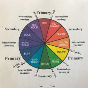 The colour wheel is provided to help with colour theory in this lesson. I suggest you make your own and stick it in the inside cover of your sketch book so it’s easily found.
Look at your green apple and notice all the different “greens” you can see. How will you mix these greens? They are bright! Blue and yellow make green, to make bright greens you need the cooler colours. See colour wheel with the names of colours written on, add these to yours to remind you where they belong. So, the apples are mainly bright yellowy green, look opposite this on the colour wheel and you find red violet (or purply red!) – this is the reason I’m choosing Crimson as a background, it is the complementary colour.
Cover a piece of paper in Crimson – you could practise your blending with a filbert brush – or just do it roughly with a flat brush. The filbert brush has a curved edge so is more conducive to blending. If you have Retarder or Flow improver mediums, these will help the colours to bend more easily. Leave this to dry while you practise the following techniques.
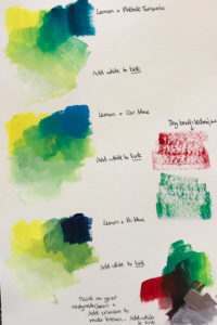 Use a cool yellow and cool blues to mix bright greens.
Choice of yellows: Lemon Yellow
Choice of blues: Coeruleum Blue, Prussian Blue, Phthalo Turquoise
Mix the greens using yellow first (as it’s lightest) and each of the blues in turn, then add white to tint (see photo ref). If you have ready-made greens I suggest you try them out, but you will still need to add blue and yellow to the colour to vary the tones and hue.
Add the Crimson red to your green to make “black” for darker areas and for the brown of the stalk. Add white to tint your dark colours
Choose any colour on your flat brush, get rid of the excess paint on a paper towel and drag the flat of the brush across the paper until you get the effect seen in my example.
On a different piece of paper “draw” the shape of the apple with watered down green paint. Use a flat brush to apply the different shades of paint looking closely at your apple and noticing which bits are yellowy green and those that are bluey green, whilst also looking at tones where the colour is darker or lighter. I used quick dabs to keep the colours clean and free style. Remember to add white to “tint” your colours for the lighter areas and add the “black” for the darkest areas (eg where the stalk comes out). Add white highlights where the light is shining on the apple. Look at the markings on the apple, there are dots & dashes on Granny Smiths! You can add these by using the end of your brush and printing them on (see photo). Add a shadow using the “Black” you mixed with green & red ensuring you look carefully at the shape of your shadow.
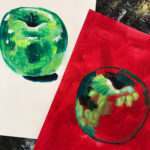
Now follow instruction 7 again, but on the Crimson background. To challenge yourself, try leaving bits of the red showing through by using the “Dry brush technique” (see photo). Don’t forget to add the highlights and markings!
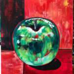
Continuing with the theory “Rule of thirds” Divide your background into thirds using watered down green paint (see photo) Use different shades of colour to fill in the sections. NB I used vertical strokes for the top half and horizontal strokes for the bottom half.
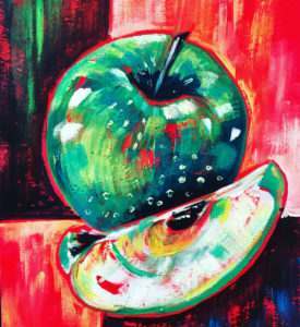
Cut a segment out of your apple and add that. Notice the “white” of the apple is actually a very, very light green, so you need to Tint your green, although because it is whiter rather than greener add the green to the white rather than the other way round. Add pips the same way as the stalk and notice any shadows caused by the segment against the apple!