
Classical composition – used by the Old Masters – was created through geometry and mathematics and the sophistication of their designs is undeniable. Nowadays classical composition is rarely taught, because the emphasis is on freedom of expression rather than craft. As a consequence, many of us latch onto basic compositional models like the ‘rule of thirds’, because it’s easy to follow and is commonly accepted as visually appealing.
During lockdown, I began to explain classical composition. In the process of doing this, I came up with the idea of printed compositional plans: readymade blueprints that could be used by anyone to help map out their image. As soon as I had made the first printed plan, I began experimenting with picture ideas, using tracing paper to draw out my designs. I could not stop. At first the pictures were quite traditional, but quickly they became more abstract. It was fun to do and it worked like a Swiss watch.
I passionately believe that compositional plans could help drastically improve your designs. To help sway you to my point of view, I’m giving away a free a blueprint (which you can download here) that shows the model of construction on which the rule of thirds is based: the golden section. This planner shows the key lines and boxes used by some past Masters when making their art.
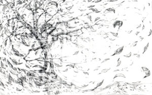 Drawing on tracing paper over the planner, I carefully positioned the tree’s trunk and limbs to help lock down the composition. To impose a strong feel of rhythm and movement, I then drew flowing lines around the image to indicate the twist and turn of the wind on which I placed leaves at various angles. Wherever possible, I positioned the leaves on the lines of the planner to help tighten the composition. To transfer my work to watercolour paper, I then placed the tracing paper cartoon drawing onto a light box and carefully traced the image onto hot pressed paper, which is easy to draw on and is great to use when I want to make the watercolour appear sharp and detailed. My plan regarding colour was to leave quite a lot of white to make the image look fresh. The painted areas would be divided into about 80% browns, oranges and yellows, 15% cold blues and 5% guest greens to draw your eye in key areas. This sort of colour division is a reliable formula for making striking artwork.
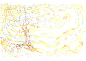 The painting began with ‘thin to thick to thin’ yellow and blue seed shapes which followed the rhythmical lines of the original drawing. The tree and leaves were then added in precisely the positions mapped out in the cartoon.
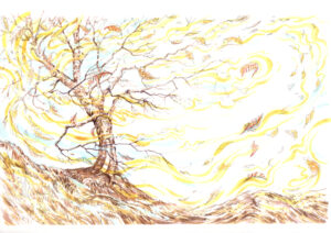 The tree and landscape were then carefully rendered to reflect the rhythm and flow set out in the first stage, hopefully making the painting look alive with movement. This was done by using mainly small painted lines and seed-like shapes, aimed in the direction you want the viewer’s eye to follow. When you want the viewer to stop on an area, use dots.
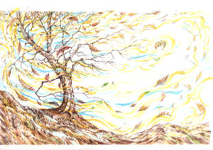 Adding a small amount of variation to the colours enriches the look of the image and makes it a little more believable.
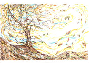 By sharpening the edges of the shadowed areas, the picture became more clarified. This was done with watercolour and some small additions of gouache to add an extra degree of sharpness where needed and lift certain areas with highlighting. The final results were an interesting blend of realism and stylisation. The process of carefully planning the artwork made me more sure of success. I produced the painting quickly and without a great deal of fuss. It did not feel difficult, stressful and frustrating. So, the message is simple: sort out your composition and you will take much of the strain out of making your art. Download the planner today, buy some tracing paper, pick up a pencil and begin planning your own success story.
Notifications