
The health of coral reefs is a hot topic worldwide, with the ongoing threat of warming seas and a daily deluge of plastic packaging. I used to be a scuba instructor, diving in the Caribbean’s shallow, sunlit reefs every day. It led me to think of its residents as ‘friends’, rather than just ‘fish,’ especially since some always hung out in the same spot. This is how I captured a few of those friends in watercolour, with texture techniques.
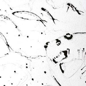 From two reference photos, I did a quick thumbnail sketch, to plan the position of fish, lights and darks, then drew the layout with light pencil lines, onto watercolour paper. I like heavyweight paper, knowing it will handle a lot of washes without buckling. Next, I applied masking fluid to all details I wanted to save as white or have texture. I used the Fineliner masking fluid like a pen, drawing loosely and quickly to avoid heavy blobs. Moving quickly forms gestural marks in the work: unique and recognisable, like handwriting. Then I added a healthy dose of spattered masking fluid, for vitality and a mysterious touch.
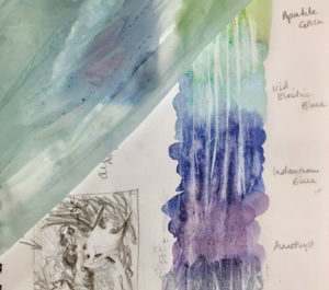 While the fluid dried, I tested my new Daniel Smith colours. I was excited to try the famous mineral ores and semi-precious gems, which give a subtle shimmer, in hues like Amethyst Genuine, Green Apatite Genuine and Iridescent Electric Blue – perfect for seawater. I also wanted some subtle texture in the water column, hinting at surface ripples, showing the way light filters down beneath the surface. Cling film technique could be used to create that effect. However, since I am constantly striving to reduce my plastic usage (helping towards a cleaner ocean) I needed an environmentally safe substitute. I decided to try biodegradable cornstarch bags instead (commonly used for composting food leftovers). Test results were pleasing – I would use this later.
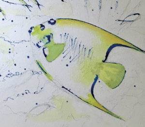 With the masking fluid dry, I used my Quill brush to add the first yellows (Hansa Yellow Light), dropping in touches of Green Apatite Genuine and Aussie Red Gold, whilst wet, to my largest fishes. I washed some yellow into the background and foreground areas, working across the painting. Yellows always look so bright at the start of a painting, but appear to fade once stronger colours are added, so I made the washes quite potent.
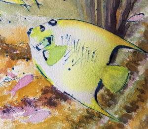 It is easy for underwater paintings to become predominantly blue. Sunlight has to pass through the depth of water, which absorbs warm hues, so red things appear greyish, both to the eye and the camera. To ensure the final painting had enough warmth, I developed an underpainting using Hansa Yellow Light, Aussie Red Gold and Quinacridone Magenta, scumbling drybrush (using a Size 12 Round) to create texture and framework in the foreground reef. Next, I washed in some distant blues: a thin wash of Iridescent Electric Blue for the water and Indanthrone Blue for the three Doctor Fish and distant soft corals.
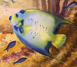 I created contours in the fishes by moistening the fish body with clean water and my Size 12 Round brush, then dropping Iridescent Electric Blue and Indanthrone Blue, with minimal brushwork, allowing the pigments to settle and blend by themselves, producing a soft, shimmery look.
With the bright warm colours fully dry, I added another layer of masking fluid, to suggest coral structures, seaweed and general undefined texture. I added the latter with a toothbrush and a sideways, scratchy movement. I doodled masking fluid over areas of ‘mustard’, a healthy colour for coral, creating structures in the middle distance. When the masking fluid was dry, I added thicker washes of warm tones: Quinacridone Magenta and Green Apatite Genuine. These darkened the soft corals behind the Queen Angelfish (right). Greens were added behind the two Butterfly Fish (left) and more contours in the foreground, to show up the masking fluid texture.
Next came the blues, with ripple texture, to create the illusion of distance and the feeling of being under the water. I mixed up big puddles of Indanthrone Blue, Iridescent Electric Blue, Lunar Blue and Amethyst Genuine. I lay down generous washes of these with my 2″ Wash brush, varying the mixture, across the entire top half of the painting. I added clean water to the furthest Butterfly Fish, too, so that some of the background colours would creep across its outline. I wanted the fish to be ‘in’ the water, not paper cut-outs.
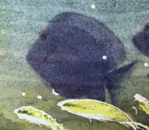 I stretched the cornstarch bin liner sideways, across the entire width of the paper, and pressed down into the puddling wash. The material fell into creases, which I adjusted in places. I left it for a while to dry, though not completely. Lifting the bin liner, still damp, meant that the patterns stayed less crisp, making soft ripples, not hard edges.
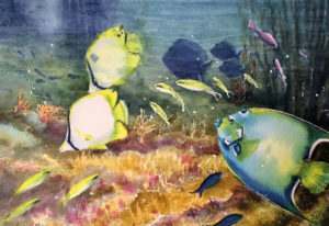 Final touches included lifting the masking fluid, with a Maskaway block, and softening edges with a damp brush to create lost edges on the tails of the small fishes. I intensified darks in eyes, with Lunar Blue, added pinks (Quinacridone Magenta) on the Blue Chromis fish and spattered colour to balance the overall composition of my fishy friends.