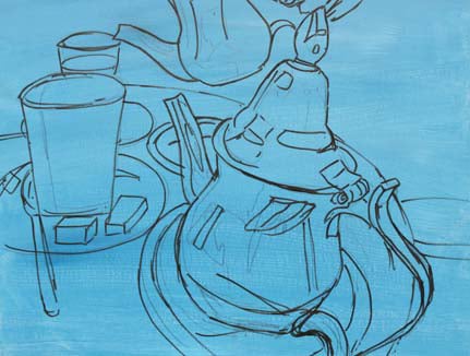
 I started by covering the board with a coat of Cerulean Blue and White mixed together. When dry I drew the images on with a Faber-Castell Sepia Bold Pen. Notice how the camera lens has distorted the silver teapot and glasses. I liked this effect so decided to draw it as the photograph and not correct the image on the canvas.
 Using the 1.5″ Flat, I dipped first into the French Ultramarine Blue and then into the Rouge and started to block in the darker areas without mixing the paint. If you feel confident you can go straight into plotting the dark shapes without drawing.
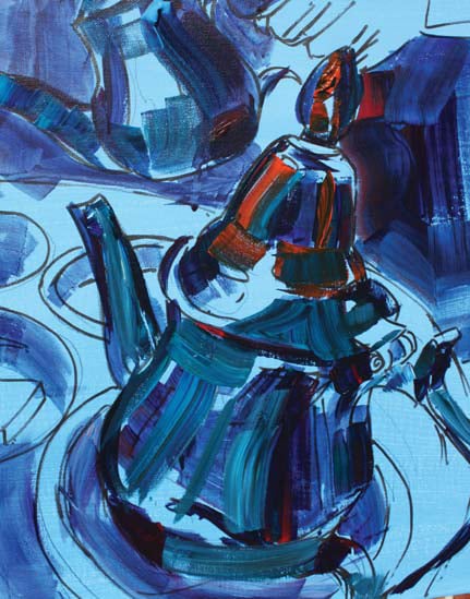 Using the 1″ Flat brush, I dipped into each of the following colours: Hookers Green, French Ultramarine Blue and Rouge, again without mixing. I continued to dip into these colours to build up the darker shapes on the silver teapot.
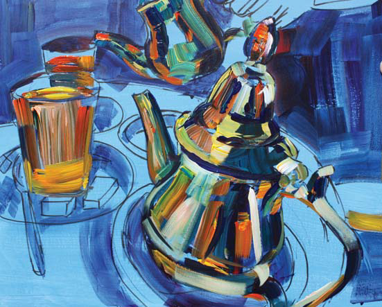 Now for a little Phthalo Turquoise, French Ultramarine Blue, Hookers Green and Rouge using the 1″ Flat to paint in the medium tones. I then dipped into a little Brick Red to give more warmth before moving on to the fun stuff. Using some warm colours: Brick Red, Cadmium Yellow, Phthalo Turquoise and a little White, I dipped again using my size 12 Flat. I added some of the much lighter tones that you can see in the silver, bringing in colour and balancing with the rest of the painting. For the mint tea in glasses I dipped into the Cadmium Yellow, Brick Red and Hookers Green.
Although I know the saucers are white I decided to use my imagination with some  Moroccan colours and dipped into Turquoise, French Ultramarine, Hookers Green and a small amount of White and Cadmium Yellow for mid tones. This is far more interesting than painting just grey shadows on white. I also blocked in some of the darker shapes using French Ultramarine and Rouge.
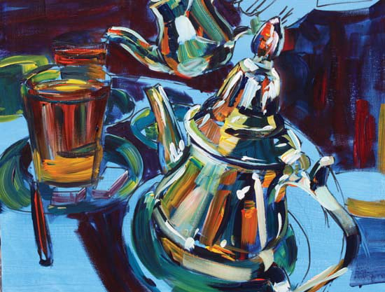 Next using the size 10 Flat, while the underneath paint was still wet, I blended in a few of the paler tones using white to give me a feel for the overall picture. I then filled in the spaces on the table using Cerulean Blue, a touch of Ultramarine Violet and a hint of White. I was not worried about picking out definite shapes like the menu as I just wanted to fill in with lighter colours. For the hand I used the Size 12 flat and dipped into the Brick Red, Cadmium Yellow and a little Ultramarine Violet, keeping it very loose as I just wanted it to be an impression of a hand – without this is might look as if the teapot was floating. I then blended a little white into the lighter areas of the hand. Next, with the 11/2″ Flat brush I randomly put some warmth into the background with a few marks of Brick Red.
 For the finishing touches I felt a little more warmth was needed to depict the hot climate and the atmosphere of the tea room, so using 1″ Flat and the SAA Red and Cadmium Orange, I added a few touches of these colours onto the silver teapots. Once this was all dry, using the SAA 0 pointed brush I added a few bright highlights around the top of the mint tea and to the shiniest areas on the teapots.
Time to relax now and enjoy the atmosphere.