
I am a sucker for colour and the Daniel Smith range of watercolours appeals to every part this. The brand has an ever expanding selection of colours that provide interest and pigment intrigue so I was delighted to learn that there were eight new colours being launched, and even more thrilled to be asked to test them out. Not every colour was necessarily going to be a permanent addition to my box, but to have the chance to investigate them all would allow me time to see how they performed. One of the colours leapt out at me – Wisteria – not only because any of the lilacs/purples are like jewels to me, but also I wondered how close to the actual plant the colour would be. I managed to find a lovely piece of reference material with a close up of the flowers and set about seeing how the colour would work. Listed below are the steps I performed to complete the painting, I hope that they are helpful and would love to see any work that you create.
If you’d like to see more from Alison, you can catch her on video on demand by clicking here. Alternatively, you can view Alison’s website here.
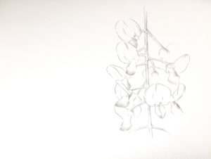 Using Millford watercolour paper, chosen because of the soft effects it delivers, I sketched out the wisteria, playing a little with the layout of where the flowers would sit so that the background would become part of the composition.
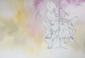 I used three colours for the first layer – Raw Sienna Light, Lavender and Wisteria. Just be mindful that the Lavender and Wisteria have a white pigment included in them so are more like a gouache than a watercolour. I used plenty of water to get the colours to flow and a little rag rolling to suggest texture.
 In order to give more drama to the piece, I applied a very careful second layer of washes. Millford is a wonderful paper and one of my favourites but you do need to be nice to it and second layers can disturb the first if you are too heavy handed with it. The second layer also incorporated the Payne’s Blue Gray, popped in behind the flower heads to push them forward.
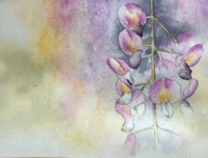 The Raw Sienna Light and Wisteria were used on the upper parts of the flowers and I also introduced Amethyst with a little Quinacridone Purple for the deeper sections. The stem holding the flower heads up used Green Gold with the Payne’s Blue Grey for shadows.
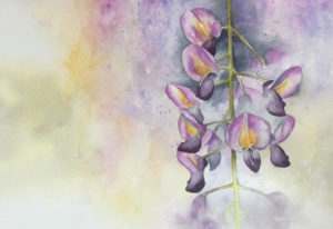 I’m such a messy painter, flicking water and colour here, there and everywhere so inevitably, splashes occur but I wasn’t too sad about them, in fact I added more as I went. You can also see at this stage that I softened the background flowers, added some more to the bottom of the composition and continued to build up the colour.
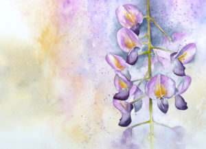 In order to make the flower heads ‘pop’ I deepened the colour behind them, carefully painting around them in the negative spaces and liked the textural effect of the spattering so much I added more! I was very conscious of stopping before it became over painted so finished at this point and left the piece on my drawing board to come back and look at with fresh eyes the next day. I’m glad I did, as when I came in to my studio the following day, I didn’t feel it needed anything adding to it.